



















A room can register as coastal without anchors, shells, signs or a literal vacation scene. The distinction lies in visual language: a low horizon, a sand-and-water boundary, washed edges, open space or texture that recalls foam. Modern coastal wall art uses those cues within a composition that still works as contemporary art. That makes the selection less about finding the most obvious ocean image and more about deciding how clearly the work should signal the coast. Once that level is set, palette, movement and texture can carry the idea without turning the room into themed décor.
Decide How Clearly the Artwork Should Say “Coast”
Set the coastal signal on a spectrum: a recognizable shoreline or horizon at one end, and an implied sand-water boundary or directional texture at the other. Literal imagery announces the coast immediately; implied imagery lets the work read as contemporary abstract first. For a non-themed interior, choose the least literal point that still supplies enough coastal character. That choice sets how much interpretive work the composition must do.
Use Coastal Cues Instead of Coastal Symbols
Replace symbols—anchors, signs and shells—with one or two compositional cues: a horizontal division, a curved warm-sand and pale-water boundary, broken foam-like white passages, washed edges or open space. Limiting the cues keeps the work suggestive rather than illustrative.
Neutral Coastal Abstract Wall Art #TO034 demonstrates that balance. Warm beige curves meet pale aqua and ivory in a wide composition; the sweeping boundary is enough to suggest shallow water and sand without shells, boats or signage.

Abstract Coastal Art Works When the Movement Still Feels Natural
Abstract coastal art remains convincing when its movement behaves like water, shoreline or changing terrain rather than an arbitrary decorative pattern.
Look for shoreline curves that widen and narrow, uneven horizontal bands and broken white passages that disperse like foam. Sweeping marks can imply a receding tide; layered directions can suggest water meeting sand.
TO034 uses long, curved bands rather than a conventional horizon. The sand-colored area and pale aqua field remain distinct, while raised linear details follow the implied shoreline. Because the movement is broad and continuous, the work reads as a contemporary panoramic abstract first. Its coastal character comes from the meeting of those shapes and colors, not from added motifs.
Do not assume any blue-and-beige abstraction is coastal. Its movement, spacing and color relationships should support that reading without help from the product title.
Choose a Coastal Palette Without Turning Everything Blue
Blue is one coastal cue, not the concept. Sand, ivory and pale aqua can establish a warm-cool relationship while leaving the composition, negative space and movement legible.
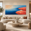
Blue & Gold Coastal Abstract Wall Art #TO848 uses deep blue and turquoise beside warm gold and broken white. The division resembles water, foamy surf and a sunlit shoreline, yet the vertical format and abstract surface prevent it from reading as a conventional landscape. It carries more coastal information than TO034, making it useful when the artwork needs to supply the room’s primary coastal cue.

Neutral work can omit obvious blue when beige, ivory and white combine with shoreline movement or texture. Readers who need broader ocean-specific color and subject advice can use the ocean painting guide. A modern coastal palette should support the composition rather than act as the only coastal signal.
Let Texture Suggest Water, Foam or Eroded Sand
Texture can provide coastal meaning without relying on a detailed scene. Raised white edges resemble foam because they create irregular borders and a sense of accumulation. Sweeping impasto can follow the arc of a wave or shoreline. Layered, eroded-looking surfaces can suggest sand shaped by water.
The direction of the texture matters. Random heavy texture may add tactility but does not necessarily feel coastal. Marks that crest, recede, overlap or follow a curved boundary create a clearer connection to water movement. Likewise, a rough beige surface beside a smoother pale field can imply the contrast between shore and water without depicting either literally.
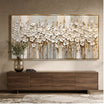
Neutral Wave Wall Art #MT229 uses a recognizable wave form, but its main impact comes from thick white texture, layered horizontal flow and a restrained beige-and-white palette. The raised crest carries the foam reference, while the limited color keeps the piece from depending on bright ocean blue.

Texture should strengthen the composition rather than compensate for a weak one. Follow the large shapes first, then check whether the raised surface reinforces their direction. The coastal reading is more convincing when composition and texture tell the same story.
Check Whether the Artwork Reads as Contemporary First
Use a simple test: if the word “coastal” disappeared from the product title, would the work still read as resolved contemporary art?
Look for simplified forms, asymmetrical balance or controlled cropping, intentional negative space and one dominant directional movement. A controlled crop should reinforce that movement, not merely cut off a recognizable scene. Limit the number of coastal cues and keep symbolism restrained. Texture should be integrated into the composition’s larger shapes instead of sitting on the surface as decoration. The absence of anchors, signs, shells and other nautical motifs is not enough by itself; the underlying arrangement must still feel deliberate.
This test filters out theme-dependent pieces. A well-composed abstract retains its structure even when the viewer does not identify water immediately because its balance, movement and surface already work together. Decorative nautical motifs cannot substitute for that visual logic.
It also clarifies the difference between this decision and a general beach art selection. A broader beach guide can compare many types of imagery. Here, the standard is narrower: the work must imply the coast while functioning as contemporary art without supporting props.
Decide How Much Coastal Signal the Room Already Has
Artwork does not operate in isolation. First count the coastal signals already built into the space. Pale timber, linen, woven fibers, washed stone, generous daylight, coastal architecture or a visible ocean view may already establish the setting. In that context, a restrained abstract with one or two coastal cues is often enough.
An urban neutral interior may require the artwork to carry more of the message. A clearer shoreline division, stronger aqua field or more legible wave movement can introduce the coastal reference without adding themed accessories. TO848, for example, speaks more directly through its blue-water and gold-shore contrast than a near-monochrome textured work would.
Avoid stacking signals simply to make the style unmistakable. If the room already includes pale wood, linen and an open view, adding literal shells, signs and a bright-blue seascape can make each element feel less considered. Let one component lead and the others support it.
For a larger selection of water- and shoreline-based work, use the seascape wall art collection.
FAQs
Can modern coastal wall art work in a home that is not coastal?
Yes. Subtle shoreline movement, open space, restrained color and integrated texture can work in modern, organic-modern, neutral or contemporary interiors when that visual language fits the room. The architecture does not need to be coastal, and the artwork does not need support from nautical décor.
How can coastal wall art look modern instead of beach-themed?
Choose work that functions as contemporary art first: strong composition, deliberate negative space, controlled texture and a restrained palette. Favor shoreline movement, horizon-like divisions and sand-water relationships over anchors, shells, boats or signs.
Choose the Coastal Signal, Then Judge the Art
Start by deciding how literal the coastal reference should be. Then look for a few convincing cues, natural movement, a balanced palette and texture that follows the composition. Finally, account for how much coastal character the room already supplies. This sequence keeps the artwork from relying on theme décor and makes it easier to compare pieces from Tactile Atelier on their visual merits. The result can feel distinctly coastal while still reading, first and last, as considered contemporary art.


Leave a comment
This site is protected by hCaptcha and the hCaptcha Privacy Policy and Terms of Service apply.