






















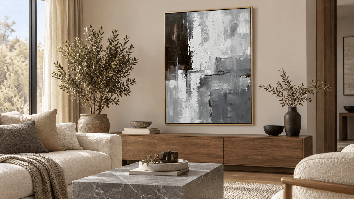
Grey artwork rarely feels wrong because grey is inherently cold. The more common problem is a mismatch of temperature or value: a blue-grey painting beside yellow cream, a pale composition disappearing into a pale wall, or a brown-grey work turning dull against a crisp cool interior. Choosing grey wall art for neutral interiors becomes much easier when you separate those two decisions. First identify whether the room’s fixed finishes lean warm or cool. Then decide how light or dark the artwork should be. Only after that should you fine-tune the particular grey family.
Identify Whether the Room Is Warm-Neutral or Cool-Neutral
Start with the largest elements that are difficult to change: wall paint, flooring, upholstery, stone and major wood pieces. Warm-neutral rooms often contain cream, ivory, beige, warm white, oak, walnut, brass or stone with a golden or brown cast. Cool-neutral rooms are more likely to include crisp white, blue-grey upholstery, concrete, cool marble, chrome or high-contrast black-and-white architecture.
Do not rely on a paint-card name. Compare the finishes directly. Grey may carry brown, beige, blue, green or violet; beige may lean peach, yellow, pink or grey. Those undertones become obvious when adjacent surfaces disagree.
If the room is mixed, identify the dominant temperature and a bridging material. A painting with cool grey and warm off-white can connect a crisp wall with natural oak more convincingly than uniform blue-grey. The aim is an intentional relationship, not an exact match.
Choose the Grey by Value Before Fine-Tuning Undertone
Value means how light or dark a color appears. It is separate from temperature: both a warm grey and a cool grey can be pale, mid-value or charcoal. This distinction matters because an artwork can have the correct undertone and still fail to separate from the wall or furniture.
In a pale room, pale-on-pale grey needs enough line, texture or dark passages to remain legible. Mid-value grey adds clearer separation. Charcoal creates the strongest anchor, especially when dark notes already appear in lighting, window frames or furniture.
View the product image as a small thumbnail. If its light-dark structure remains clear, it should retain presence at normal distance. If it merges into one pale field, decide whether that softness is intentional.
Warm Grey, Cool Grey, Greige and Charcoal Behave Differently
Warm Grey and Greige
Warm grey carries beige, brown or muted green; greige sits between grey and beige. These families often relate well to cream, warm white, oak, walnut and travertine, where clean blue-grey might look disconnected.
Warm does not mean yellow. Its role is to avoid a noticeably blue cast beside warm materials. With several beiges, choose a grey that shares warmth but differs enough in value or texture to stay distinct.
Cool Grey and Blue-Grey
Cool grey can lean blue, green or violet. It suits crisp white, cool stone, black, chrome and blue-grey textiles. In a warm room, repeat that temperature in a slate surface, blue-black accent or another cool element.
Next to warm cream, blue-grey may appear bluer because the contrast emphasizes both temperatures. That should be deliberate rather than a surprise after installation.
Charcoal
Charcoal may lean warm or cool, but its darkness creates the first effect: an anchor. Pale surroundings support the contrast, while repeated dark notes keep it from feeling isolated.
Grey Neutral Abstract Wall Art #TA026 shows several roles within one composition. White and soft grey passages keep much of the surface light, while the dark block at one side and darker linear divisions provide structure. The contrast can connect a pale neutral room to black or charcoal accents without making the whole artwork dark.

Grey and Beige Should Share Something—But Not Everything
Grey and beige work together when they share a useful connection. That may be warmth, a common undertone, repeated dark accents or a related material quality. They do not need to match. In fact, an exact near-match can look accidental when one surface is just slightly pinker, yellower or cooler than the other.
With creamy walls and a warm beige sofa, greige can echo the warmth while white relief or dark marks add separation. Blue-grey can work if slate textiles or cool metal repeat it; without that bridge, the painting may look unusually blue and the cream unusually yellow.
A muddy effect usually means insufficient distinction. If grey and beige are close in value but subtly disagree in undertone, choose a more clearly related temperature or increase the value difference.
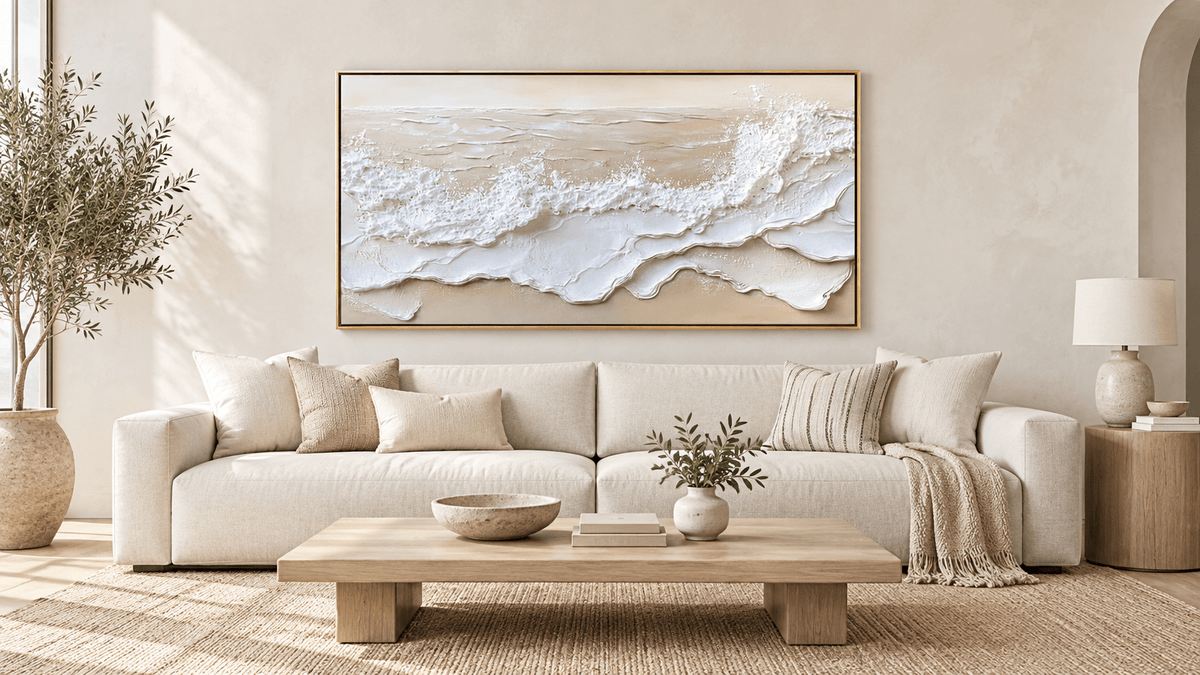
Textured Neutral Abstract Wall Art #MT333 uses a beige-grey ground with raised white circular and linear marks. Its warm neutral base relates to beige, while the structured relief prevents the surface from becoming one undifferentiated field.

Match Grey Art to Wood by Temperature, Not by Color
Read wood as a temperature and value influence rather than a color to reproduce. Pale oak often suits greige, warm soft grey and muted grey-green, while bleached or greyed oak may support cooler grey.
Walnut’s deeper brown, red or golden notes can carry charcoal or deeper mid-grey. Cool grey still works when another cool finish creates continuity or the contrast is intentionally crisp.
Avoid formulas such as “oak always needs warm grey.” Finish, daylight, textiles and wall color shift wood’s appearance. Compare artwork with the actual materials, and do not treat a subtle on-screen undertone as exact.
Grey Art on a Grey Wall Needs Separation
Grey artwork can work on a grey wall, but identical-looking grey is not the goal. Separation can come from at least one of six places:
- a lighter or darker overall value;
- a warmer or cooler temperature;
- visible texture;
- decisive line or geometric structure;
- a contrasting frame;
- distinct dark and light passages within the composition.
A pale warm-grey work can separate from a mid-value cool-grey wall through temperature. Charcoal on pale greige separates by value. Tone-on-tone work can rely on texture and line, provided its edges remain legible at normal distance.
This is a different problem from selecting white wall art on white walls. Here, temperature and grey value remain the main controls rather than a broader study of white surfaces.
Decide Whether Grey Should Blend or Anchor
Before comparing individual works, choose the role the artwork should play.
For quiet integration, keep the value difference narrow, repeat the dominant undertone and use texture or structured marks for definition.
For a stronger anchor, use charcoal, dark architectural marks or a pronounced light-dark division. Moody Urban Cityscape Wall Art #MT058 uses dark blue-grey architecture, a pale central opening and reflective street tones. It carries a cool temperature and much deeper value than a typical pale neutral room, so it acts as a focal anchor rather than background texture.

An anchor looks intentional when its darkness recurs in a black frame, table leg or charcoal textile. The room does not need to become uniformly dark.
A Practical Grey Art Decision Sequence
Use this order when comparing pieces from a grey wall art collection:
- Identify room temperature. Decide whether the fixed finishes read mainly warm, cool or deliberately mixed.
- Identify wall and furniture value. Note how pale or dark the largest nearby surfaces are.
- Choose blend or anchor. This sets the useful amount of tonal contrast.
- Select the grey family. Compare warm grey, greige, cool grey, blue-grey and charcoal within that role.
- Check wood and stone. Look for a shared temperature or an intentional bridge rather than a literal match.
- View at normal distance. Confirm that the composition stays legible and that its undertone does not turn unexpectedly blue, green, violet or brown beside the room finishes.
If the room needs more warmth than the grey category provides, compare the result with neutral wall art, where beige and warm off-white play a larger role. The distinction helps keep the selection grounded in the room rather than in a preferred color name.
FAQs
Can grey wall art work on a grey wall?
Yes. Create separation through value, temperature, texture, line, framing or distinct light and dark passages. A pale warm-grey artwork can stand apart from a cooler mid-grey wall even though both belong to the same broad color family.
What grey artwork works best with beige and cream interiors?
Warm grey or greige is often the easiest starting point because it relates to the room’s warmth. Cool grey can also work when another cool element supports it. In either case, make sure the artwork has enough value difference or texture to avoid a muddy near-match.
Make the Neutral Relationship Deliberate
The useful question is not whether grey “matches” a neutral room. It is whether the artwork shares or deliberately contrasts the room’s temperature, and whether its value gives the desired degree of separation. Read the fixed finishes first, choose blend or anchor second, then compare grey families. That method turns a vague neutral palette into a controlled decision—and gives you a clear basis for evaluating work from Tactile Atelier in the context of the room where it will live.


Leave a comment
This site is protected by hCaptcha and the hCaptcha Privacy Policy and Terms of Service apply.