









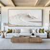





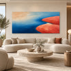



Beach art can make a room feel lighter and more relaxed, but it does not need to turn the space into a themed vacation rental. The most convincing interiors take a few qualities from the coast—open space, sun-washed color, natural texture, and an unhurried mood—without filling every surface with seaside references.
The right artwork may show a recognizable shoreline, or it may suggest sand, water, and reflected light through abstract shapes and layered paint. What matters is how the subject, palette, and scale relate to the room around it.
Before choosing a piece, decide how strongly you want the beach to influence the space. That decision will help you compare beach paintings that feel quietly coastal with artwork that creates a more immediate sense of escape.
Decide How Coastal You Want the Room to Feel
A beach-inspired room can be subtle, expressive, or somewhere in between. Defining that level first prevents the artwork from competing with the furniture and accessories already in place.

A Subtle Coastal Reference
For a room that is not otherwise coastal, choose beach artwork with a restrained palette and a simplified composition. Sand, cream, faded blue, warm white, and soft gray can suggest the shore without making the subject overly literal.
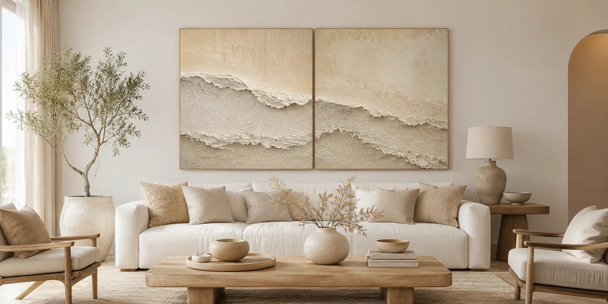
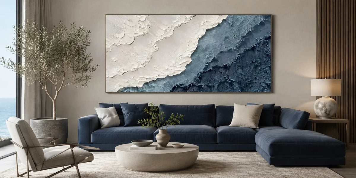
An abstract piece may be enough to introduce the idea through horizontal movement, pale color transitions, or raised marks that resemble foam and wind-shaped sand. This approach works well in modern living rooms, bedrooms, and open-plan spaces where the artwork needs to fit comfortably with the rest of the interior.
A subtle coastal reference is also easier to live with year-round. It can sit alongside wood, linen, stone, and neutral upholstery without making the room feel seasonal.
A Relaxed Vacation Mood
When you want the space to feel more like a retreat, look for clearer signs of the beach: a visible shoreline, brighter water, open sky, warm sand, or a composition that creates a sense of distance.
This direction can work well in a casual living room, guest bedroom, sunroom, or vacation property. The artwork may carry more color and detail because it is doing more of the work in establishing the mood.
Keep the surrounding décor relatively simple. A strong beach painting often needs less support than expected. Natural materials and a few repeated colors are usually enough.
Artwork for a Coastal Home
In a home near the water, beach wall art does not need to repeat the view outside. A literal shoreline may feel unnecessary when the room already overlooks the coast.
Instead, consider artwork that interprets the setting through texture, color, or close-up details. Abstract sand tones, white wave-like marks, or deeper blue layers can connect with the environment without competing with it.
Homes with large windows also receive stronger and more changeable light. Check how the artwork looks at different times of day, especially when the wall faces direct sunlight or strong reflections from the water.
Choose a Beach Subject That Fits the Mood
Not every image of the coast creates the same feeling. The amount of open space, the viewpoint, and the presence or absence of people all influence how beach artwork reads in a room.

Open Shorelines
An open shoreline with a wide stretch of sand or sky creates a sense of breathing room. These compositions can be helpful in compact interiors or rooms with substantial furniture.
A scene with few visual interruptions generally feels quieter. If the room already contains patterned fabrics, bookshelves, or several decorative objects, an open composition can provide balance.
Wide shoreline scenes are a natural choice above sofas, beds, and sideboards because their horizontal movement follows the furniture below.
Dunes and Natural Coastal Forms
Dunes, grasses, sand ridges, and weathered coastal surfaces bring warmth to beach art. They shift the focus away from blue water and toward the natural materials found along the shore.
This type of beach artwork works especially well with oak, rattan, linen, clay, and soft beige interiors. It can introduce a coastal atmosphere without relying on a traditional blue-and-white color scheme.
Look for compositions with repeated curves or layered bands. These shapes can create movement while remaining softer than breaking waves or dramatic skies.
Beach Scenes with More Activity
Artwork that includes energetic surf, strong sunlight, figures, or a busier shoreline feels more lively. It can suit a social space such as a family room, dining area, or bright entryway.
The more activity the painting contains, the simpler the surrounding wall should be. Avoid placing a detailed scene beside several small frames or highly patterned décor, as the arrangement may become visually crowded.
For a restful bedroom, an empty or minimally detailed beach scene is usually easier to live with than one filled with movement.
Abstract Beach Artwork
Abstract beach art focuses on the visual character of the coast rather than a particular view. White may suggest foam, pale beige may read as sand, and softened blue or green areas can imply shallow water.
Because the image is less literal, it can work in homes that do not follow a coastal decorating style. The artwork contributes color, texture, and movement while leaving the room open to other influences.
When comparing abstract pieces, look for a clear internal balance. Even without a recognizable shoreline, the composition should have a sense of direction, proportion, and visual rest.
Build a Coastal Palette Without Overdoing Blue
Blue is a natural choice for beach paintings, but it is only one part of a coastal palette. Sand, warm white, soft gray, muted green, clay, charcoal, and weathered brown can all help establish the setting.

Start with the Room’s Undertones
Look at the elements that are difficult to change:
- Flooring
- Large furniture
- Curtains
- Wall color
- Cabinetry
- Stone or tile surfaces
If these elements have warm undertones, beach artwork containing cream, sand, taupe, or muted aqua will often sit more naturally than a cool, crisp blue.
For cooler interiors, blue-gray, soft white, charcoal, and subdued green may create a more balanced connection.
The artwork does not need to match the room exactly. Repeating one or two undertones is usually enough.
Use Faded Color for a Sun-Washed Look
Beach interiors often feel more relaxed when colors appear softened rather than highly saturated. Faded blue, pale aqua, chalky white, and sandy beige can suggest surfaces altered by sun, salt, and weather.
These colors work well in bedrooms and living spaces where you want the artwork to support the room rather than dominate it.
They are also easier to combine with natural fabrics and light wood than very bright turquoise or intense cobalt.
Add Darker Tones for Structure
A room based entirely on pale neutrals can begin to feel flat. Dark navy, charcoal, deep green, or a small area of black can give beach wall art greater definition.
Darker artwork is particularly effective against white or cream walls. It can also connect with black window frames, dark lamps, or deeper wood tones elsewhere in the room.
Use strong color according to the size of the wall. A very dark canvas may feel heavy in a narrow space, while the same piece can anchor a large living room.
Match the Artwork to the Room and Wall
Size and placement should support the beach subject rather than distract from it. Begin with the available wall area, then compare the artwork with the furniture and architecture around it.
Living Rooms and Open-Plan Spaces
A living room often needs a piece large enough to remain visible from across the space. Above a sofa or long cabinet, a horizontal beach painting can create a strong relationship with the furniture.
As a starting point, artwork measuring roughly two-thirds to three-quarters of the furniture width often feels balanced. The surrounding wall, ceiling height, and nearby windows should still guide the final decision.
In an open-plan home, consider the artwork from more than one viewing position. A piece may look appropriate from the sofa but too small when seen from the dining area or kitchen.
Bedrooms and Guest Rooms
Beach art is well suited to bedrooms because the subject can feel open and restful. Look for softer contrast, fewer small details, and a composition that does not appear overly active above the bed.
A single wide canvas can make the arrangement feel settled. A diptych may also work, but the gap between the panels should be included when measuring the total width.
For guest rooms, avoid building the entire space around a strong seaside theme. One substantial painting, supported by natural fabrics and simple colors, is usually more versatile.
Entries, Hallways, and Narrow Walls
A vertical beach painting can suit a narrow entry, stair landing, or wall between doors. Rather than presenting a broad shoreline, it may focus on a section of water, a dune, reflected light, or the transition between sand and sea.
In a hallway, choose a level of detail that can be appreciated at close range. Texture and smaller tonal changes are more noticeable when viewers pass near the artwork.
Square formats also work well above compact consoles or in spaces divided by windows and doorways.
Actual Beach Houses and Vacation Properties
In a vacation home, it is easy to repeat the coastal theme in every room. This can make the property feel staged rather than comfortable.
Use different levels of coastal influence throughout the home. A clear beach scene may suit the main living area, while bedrooms can use quieter abstract work or neutral textured pieces. Other rooms may need no coastal artwork at all.
Also consider practical placement. Avoid hanging canvas art where it will be exposed to persistent moisture, splashing water, or intense direct sunlight. A protected interior wall is more suitable than a damp bathroom or an uncovered outdoor area.
Let Texture Create the Beach Feeling
The surface of a painting can communicate the coast even when the colors are limited. Raised white paint may resemble foam, rough neutral marks can suggest sand, and layered strokes can create the impression of wind, tide, or reflected sunlight.

This is especially useful in rooms with a quiet palette. Cream, beige, and soft gray beach artwork can still have a strong presence when the surface catches light at different angles.
Heavier texture creates more visible shadow and may suit a broad wall with minimal surrounding decoration. Finer texture has a more restrained effect and works naturally in bedrooms, reading spaces, and smaller rooms.
Lighting changes how the surface appears. Side lighting reveals raised brushwork, while even frontal lighting makes tonal layers easier to see. Avoid placing strongly textured artwork directly beneath harsh overhead lighting, which may create distracting highlights.
Finish also affects the final look. An unframed canvas can feel relaxed and contemporary, while a selected frame may add definition against a wall with similar colors. Custom sizes and finish options depend on the individual artwork, so available choices should be confirmed before ordering.
Browse Beach Art at Tactile Atelier
Once you have decided how coastal the room should feel, compare the available work by subject, color, format, and texture rather than choosing on color alone.
The Beach & Ocean Art selection is the most direct place to explore shoreline-inspired artwork, layered coastal color, wave-like texture, and abstract interpretations of sand and water.
Seascapes may be a better fit when open water and the horizon are the main focus. Coastal Art offers a broader interpretation of life and scenery near the shore, while All Paintings is useful when you want to compare beach artwork with other subjects before deciding.
At Tactile Atelier, the canvases are hand-painted with visible texture, tonal layering, and physical depth. They are designed to work in modern interiors without relying on heavily themed decorative details.
Custom sizes and selected finish options may be available for individual pieces. For an unusually wide wall, a specific furniture arrangement, or a room with limited hanging space, confirm the available format before ordering.
You can also send the team a room photo and wall measurements for guidance. Include the furniture width, available wall height, and a clear view of the surrounding materials and colors.
Free standard shipping is available on eligible orders, with international delivery confirmed according to the destination. Secure payment options and a 30-day return window are available for eligible non-custom artworks under the applicable policy terms.
The right beach art should remind you of the coast without making the room feel like a set. Begin with the atmosphere you want, then compare subject, palette, scale, and texture. When those elements work together, the artwork can bring a relaxed shoreline mood into the home while still feeling connected to the way you live.
Frequently Asked Questions
What colors work well with beach art?
Beach art can work with cream, sand, white, muted blue, soft green, taupe, gray, and darker navy accents. Choose tones that relate to the room’s flooring, furniture, and wall color rather than trying to match small accessories exactly.
How large should beach wall art be above a sofa?
Artwork measuring approximately two-thirds to three-quarters of the sofa width is a useful starting point. Mark the dimensions on the wall and review them from the room’s main viewing positions before choosing.
Can beach paintings work outside a coastal-style home?
Yes. Abstract or minimally detailed beach paintings can work in modern, neutral, or transitional interiors. Restrained colors and limited seaside details help the artwork feel integrated rather than themed.



Leave a comment
This site is protected by hCaptcha and the hCaptcha Privacy Policy and Terms of Service apply.