

















Mixed artwork looks disordered when every piece asks for attention in a different way and nothing links the group. The problem is not the presence of abstract, figurative, landscape or floral art in one room. It is the absence of hierarchy and visual continuity. To understand how to mix wall art styles, decide which work leads, which pieces support it, and which one or two cues repeat across the room. That structure allows meaningful contrast without making every color, frame and subject match. The result should feel collected over time, but still edited.
Start With One Dominant Artwork
Choose the piece that should register first. Dominance can come from size, contrast, saturated color, dense texture, an active subject or a position that naturally catches the eye. The largest work often leads, but a smaller portrait with a stark face or a vivid palette can outweigh a physically larger neutral painting.
Once the dominant piece is clear, give the remaining art a different job. A supporting work may repeat one color, provide a quieter area, continue a directional line or offer a recognizable subject beside a more abstract focal point. It should contribute to the room without demanding an equal visual response.
This is where selection benefits from comparison rather than isolated shopping. When browsing Tactile Atelier, view a possible addition beside an image of the art you already own. Ask which one leads at a glance. If both rely on the same intense color, heavy texture and high contrast, one may need to move to another wall or another room.
Dominant does not mean that every other piece must be pale or small. It means the visual order is legible. The eye should encounter a clear first note, then discover supporting works rather than bouncing among several equally forceful statements.
Repeat One Visual Thread—Not the Entire Look
Cohesion needs a connection, not duplication. One repeated color can link different subjects. A similar value range can connect a landscape and a geometric abstract. Related frame materials, directional movement, texture, negative space or even an echo of one shape can establish a thread.
Start with one strong connection and add a second only if the mix still feels fragmented. For example, a soft blue field may appear in both a figurative painting and a landscape, while warm wood frames repeat elsewhere. That is enough; the brushwork and subjects can remain different.
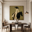
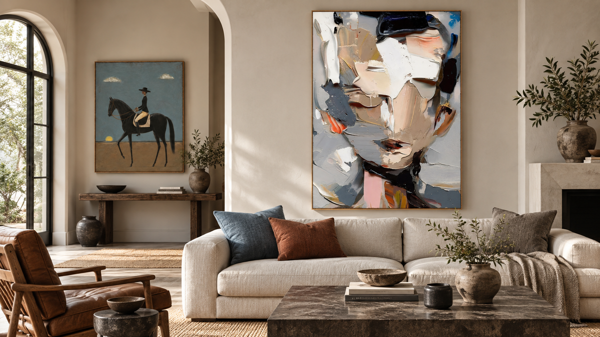
Contemporary Equestrian Wall Art #MT029 illustrates how a recognizable subject can support a more expressive piece. Its black horse and rider create a clear focal figure, but the restrained blue sky, earth tones and open ground leave visual breathing room. Beside a busier abstract, the shared blue or black could provide continuity while the quieter composition prevents direct competition.

Avoid matching every visible feature. Repeating the same palette, frame, texture and subject intensity can make the room feel purchased as a set rather than assembled with judgment. A useful visual thread should be noticeable enough to connect the art but quiet enough to leave room for difference.
Abstract and Figurative Art Can Work Together
Abstract and figurative art solve different visual tasks. An abstract piece can carry color, rhythm or surface. A figurative work can provide narrative focus and a recognizable subject. They work together when their compositional weight is compatible or when one element crosses between them.
Modern Abstract Portrait Wall Art #MT054 is useful because it sits between the categories. A face remains identifiable, while layered palette-knife passages fragment the features into neutral, grey, black and small colored areas. It can connect a fully abstract painting to a conventional portrait because it shares visual language with both.

To mix a more traditional figure with a nonfigurative work, compare three things. First, look at value: does one use deep darks while the other is almost entirely pale? Second, compare activity: are both densely marked? Third, identify a connecting movement or color. A single shared black line, warm neutral or upward rhythm can be more useful than an exact color match.
Do not ask abstract art to imitate the figure or require the figure to adopt abstract brushwork. If the underlying difference is still unclear, a focused guide to abstract wall art for modern homes can help identify the compositional qualities you want to repeat.
Balance Active and Quiet Artwork
Visual activity increases with multiple figures, dense marks, saturated color, sharp contrast, fragmented composition and heavy texture. Activity is not a flaw, but several active pieces placed close together can erase hierarchy. The eye receives many signals without a place to pause.
Balance an active work with art that has broader forms, fewer color changes, more negative space or a narrower value range. The supporting piece does not have to be minimal. It simply needs to operate at a lower level of intensity.
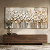
Colorful Textured Floral Wall Art #TO123 is intentionally active: raised flowers repeat across a wide field in pink, red, orange, yellow, green, teal and purple. The light background keeps the composition airy, yet the repetition, color and texture still give it strong presence. Pairing it with another densely colored floral would amplify activity; placing it near a restrained portrait or open landscape would create a clearer pause.

Also consider where activity sits across the room. Two forceful works can coexist when a doorway, quiet wall or substantial area of negative space separates them. Put the same pieces shoulder to shoulder and they may compete. This is a visual-weight decision, not a rule that limits a room to one colorful painting.
Decide Whether Frames Should Match
Matching frames are an efficient unifying device when the artworks differ strongly in subject, palette and technique. A repeated slim black, warm wood or pale metal frame creates a perimeter rhythm around otherwise unrelated images. It can make a deliberately varied group feel edited.
Frames do not have to match when another visual thread is already doing that work. Different wood tones can feel intentional if the art shares a restrained palette. A black frame and a natural-wood frame can coexist when similar dark marks appear within both paintings. Frame variation is easier to absorb when the artwork itself includes quiet areas.
Judge the frame as part of the artwork’s visual weight. A wide dark frame increases contrast and mass; a narrow pale frame recedes. If several paintings are already active, multiple ornate or high-contrast frames may add another competing layer. Simplifying one frame can correct the group without changing any artwork.
The useful question is not “Do frames match?” but “What is currently supplying continuity?” If the answer is unclear, matching frames may provide it. If palette, movement or value already connects the works, varied frames can reinforce the collected character.
Use Spacing as a Visual Separator
Spacing gives different styles permission to remain different. The greater the contrast in palette, subject, texture or frame treatment, the more breathing room the works often need. Space lets the eye finish reading one composition before entering the next.
This does not require a detailed gallery-wall grid. Look from the normal viewing position and check whether the edges appear to merge into one busy cluster. If they do, widen the separation or divide the pieces across adjacent walls. If the works feel unrelated and isolated, bring them closer or strengthen a repeated cue.
Furniture and architecture can also separate art. A doorway, tall plant, floor lamp or change in wall plane creates a natural pause. Use those boundaries to keep strong contrasts from becoming collisions. The aim is a readable rhythm: artwork, breathing room, then artwork again.
Know When the Mix Actually Clashes
A varied room is not automatically a successful one. Look for specific warning signs:
- several equally strong focal points;
- unrelated saturated palettes;
- no repeated color, value, material, movement or shape;
- heavy visual weight concentrated on one side;
- too many competing frame treatments;
- every piece densely detailed or heavily textured.
Correct the mix in a fixed order. First, remove or relocate one competitor. This immediately reveals whether too many focal points were the real problem. Second, increase the space between the remaining works. Third, repeat one cue through a frame, a color or a quieter supporting piece. Finally, reassign roles: decide which work leads and which should recede.
Do not begin by buying another artwork to “tie everything together.” A new piece can add a fourth problem to a group of three. Editing is often more effective than adding. Photograph the room, reduce the image to a thumbnail and note where your eye jumps first, second and third. If there is no sequence—only simultaneous impact—the hierarchy still needs work.
FAQs
Can you mix abstract and figurative wall art?
Yes. Connect them through value, palette, movement, framing or visual weight rather than identical style. Let one piece carry the main color or texture role and allow the other to provide a quieter narrative or subject focus.
Do all frames need to match when mixing art styles?
No. Matching frames can unify a highly varied group, but different frames work when another cue already connects the art. Keep frame visual weight in balance so several dark, ornate or high-contrast treatments do not compete.
Aim for Collected, Not Accidental
Successful mixing is controlled contrast. Choose one dominant artwork, assign supporting roles, repeat one or two visual threads, balance active and quiet surfaces, and use spacing to protect the differences. If the room still feels busy, remove a competitor before adding another connection. That approach lets paintings from the wall art collection remain recognizably different while the room reads as one considered composition.


Leave a comment
This site is protected by hCaptcha and the hCaptcha Privacy Policy and Terms of Service apply.