















An ocean painting can give a room a calmer visual rhythm, but the right choice depends on more than finding a shade of blue you like. The movement of the water, the position of the horizon, the amount of open space, and the scale of the canvas all affect how the artwork sits within an interior.
Some ocean art feels light and spacious, with pale skies and quiet water. Other pieces use dark navy tones, heavy texture, or energetic waves to create a stronger focal point. Abstract sea artwork can suggest movement without depicting a specific coastline, while a more recognizable seascape offers a clearer sense of place.
The aim is not to match the painting to every object in the room. It is to choose a composition, palette, and format that work with the wall, furniture, lighting, and mood you already have.

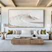
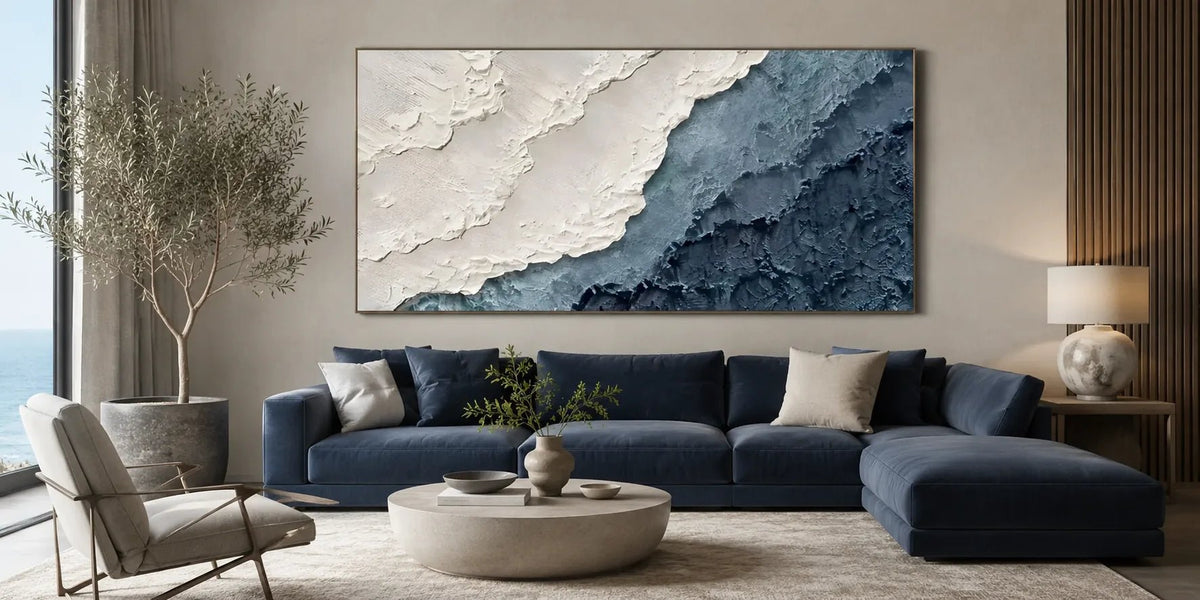
The width, horizon, and color balance of ocean artwork influence how naturally it fits above furniture.
What Kind of Ocean Painting Fits Your Room?
Before considering exact dimensions, decide how clearly you want the artwork to represent the sea. Ocean paintings range from recognizable coastal scenes to highly simplified compositions built from color, texture, and horizontal movement.
Abstract Ocean Art
Abstract ocean art uses visual cues rather than precise scenery. A pale horizontal division may suggest the meeting point between water and sky. Sweeping brushstrokes can resemble waves, while bands of white, gray, sand, or blue create the impression of distance.
This approach works well in rooms with clean-lined furniture, limited ornament, and a restrained palette. The subject remains recognizable enough to create an ocean mood, but it does not make the room feel themed.
Look at the direction of the brushwork. Long horizontal strokes tend to feel settled and expansive. Curved or diagonal marks create more movement. A painting with broad areas of open color will usually feel quieter than one filled with overlapping waves and strong contrasts.
Abstract work is also useful when you want ocean artwork to relate to the room through color and texture rather than through a literal beach scene.
Recognizable Seascapes
A recognizable seascape may show a defined horizon, open water, shoreline, clouds, or rolling waves. It offers a clearer sense of landscape and can become a natural focal point in a living room, bedroom, dining area, or office.
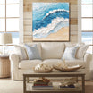
When evaluating this type of sea artwork, consider the weather and water conditions shown in the composition. Still water, a pale sky, and a distant horizon generally create a quieter impression. Large waves, dark clouds, or high contrast introduce more energy.
Also check how much of the canvas is occupied by water. A low horizon gives greater emphasis to the sky and often feels airy. A higher horizon brings the water forward and can make the scene feel closer and more immersive.
Minimalist and Neutral Seascapes
An ocean painting does not have to be predominantly blue. Neutral seascapes may use white, beige, gray, taupe, or soft earth tones to suggest sand, foam, mist, and distant water.
These pieces suit interiors where strong blue would feel too cool or visually dominant. They can work especially well with warm wood, cream upholstery, stone surfaces, and natural fabrics.
Minimalist compositions usually rely on proportion and surface variation. Because there are fewer visual elements, the placement of each line, color field, or textured mark becomes more important.

Simplified ocean art can introduce a coastal mood without turning the room into a literal seaside theme.
Choose Ocean Art Colors by Mood, Not Just Décor
Blue is closely associated with ocean art, but different blues produce very different results. Before choosing, consider the temperature, depth, and saturation of the color rather than treating every blue painting as interchangeable.
Pale Blue and Soft Gray
Pale blue, blue-gray, and misty white tend to feel open and understated. These tones work naturally in bedrooms, quiet living rooms, and interiors with light walls or soft neutral furniture.
They are useful when the artwork should support the room rather than become its strongest feature. A low-contrast composition can still have presence when it includes visible brushwork or layered tonal changes.
Navy and Deep Ocean Blue
Dark navy and blue-black shades give ocean artwork greater visual weight. They can anchor a pale room, create contrast against white walls, or connect with darker furniture and architectural details.
Deep blue works particularly well on a generous wall where the painting has enough space around it. On a small or crowded wall, a very dark canvas may feel heavier than expected.
Lighting is important. Dark blues can appear almost black in dim rooms, while daylight may reveal layers of cobalt, gray, teal, or violet. Review the artwork under lighting similar to that of the intended room whenever possible.

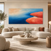
Deep ocean tones create a stronger focal point and reveal different color layers as the light changes.
White, Sand, and Warm Neutrals
Warm neutral ocean paintings can connect sea-inspired imagery with beige, cream, oak, linen, and other natural materials. They are often easier to place in rooms that already contain warm undertones.
White areas may suggest foam, clouds, or reflected light, while sand and taupe tones keep the composition from feeling overly cool. Small areas of blue can then act as accents rather than dominating the painting.
Avoid trying to match the artwork exactly to a rug, cushion, or curtain. Instead, look for one or two shared undertones and allow the remaining colors to introduce controlled variation.
Match the Size and Format to the Wall
Ocean compositions naturally suit wide formats because water and horizon lines move horizontally. However, the right shape still depends on the available wall and the furniture below it.
Above a Sofa, Bed, or Sideboard
Artwork above furniture should feel connected to what sits beneath it. A painting that is too narrow may appear isolated, while an oversized piece can crowd nearby windows, shelves, or lighting.
As a practical starting point, consider artwork measuring approximately two-thirds to three-quarters of the furniture width. This is not a fixed rule, but it provides a useful proportion to test.
Use removable tape to mark the proposed dimensions on the wall. View the outline from the doorway and the main seating position rather than judging it only while standing directly in front of the wall.
The gap between the furniture and artwork also matters. Keep enough separation to avoid a cramped arrangement, but do not hang the painting so high that the two elements appear unrelated.
Panoramic Ocean Artwork
A panoramic format emphasizes the horizon and can visually extend the width of a room. It is well suited to long sofas, dining tables, headboards, and wide blank walls.
This format needs breathing room on both sides. If the wall is interrupted by tall shelving, a doorway, or closely spaced windows, a less elongated canvas may sit more comfortably.
Panoramic paintings are particularly effective when the composition contains long, calm bands of sky and water. A highly active wave scene in a very wide format may create more visual movement than a restful room needs.
Diptychs and Two-Panel Art
A diptych divides one composition across two canvases. The small gap between the panels becomes part of the design, adding structure without interrupting the overall image.
Measure the complete width, including the space between panels, when planning placement. If the gap is too wide, the image may feel disconnected. If it is too narrow, the panels can look accidentally separated.
Two-panel ocean art can work above a large sofa or bed, especially when the wave or horizon continues naturally from one panel to the other.

When choosing a diptych, include the space between both canvases in the total wall measurement.
Vertical and Square Formats
A vertical ocean painting can suit a narrow wall, stair landing, reading corner, or space beside a doorway. Instead of emphasizing a wide horizon, it may focus on a breaking wave, reflection, or upward movement.
Square formats feel more contained and balanced. They work above compact furniture or between architectural features where a panoramic painting would not fit.
Do not assume every ocean scene must be horizontal. Let the wall shape determine the format before narrowing the choice by subject.
Why Texture Matters in Ocean Artwork
The sea is defined by changing surfaces: ripples, foam, spray, reflections, and shifting light. Texture allows an ocean painting to suggest those qualities without relying entirely on detailed imagery.
Raised paint can make pale wave crests catch the light. Layered blue and gray tones can suggest water beneath the surface, while rougher marks may create the impression of wind or movement.
In a neutral room, texture often matters more than strong color. A painting built from white, beige, and soft gray can still hold attention when the surface has enough variation.
Hand-painted canvas art also changes slightly throughout the day. Side lighting emphasizes raised brushwork, while softer frontal light reduces shadow and makes tonal transitions more noticeable.
Consider how pronounced you want the surface to be. Heavier texture creates a stronger physical presence and may suit a large, minimally furnished room. Finer texture has a quieter effect and may be more appropriate for a bedroom or study.
Avoid placing heavily textured artwork where harsh direct lighting creates distracting highlights. View the intended wall during both daylight and evening hours before deciding on the final position.

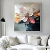
Layered paint and directional light give a restrained ocean palette greater surface variation.
Compare Ocean Painting Styles at Tactile Atelier
When comparing several types of ocean art, begin with the degree of realism you prefer and the atmosphere the room needs.
Choose a traditional or clearly recognizable seascape when you want an identifiable view of open water, a horizon, or waves. Consider abstract ocean artwork when color, movement, and texture matter more than depicting a specific location. A neutral coastal composition may be more suitable when the room already uses warm materials and understated colors.
The Seascapes selection is the most direct starting point for comparing ocean waves, neutral seascapes, blue compositions, and panoramic formats. Beach & Ocean Art offers a broader interpretation of shorelines and water-inspired subjects, while Coastal Art can help when the desired look extends beyond the open sea. All Paintings is useful when you want to compare ocean-inspired work with other subjects before settling on a direction.
At Tactile Atelier, the canvases are hand-painted with real texture, tonal layering, and visible surface variation. The work is designed for calm modern interiors rather than relying on flat imagery alone.
Custom sizes and selected finish options may be available depending on the individual artwork. Confirm the available choices before ordering, particularly when working with an unusually wide wall or a specific framing arrangement.
The team can also help compare size, format, or artwork direction from your wall dimensions or a room photo. Include the width of the furniture, the available wall height, and a clear view of the surrounding colors for more useful guidance.
Free global shipping, secure payment options, and a 30-day return window are available under the applicable order and return terms.
A successful ocean painting should suit both the wall and the way the room is used. Compare the horizon, movement, color temperature, texture, and viewing distance before focusing on small decorative details. The right piece will not need to match everything around it; it should give the room a clear visual anchor while preserving the quiet atmosphere that drew you to ocean art in the first place.
Frequently Asked Questions
What size ocean painting should I hang above a sofa?
Artwork measuring roughly two-thirds to three-quarters of the sofa width is a useful starting point. Mark the dimensions on the wall first and check the proportion from the room’s main viewing position.
Does ocean art have to be blue?
No. Ocean art can use white, beige, gray, taupe, green, or other muted tones to suggest water, sand, mist, and reflected light. Choose colors that relate naturally to the room’s undertones.
Is one large ocean artwork better than a set of two?
A single canvas creates an uninterrupted focal point, while a diptych adds structure through the gap between its panels. The better choice depends on the wall width, furniture layout, and composition you prefer.


Leave a comment
This site is protected by hCaptcha and the hCaptcha Privacy Policy and Terms of Service apply.