
















Texture becomes visible when light treats raised and recessed areas differently. A ridge catches a highlight; the surface behind it falls into shadow; the eye reads that contrast as depth. More brightness does not automatically produce more texture. Broad frontal light can make a painting bright but visually flat, while a steep side angle may exaggerate every ridge. Learning how to light textured wall art is therefore a matter of direction, source size, intensity and viewing position. The goal is readable surface variation without glare, hard hotspots or shadows so deep that the composition disappears.
First, Identify Where the Existing Light Comes From
Before adding a fixture, observe the light already reaching the wall. Note whether the nearest window sits in front of or beside the painting, when it is strongest, which fixtures run at night, and whether another surface reflects light toward the artwork.
View the painting morning, late afternoon and after dark from the main seat and both sides. Relief that appears only at one time depends on the window angle. Consistent flatness suggests diffuse frontal light; one dramatic edge suggests strongly one-sided light.
Use a simple inventory:
- Identify the strongest source.
- Note whether it reaches the painting frontally or laterally.
- Watch the length and direction of small shadows in the texture.
- Check for glare from the normal viewing position.
- Compare color in daylight and under evening fixtures.
Tactile Atelier artwork may show pronounced or subtle relief, so the setup must respond to the actual surface.
Side and Grazing Light Reveal Relief Most Strongly
Side light reaches the painting from the left or right rather than directly from the viewer’s direction. At a shallow angle, sometimes called grazing or raking light, it skims across the surface. Raised edges catch narrow highlights, and each ridge creates an immediate shadow behind it. Those repeated highlight-shadow pairs reveal micro-relief that broad frontal illumination can hide.
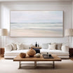
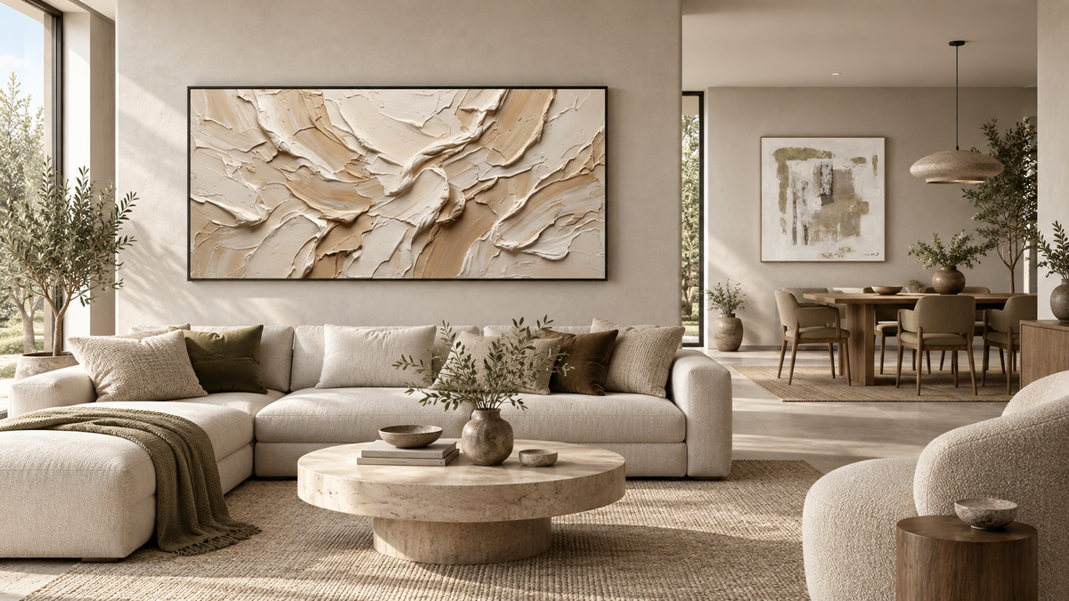
Minimalist Textured Wall Art #MT724 demonstrates why direction matters. Its white sculptural lines and layered fields differ only slightly in color, so their visibility depends heavily on highlights along the raised edges and soft shadows in the recessed transitions.

The shallowest angle is not always best. Deep relief can cast long shadows, while a small hard source produces sharper edges than a broader one. If the result looks theatrical, move closer to frontal or broaden the source. Judge from the normal seat: the useful angle reveals relief while directing reflections away from that sightline.
Frontal Light Makes Color Clearer but Can Flatten Relief
Frontal light travels toward the surface from near the viewer’s direction. It illuminates raised and recessed areas more evenly, reducing the small shadows that communicate depth. This can make color relationships easier to see, especially in a painting with many hues, but subtle texture may appear flatter.
With deep texture, frontal or slightly off-axis light can keep the composition legible without turning every ridge into a dark line. The choice is whether the painting needs stronger relief or more even color. Reflective paint, metallic accents or steep ridges may create a hotspot when the source sends light back toward the viewer; shifting the source sideways or higher can redirect it.
Black Minimalist Texture Wall Art #MT011 relies on raised geometric elements within a nearly monochrome field. Frontal light can show the black surface evenly, while a small lateral component separates the repeated raised forms. Too little direction makes the grid recede; too much can turn each element into a harsh highlight and shadow.

Natural Daylight Changes the Painting Throughout the Day
Daylight is not stable. Low morning or evening angles create longer texture shadows, while overcast or screened daylight spreads broadly and softens relief. A window that reveals texture in the morning may light it frontally at midday.
Warm late-day light can emphasize cream, beige and gold, while cooler daylight may make white and grey passages crisper. Mixed sources can cast different colors across the same work.
Direct sun can create a moving bright patch with hard boundaries. Judge the painting under the more consistent daylight it receives for most viewing hours rather than treating a brief sunbeam as the reference.
Photograph the same view at two or three times. The comparison reveals changes in shadow, glare and color, and shows which useful direction artificial light should replace after sunset.
Picture Lights, Track Lights and Directional Fixtures Solve Different Problems
Choose a fixture by the light pattern it creates, not by its decorative label. The surface depth, painting width, ceiling arrangement and viewing position determine which approach is useful.
Picture light
A picture light focuses illumination close to the wall, usually from above. It can reveal upper edges while keeping the source visually contained. Deep relief may cast heavy shadows beneath projecting forms, and coverage must be broad enough to avoid a bright center with dim sides.
Track or adjustable spot
An adjustable source gives more control over direction and distance and can aim across large or deep relief. A narrow beam may create a hotspot; a broader beam is often more even. Keep the strongest reflection away from the main view, and follow manufacturer and local requirements for permanent installation.
Ambient ceiling light
Ambient light supports the room but often reaches art diffusely or steeply. It may show color without revealing small relief. Use it as a base layer, then add direction at the painting if needed rather than brightening the entire room.
Warm and Cool Light Change Both Color and Depth
Light color changes the paint you perceive, while direction changes the relief you perceive. Warm illumination can intensify ivory, beige, gold, ochre and warm wood tones. Cooler light may make white, grey and blue passages look cleaner or more separated. Neither is universally accurate for every artwork or interior.
Compare the art source with the room’s evening light. A cool picture light in a warm room can look detached; a warm source may turn white relief creamier and reduce cool-grey distinctions.
Do not prescribe one color temperature for every work. Palette, wall color and surrounding sources change the result; test the intended light when possible.
White or pale relief deserves particular attention because small color shifts are easy to notice. The guide to white textured wall art on white walls addresses the broader pale-on-pale relationship; here, the lighting task is to preserve color separation while creating enough directional shadow to show depth.
Troubleshoot Common Lighting Problems
The artwork looks flat
Check direction before brightness. Add a lateral component, move an adjustable source off the viewing axis, or reduce dependence on broad diffuse frontal light. Watch for short shadows beside raised details; if none appear, the light is probably too frontal or too even.
The texture looks too harsh
Deep black shadows and razor-edged highlights indicate excessive one-sided contrast or a small hard source. Move the angle closer to frontal, broaden or soften the source, reduce intensity, or add gentle fill from the opposite side. Preserve some shadow so the relief does not disappear.
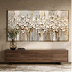
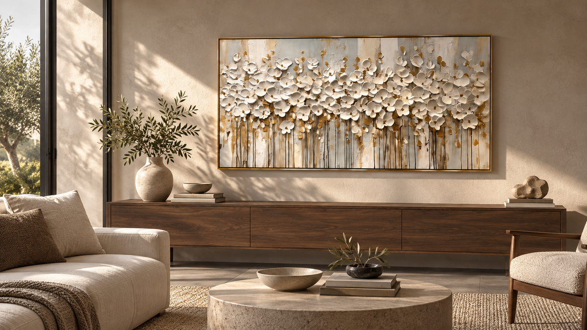
White Floral Textured Wall Art #TO859 contains dense raised blossoms, projecting petal edges and many small recesses. A very shallow hard light could create hundreds of high-contrast micro-shadows. A broader, less extreme angle lets the floral relief remain dimensional without breaking the composition into dark outlines.

For more context on the visual role of this specific subject type, see the guide to textured floral wall art. Lighting should reveal the petals, not replace their overall compositional reading.
You see glare or hotspots
From the main view, change the source angle rather than only dimming it. Broaden the beam if the center is much brighter than the edges, and keep concentrated light off the viewing axis.
The color looks different at night
Turn sources on one at a time. Compare the dedicated art light alone, then add ambient sources to identify which combination creates an uneven cast.
Test the Artwork Before Finalizing the Lighting
Check daylight, sunset and nighttime from the primary seat, entry and a side angle. At each position, assess relief, color, glare and shadow.
Change one variable at a time: direction, beam spread or source size, intensity, then color character. Use adjustable placement for evaluation before committing to a permanent position.
The best setup is often a compromise. Choose the arrangement that keeps the composition readable from important positions and shows relief without letting it dominate.
FAQs
What type of light is best for textured wall art?
A controllable directional source is usually most useful because its angle can create readable highlights and shadows. Picture lights and adjustable spots solve different coverage problems; the right choice depends on relief depth, artwork width, viewing position and existing daylight.
Why does my textured painting look flat at night?
The evening light may be too frontal, diffuse or distant to create small shadows beside raised details. Add or redirect a lateral source, then check for glare and excessive contrast before increasing brightness.
Reveal the Surface Without Overstating It
Good textured wall art lighting balances direction, coverage, intensity and color. Diagnose the existing source, use lateral light when relief needs help, soften the angle when shadows become harsh, and move reflections away from the main sightline. Test during the hours when the room is used. That process will help work from the textured wall art collection show its surface character without making every ridge equally dramatic.



Leave a comment
This site is protected by hCaptcha and the hCaptcha Privacy Policy and Terms of Service apply.