

















In an open-plan interior, several walls can enter the same visual field. A painting that works above the sofa may also be visible from the dining table, kitchen and entry, where it competes with art assigned to other zones. Choosing wall art for an open plan living room therefore requires more than making each wall attractive on its own. Map which artworks appear together, select one primary anchor, and let the remaining pieces support or transition between zones. The aim is continuity across the shared space without making the living and dining areas identical.
Map the Main Sightlines Before Choosing Artwork
Stand at the main entry before focusing on individual walls. Note which wall appears first, what overlaps behind it and whether living and dining art would be visible together. Repeat from the sofa, dining table, kitchen and circulation route.
A sightline is the sequence the eye encounters, not simply the nearest wall. A distant dining painting may appear directly behind the living area, while a larger wall may be visually isolated by a corner or cabinet.
Photograph each important view and mark the first wall, secondary wall and any overlap between potential focal pieces. This keeps the exercise focused on simultaneous visibility rather than room measurement.
Place thumbnails within those sightline photographs. Ask not only whether a piece works above the table, but what happens when it appears behind the sofa artwork from the entry.
Choose One Primary Anchor Artwork
Most open plans benefit from one artwork that establishes priority. The anchor may lead through size, contrast, color, texture or a position visible from several zones. It defines a functional area and gives the shared composition a starting point.
The living zone is often practical because seating creates a clear grouping, but a dining wall can lead when it terminates the longest view more effectively.
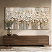
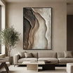
Neutral Textured Abstract Wall Art #TO899 has the physical and surface presence to anchor a zone without introducing a saturated palette. Its panoramic field, broad cream and taupe forms, and heavy raised edges create importance through scale and texture. In an open plan, that type of work can establish the living area while leaving color capacity for quieter art elsewhere.

Browse living room wall art with the entire sightline in mind. The anchor should remain legible from afar without overwhelming art revealed in the next zone.
Let Supporting Artwork Perform a Different Job
Supporting artwork is not a smaller anchor. It can repeat one color, continue a line, echo texture, create a low-contrast pause or help the eye move between zones.
If the anchor uses broad cream forms and strong texture, a dining piece might repeat the warm value with a flatter surface and clearer subject. A colorful anchor may need only one repeated accent within a quieter work.
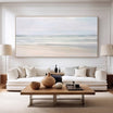
Neutral Abstract Wall Art #TO843 is suited to a supporting role because its square form contains ivory, taupe, warm grey, brown and muted olive-gold in a restrained arrangement. It has enough structure to hold a wall, but its broken neutral forms do not demand the same kind of attention as a large, deeply textured panorama.

Compare dining room wall art with the established anchor, not only the furniture. If the dining piece leads from every position, accept it as the anchor or choose a quieter alternative.
Coordinate Connected Zones Without Matching the Art
Coordinate through one undertone, frame material, value range, directional movement, accent color or degree of visual quietness. Subjects and styles can differ.
A landscape and abstract can connect through muted greens and warm neutrals; textured and flatter pieces can share broad organic shapes. Matching frames are unnecessary when another cue is clear.
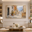
Soft Green Forest Landscape Wall Art #MT425 provides a recognizable subject with a calm visual weight. Its muted green canopy, pale atmospheric areas and panoramic rhythm could connect to a neutral abstract through value and movement, while the forest subject keeps the dining or transition zone distinct.

Keep the mechanism specific: “repeat the anchor’s muted green once” is useful; “make it cohesive” is not. For one-zone decisions, use the dining room wall art guide. The open-plan test remains every shared sightline.
Account for Distance and Scale Across the Open Plan
An artwork may be viewed from two meters at the table and from eight meters across the kitchen. At longer distances, fine marks and small tonal changes merge. Large forms, a clear silhouette and distinct light-dark organization remain readable. This is why a visually simple supporting piece can perform better across zones than a small, highly detailed work.
Assess scale from the farthest regular viewpoint, then walk closer. The distant view should preserve the composition; the close view can reveal detail. Work that succeeds only nearby may disappear from the open-plan field.
Long horizontal works can carry across a distant wall because their shape follows the architecture and remains legible from the side. The separate guide to panoramic wall art addresses that format in depth. In an open plan, the added question is whether the panorama becomes a background anchor, a terminal focal point or an unintended competitor to another zone.
Do not convert this into a furniture-width calculation. Cross-zone scale is about what survives distance and what enters the same field, not a fixed percentage of a sofa or sideboard.
Avoid Two Focal Points Fighting Across One Sightline
Conflict appears when saturated paintings face one another, high-contrast works share one view, or heavy textures occupy adjacent walls without a quiet transition. Each may work locally but divide attention together.
Stand where both focal candidates are visible. If neither establishes priority, quiet the secondary zone through a narrower value range, fewer saturated colors, gentler texture or more negative space.
Placement can also solve competition. A strong dining artwork may work when a change in wall plane prevents it from facing the living anchor directly. Alternatively, separate dominant colors so the two pieces do not create equal color events at opposite ends of the room.
Do not assume a quiet work must be pale. A dark painting with broad simple shapes can be less active than a light piece filled with detail. Judge visual weight through scale, contrast, color, texture and complexity together.
Use Artwork to Define Zones Without Building Visual Walls
Artwork can anchor the sofa group, give the dining table a clear destination, pause a long circulation wall or mark the transition between kitchen and living space. These cues help functional zones feel intentional even when there are no full-height partitions.
The risk is over-defining every area. If each zone receives a different dramatic palette, frame system and subject language, the open plan starts to feel like several small rooms placed side by side. Assign the strongest identity to the anchor zone, then carry a limited cue into supporting areas.
Think in transitions. A quiet square work between living and dining can absorb a color from each direction. A restrained landscape can introduce organic movement before the viewer reaches a more abstract anchor. Art should clarify where a zone is without making the boundary feel abrupt.
A Simple Open-Plan Art Planning Sequence
- Stand at the main entry. Identify the first wall and the artwork positions visible behind it.
- Mark overlapping sightlines. Repeat from the sofa, dining table, kitchen and circulation path.
- Choose the anchor zone. Decide which functional area should establish the first visual priority.
- Choose the anchor artwork. Use scale, contrast, color, texture or strategic visibility to make its role clear.
- Add one supporting visual thread. Repeat an undertone, value, movement, frame material or accent color.
- Check every main position. Confirm that close and distant views preserve the intended hierarchy.
- Remove competing focal points. Quiet or relocate any work that repeatedly challenges the anchor in the same sightline.
Complete the sequence before filling every available wall. Open plans often need fewer artworks than their total wall area suggests because each piece participates in several views. Empty wall can be a transition rather than an omission.
FAQs
Should wall art in an open-plan living and dining room match?
No. Use one repeated cue—such as an undertone, frame material, value range, movement or accent color—while allowing the subjects and styles to differ. The relationship should be visible without making both zones identical.
How many statement artworks can an open-plan room have?
Usually one clear anchor is the safest starting point. A second strong work can succeed when it is not visible in the same dominant sightline or when its color, contrast and texture are deliberately quieter.
Design the Whole Visual Field
The central open-plan question is what the eye sees simultaneously. When comparing Tactile Atelier options, map the entry, living, dining and kitchen views; assign one anchor; give supporting art a different job; and test the hierarchy from both near and far positions. When each piece belongs locally and one visual thread connects the zones, the shared interior can feel continuous without becoming matched or repetitive.


Leave a comment
This site is protected by hCaptcha and the hCaptcha Privacy Policy and Terms of Service apply.