


















If you are deciding how to style floral wall art in a modern home, begin with the surface rather than the flower. In textured floral wall art, raised paint, layered petals, palette-knife marks, and small shadows can matter as much as the botanical subject. The same white bloom may feel quiet when lightly brushed or architectural when built in deep relief. Light changes those surfaces throughout the day, while surrounding materials determine whether the room feels balanced or visually dense. Treat the artwork as a tactile object: evaluate surface, abstraction, light, palette, materials, and visual weight before considering decorative coordination.
Start With Texture, Not the Flower
Flat floral imagery carries information through outline, color, and composition. Its neutral surface changes little as room light shifts.
A lightly textured painting adds brush direction and subtle paint buildup without making surface the dominant feature. From across the room, viewers read the overall flower mass, silhouette, contrast, and relief density; up close, petal edges, layered paint, palette-knife marks, and individual strokes become visible. A strong piece should remain coherent after individual petals disappear, then reward closer viewing through its material detail. When buying online, compare full-room images with close views so neither composition nor surface is judged in isolation.
Highly textured or sculptural floral art behaves differently. Raised areas catch highlights and cast small shadows; deep petals project forward and palette-knife ridges interrupt a smooth field. The surface becomes part of the composition.
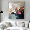
The Sculptural White Floral Wall Art #TO830 makes that distinction clear. Its oversized white bloom is constructed through pronounced raised petals, with gray transitions and a charcoal passage supplying definition. The flower is recognizable, but its relief gives it the presence of a wall-mounted sculptural object.

Ask how much physical texture you want to notice. Moderate texture enriches an image without controlling the room. Heavy relief becomes a focal material, while isolated raised blooms will feel lighter than tightly repeated petals even at a similar depth.
Decide How Recognizable You Want the Flowers to Be
Recognizable flowers offer immediate botanical identity and a strong focal subject, but a literal bouquet, conventional vase, or symmetrical arrangement may read as more decorative.
Semi-abstract florals suggest blooms while allowing paint and shape to lead. Cropped petals, simplified outlines, dispersed stems, or unexpected scale keep the subject accessible without dictating a traditional floral mood.
In highly abstract floral work, petals may become repeated forms, clustered relief, arcs, or fields of color. The room may register rhythm and material before it registers flowers. This is useful when you want organic movement without a literal botanical display.
The Textured Neutral Floral Wall Art #TO004 sits between recognition and abstraction. Its oversized pale petals are legible, yet their cropped scale, flowing curves, gold-toned edges, and limited background shift attention toward form. Browsing the wider floral wall art collection makes it easier to compare literal blossoms, loose florals, and sculptural interpretations on that spectrum.

Understand How Texture Changes Under Light
Floral relief does not have one fixed appearance. Side light catches raised petal rims and casts shadows into recessed centers or between overlapping layers. On a sculptural bloom, this separates individual petals; across a dense flower cluster, it makes the repeated surface rhythm more pronounced.
Flat frontal light compresses those separations, causing shallow petals to read more as color shapes and densely layered blossoms as a continuous band. Overhead light favors upper petal edges while leaving lower recesses subdued.
As natural daylight changes direction and intensity, irregular petal surfaces alternate between highlight and shadow. A bloom may look crisp in the morning and softer later. Warm light brings ivory or gold-toned petal edges forward; cooler light makes white, gray, and recessed botanical forms more distinct.
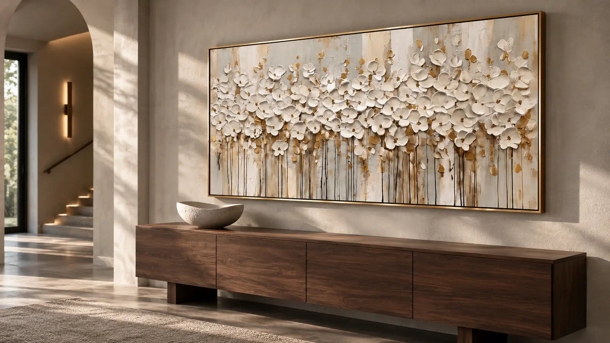
The panoramic White Floral Textured Wall Art #TO859 uses a dense band of raised ivory blossoms above elongated vertical marks. Side light clarifies individual petal edges and separates the white forms from the warm neutral ground. In flat frontal light, the same piece reads more as a continuous floral band.

Before choosing a position, observe when light reaches the wall and from which direction. The aim is not maximum brightness; it is enough angled illumination to reveal the surface without producing harsh glare.
Choose Between White, Neutral, and Colorful Floral Art
White and Tonal Floral Art
With little color contrast, relief carries more of the visual information. White petals remain distinct through shadow, edge height, and subtle shifts between ivory, cream, and gray. A pale piece therefore needs visible construction; otherwise it may disappear against a similar wall. The guide to white wall art on white walls provides a related comparison of tonal separation beyond floral subjects.
Neutral Floral Art
Cream, beige, taupe, warm gray, and muted earth tones allow layering to remain visible without making the room feel colorful. Differences in value are important. A taupe background behind ivory relief provides clearer definition than two nearly identical pale tones. Neutral does not mean visually weak when the surface has depth or the composition concentrates its forms.
Colorful Floral Art
Color and relief can share the focal role. In Colorful Textured Floral Wall Art #TO123, raised wildflower forms repeat across a light field in pink, red, orange, yellow, green, teal, and purple. The pale upper area prevents the many hues from becoming uniformly dense, while the textured lower field supplies movement and grounding.

Decide whether color or texture should carry most of the impact. If both are strong, the painting will demand clear visual priority. If color is restrained, deeper relief can provide interest without increasing chromatic activity.
Balance Texture With the Other Materials in the Room
Judge the density of floral relief against the tactile density already present in the room. Smooth walls and simpler surrounding surfaces give large sculptural petals, tightly clustered blossoms, or repeated raised flowers enough quiet space to become prominent.
In a materially busy room, the artwork needs more restraint. Pronounced wall finishes, patterned textiles, or strongly grained furniture can compete with dense botanical relief. A more open floral composition, shallower petals, fewer concentrated clusters, or greater negative space keeps the surfaces from merging into one continuous field of activity.
Do not match material to material. Count competing surface signals. If the room is visually quiet, deep floral relief can supply the missing tactile focus; if the room is already layered, let spacing and relief density control how assertive the artwork feels.
Use Visual Weight to Keep Floral Art From Feeling Too Decorative
Floral imagery is not automatically delicate. Large painted masses, dark centers, dense petals, edge-to-edge forms, high contrast, and deep relief can make a flower painting feel sculptural or architectural. Concentrated weight gives the artwork authority even when the palette is pale.
Negative space, dispersed marks, low contrast, and open arrangement reduce weight. A colorful work can therefore feel lighter than a tightly cropped monochrome bloom. Judge painted mass, not the assumed character of the flower.
A modern floral piece often succeeds when it avoids equal emphasis everywhere. One dominant cluster, a clear band, or a large bloom establishes hierarchy; quieter passages allow that form to register. This keeps the subject from becoming a repeated decorative pattern across the whole wall.
Decide Whether the Artwork Should Blend In or Become the Focal Point
For a quieter role, look for a narrow palette, moderate texture, open composition, and subtle relief. The artwork can repeat a room undertone while allowing furniture or architecture to remain dominant.
For a focal role, choose deeper relief, stronger value differences, dense floral masses, or color combined with texture. The surrounding room should then provide visual support rather than equal competition. A highly textured painting beside patterned wallpaper, complex shelving, and several sculptural objects may lose its hierarchy even if each element works on its own.
The practical question is not “Is this a statement piece?” but “What else is already making a statement?” Assign priority before adding surface intensity.
Before You Choose, Check These Six Things
- Texture depth: subtle brushwork or sculptural relief?
- Flower recognition: literal, semi-abstract, or highly abstract?
- Relief density: clustered floral surface or open composition?
- Palette: should color or surface carry the visual impact?
- Light: will directional light reveal the petal relief?
- Visual role: quiet material interest or strong focal artwork?
FAQs
Does floral wall art work in a modern home?
Yes. Simplified or semi-abstract forms, controlled palettes, deliberate negative space, and dimensional texture prevent the subject from reading as conventional decorative florals. Composition and physical construction matter more than the flower category alone.
Where should textured floral wall art be placed for the texture to show?
Choose a position visible from more than one angle and reached by natural or artificial side light. Angled illumination creates small highlights and shadows across raised paint. Avoid relying only on flat frontal light, which can reduce perceived depth.
Style the Surface as Part of the Room
The most useful sequence is texture, abstraction, light, palette, surface density, then visual weight. It reveals why two floral artworks with similar subjects can behave differently in the same interior. One may merge quietly through pale color and shallow relief; another may act like sculpture through dense petals and changing shadow. Evaluate the physical surface in the actual light and against the materials already present. Tactile Atelier offers hand-painted floral work that can be compared as tactile objects rather than selected only by flower motif.


Leave a comment
This site is protected by hCaptcha and the hCaptcha Privacy Policy and Terms of Service apply.