



















White wall art can work beautifully on white walls, but the combination needs more than matching color.
When both the artwork and wall are pale, visual definition has to come from somewhere else: texture, shadow, undertone, line, scale, or framing.
That is what makes white-on-white interiors successful. The artwork does not need to create dramatic contrast. It only needs enough distinction to remain visible while preserving the quiet, layered character of the room.
Can You Put White Wall Art on a White Wall?
Yes.
The mistake is assuming that color contrast is the only way a painting separates itself from the wall.
A predominantly white artwork can remain clearly visible through:
- Raised texture
- Warm or cool undertones
- Gray or beige details
- Defined lines and shapes
- Dimensional shadows
- A contrasting frame
- Confident scale
This is why some white-on-white combinations look sophisticated while others feel flat.
Instead of asking whether the painting and wall are both white, ask whether they differ enough in surface, tone, structure, or depth.
If you are comparing pale artwork specifically, the white wall art collection makes it easier to see how different subjects, textures, and undertones create variation within a restrained palette.
Use Texture and Light to Create Definition

Texture is one of the most effective ways to make white artwork visible without introducing strong color.
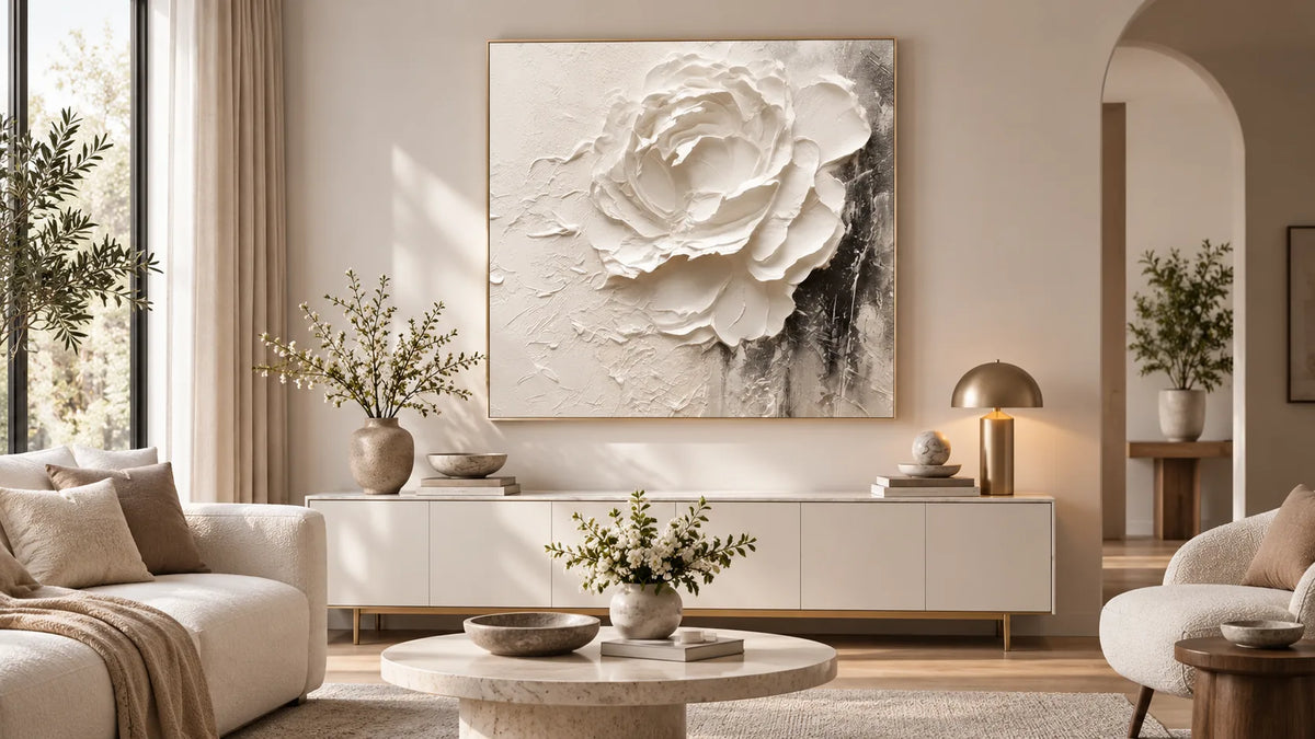
Raised paint and sculptural surfaces interact with light differently from a flat wall. Ridges catch highlights, recessed areas create shadows, and irregular surfaces change slightly as daylight moves through the room.
This gives white artwork a physical presence even when its palette remains close to the wall color.
Lighting direction matters as much as brightness.
Side light often reveals texture particularly well because it creates small shadows across raised surfaces. Strong, direct front light may reduce those shadows and make subtle relief appear flatter.
Before choosing a textured painting, notice:
- Where the nearest windows are
- Whether the wall receives side or front light
- How the space changes after sunset
- Where lamps or directional lighting are positioned
A textured white painting may look very restrained in soft daylight and more sculptural under evening lighting.
For a deeper explanation of how surface relief responds to the room, the existing textured wall art guide covers texture, lighting, and visual depth in more detail.
White Is Not One Color

One of the easiest ways to make white art work on a white wall is to use slight differences in undertone.
A wall may appear white while actually leaning toward:
- Cream
- Beige
- Gray
- Yellow
- Blue
- Taupe
Artwork can either echo that temperature or contrast with it gently.
Warm White Walls
Cream, ivory, soft beige, and warm taupe details tend to sit naturally against warm white walls.
These combinations work particularly well around natural wood, linen, warm stone, woven materials, and brass or bronze accents.
Cooler White Walls
Gray-white, chalky white, and cooler off-whites can work well with artwork containing gray, charcoal, muted blue, or cleaner white tones.
You do not need a dramatic difference.
A small shift from warm wall to cooler artwork—or the reverse—can create enough separation to make the painting visible.
When comparing artwork online, also remember that the rest of the room affects how white is perceived. Flooring, wood tones, textiles, and artificial lighting can all make a pale painting read warmer or cooler.
Let Composition Do Some of the Work
A white painting can still have a strong composition.
Look for structure created through:
- Organic forms
- Geometric lines
- Layered shapes
- Mountain or landscape silhouettes
- Botanical elements
- Abstract movement
- Controlled dark or neutral accents
This matters particularly when viewing the artwork from across the room.
If the composition has clear visual structure, the painting can remain readable even when the color contrast is subtle.
A useful test is to imagine the artwork without its color. If the shapes, movement, or surface would still hold your attention, the piece is less dependent on strong pigment to make an impact.
Decide How Much Separation You Want From a Frame
Framing can change the white-on-white effect considerably.
Frameless
A frameless canvas creates the most seamless look.
This works best when the painting already has enough texture, tonal variation, or compositional structure to define itself.
Natural Wood Frame
Wood introduces warmth and gives the artwork a clear edge without creating severe contrast.
It works especially well with cream, ivory, beige, and organic neutral interiors.
Dark Frame
Black or charcoal framing creates a much stronger boundary.
This can be useful when the room already includes darker window frames, lighting, furniture details, or hardware.
White Frame
A white frame maintains the pale palette while still creating physical separation between the artwork and wall.
The correct choice depends on whether you want the painting to blend gently into the interior or read as a more defined focal point.
Scale Matters When Color Is Quiet
A pale artwork that looks detailed up close can disappear when it is too small for the wall.
This is especially noticeable in white-on-white interiors because the painting cannot rely on bold color to command attention from a distance.
A larger scale gives subtle texture, line, and tonal variation more physical presence.
That does not mean every white painting should be oversized.
Instead, compare the artwork with:
- The furniture beneath it
- The usable wall area
- The normal viewing distance
- The amount of surrounding empty space
A restrained painting can often be larger than a strongly colored piece without making the room feel visually heavy.
For example, white textured mountain wall art combines a white, ivory, gray, and soft taupe palette with raised mountain forms, allowing surface and structure to provide definition without relying on vivid color.
Use Materials Around the Artwork to Prevent Flatness

The wall and painting are only part of the composition.
Nearby materials can create additional contrast even when the overall palette remains neutral.
White wall art often works particularly well with:
- Natural wood
- Linen
- Bouclé
- Stone
- Ceramic surfaces
- Woven rugs
- Concrete
- Matte black details
- Warm metals
A pale painting above a walnut console will read differently from the same painting above glossy white furniture.
The artwork itself has not changed, but the materials around it provide warmth, texture, and tonal separation.
This is why a white-on-white scheme should be evaluated as a complete room rather than as two isolated colors.
Know When You Need More Tonal Contrast
Sometimes texture and scale are not enough.
If the painting still disappears from the normal viewing distance, introduce slightly stronger tonal differences.
That does not mean abandoning a neutral interior.
Small amounts of:
- Beige
- Taupe
- Gray
- Brown
- Charcoal
- Sage
- Muted earth tones
can provide enough definition while keeping the overall room restrained.
Consider more contrast when:
- The wall receives very little light
- Both the artwork and surrounding furniture are nearly identical whites
- The artwork has minimal surface texture
- The painting is difficult to distinguish from across the room
- You want the artwork to become a stronger focal point
The amount of contrast should match the role you want the painting to play.
Avoid Matching the Wall Too Literally
It can be tempting to choose artwork based on the exact shade of the paint.
That often produces a flatter result than choosing complementary undertones and textures.
A warm ivory painting can look more interesting against a cooler white wall than an artwork in almost exactly the same white. Similarly, a soft gray-white composition may create enough distinction against cream walls without disrupting the neutral palette.
Rather than looking for an exact match, aim for coordination.
The artwork should belong in the room without visually disappearing into it.
A Simple White-on-White Checklist
Before choosing your artwork, ask:
What undertone does the wall have?
Warm, cool, gray, cream, or neutral?
Where will the light come from?
Will it reveal or flatten surface texture?
Does the artwork have enough structure?
Look at lines, forms, relief, and tonal variation.
Is the scale strong enough?
Can the painting still be read clearly from the normal viewing position?
Would a frame help?
Consider whether the artwork needs a stronger visual boundary.
What materials surround it?
Wood, stone, fabric, and metal can all create useful separation.
If the answers work together, strong color contrast is rarely necessary.
White-on-White Should Feel Layered, Not Invisible
The goal of white wall art on white walls is not to make the painting disappear.
It is to create a quieter kind of definition.
Texture can produce shadow. Warm and cool whites can create subtle tonal shifts. Lines and composition can establish structure. Scale can give a restrained painting presence, while surrounding materials add another layer of contrast.
When those elements are considered together, white artwork can remain calm without becoming flat.
Instead of searching for a painting that matches your wall exactly, choose one that contributes something the wall does not already have—whether that is texture, structure, depth, or a slightly different tone.
You can explore hand-painted neutral and textured artwork through Tactile Atelier and compare how different surfaces and undertones behave within a light interior.


Leave a comment
This site is protected by hCaptcha and the hCaptcha Privacy Policy and Terms of Service apply.