









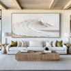






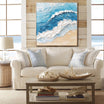

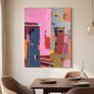


Choosing between horizontal and vertical wall art is not simply a matter of personal taste. Orientation changes how the eye moves through a room, how wide or tall a wall appears, and how naturally the artwork relates to nearby furniture.
As a general rule, horizontal wall art works best above wide furniture and on walls that need greater visual width. Vertical wall art is usually better for narrow walls, tall architectural features, and spaces that need a stronger sense of height.
The best choice, however, depends on the relationship between the artwork, the wall, the furniture, and the room as a whole.
Horizontal vs Vertical Wall Art at a Glance
| Choose horizontal wall art when… | Choose vertical wall art when… |
| The wall is wider than it is tall | The wall is narrow or unusually tall |
| The artwork hangs above a sofa, bed, or console | The artwork hangs between windows or beside a doorway |
| You want the room to feel wider and calmer | You want to emphasize ceiling height |
| The furniture below creates a strong horizontal line | The architecture creates a strong vertical line |
| The subject has a panoramic or flowing composition | The subject has an upright or ascending composition |
These are starting points rather than fixed rules. Visual weight, color, texture, and surrounding negative space can change how either orientation behaves.
What Horizontal Wall Art Does to a Room

Horizontal artwork encourages the eye to move from side to side. This can make a wall appear wider and create a calm, grounded feeling.
It is especially effective above:
- Sofas
- Beds
- Sideboards
- Dining tables
- Long console tables
- Fireplace mantels
A horizontal composition normally feels most connected to the room when it echoes the width of the furniture below it. A work such as Textured White Floral Wall Art, for example, uses a wide format and flowing floral forms to extend visual movement across the wall.
Horizontal artwork can also help balance tall ceilings. In a room that already feels vertically stretched, a wide composition introduces a stabilizing line and brings attention back toward the furniture and living area.
When Horizontal Art Can Feel Wrong
Horizontal art may look compressed when placed on a very narrow wall. It can also appear disconnected if it is much smaller than the furniture below it or if there is excessive empty space on both sides.
A wide format should have enough room to breathe without appearing to float in the middle of an oversized wall.
What Vertical Wall Art Does to a Room

Vertical artwork guides the eye upward. It can make ceilings feel taller, emphasize architectural height, and bring structure to narrow areas that cannot accommodate a wide canvas.
Vertical pieces are particularly useful:
- Between windows
- Beside doors
- At the end of a hallway
- Above a narrow pedestal or cabinet
- In stairwells
- On columns or slender wall sections
- In rooms with limited horizontal wall space
The Minimalist Textured Wall Art is a relevant example because its upright format and sculptural linear movement reinforce the height of a wall without requiring excessive width.
Vertical artwork can also introduce energy into a room dominated by low furniture. A tall piece above a narrow console or beside an armchair prevents the entire visual composition from sitting at the same height.
When Vertical Art Can Feel Wrong
A single narrow vertical canvas may feel undersized above a long sofa or bed. The orientation can also create too much upward pull in a room that is already narrow and tall.
In those situations, a horizontal work—or a balanced grouping of multiple vertical pieces—may create a more stable result.
Start With the Shape of the Available Wall
Before considering subject or color, examine the usable wall area.
Ignore doors, windows, switches, vents, and furniture that visually interrupt the surface. The remaining uninterrupted area is the practical wall shape your artwork needs to address.
If that area resembles a landscape-format rectangle, horizontal art will usually feel natural. If it resembles a portrait-format rectangle, vertical art will normally integrate more easily.
The objective is not to fill every inch. It is to select an orientation that responds to the wall’s proportions while preserving intentional negative space.
Let the Furniture Establish the Primary Line
Furniture creates strong directional cues.

A sofa, bed, dining table, or sideboard establishes a horizontal line. Artwork placed above it generally looks more cohesive when it follows that direction. A narrow cabinet, floor lamp, doorway, or architectural column produces a vertical line that can be reinforced with upright artwork.
This does not mean the artwork must duplicate the exact shape of the furniture. It should simply feel connected to the same visual structure.
When the artwork is centered above furniture, evaluate the artwork and furniture as one composition rather than two unrelated objects.
Consider Ceiling Height
Orientation can visually correct—or exaggerate—the proportions of a room.
In a room with a low ceiling, a vertical artwork can draw the eye upward and make the space feel taller. Leave enough open wall above the piece to allow that upward movement to continue.
In a room with a high ceiling, a horizontal artwork can make the space feel more grounded. This is particularly useful when the furniture occupies only the lower portion of a tall wall.
For double-height rooms, one large vertical piece may be more effective than several small works because it can connect the lower living area with the architecture above.

Account for Visual Weight
Two artworks with identical dimensions can feel completely different in scale.
Dark colors, heavy contrast, dense compositions, thick texture, and bold frames increase visual weight. Light colors, open compositions, soft contrast, and slim frames reduce it.
A dark horizontal painting may dominate a wall more strongly than a larger neutral canvas. Similarly, a narrow vertical work with deep black forms may feel more substantial than its dimensions suggest.
If color is influencing your orientation decision, the principles in this guide to black wall art can help you evaluate tone and visual mass separately from physical size.
Match the Orientation to the Subject
The subject and composition should support the format.
Horizontal formats often suit:
- Landscapes
- Seascapes
- Wide botanical arrangements
- Abstract movement that travels across the canvas
- Groups of figures
- Panoramic architectural scenes
Vertical formats often suit:
- Portraits
- Tall trees
- Upright botanical forms
- Standing figures
- Waterfalls
- Architectural details
- Abstract compositions with ascending movement
Cropping a naturally horizontal subject into a vertical format can make it feel confined. Stretching a naturally vertical subject across a wide canvas can weaken its focal point.
Choose the orientation that allows the composition to develop naturally.
When to Break the Rule
The expected orientation is not always the most interesting choice.
A vertical artwork beside a sofa can create asymmetrical balance when paired with a floor lamp, plant, or side table. A horizontal work on a narrow wall can create deliberate tension if the room has enough surrounding space.
At Tactile Atelier, texture, composition, and visual movement are central to how an artwork interacts with an interior. Orientation should therefore support the room without making the arrangement feel overly predictable.
Break the rule when the result has a clear visual purpose—not simply because an available artwork happens to fit.
Horizontal or Vertical Art by Room
Living Room
Horizontal art usually works above a sofa because it follows the furniture’s width. Vertical art is better beside a fireplace, between windows, or above a narrow cabinet.
If the living room has a large uninterrupted wall, first decide whether the objective is to widen the seating area or emphasize the ceiling height.
Bedroom
A horizontal piece above the headboard creates a calm, unified composition. Two vertical pieces can also work well when positioned symmetrically above bedside tables or on either side of the bed.
Dining Room
Horizontal art often complements a long dining table or sideboard. A vertical work can define a narrow wall at the end of the room and create a focal point visible from the table.
Entryway
The correct orientation depends on the furniture. Use horizontal art above a wide console and vertical art above a narrow table or bench.
Hallway
Long hallways generally benefit from horizontal movement or a sequence of related works. A vertical piece is effective at the end of a hallway because it provides a clear destination for the eye.
What If the Wall Could Take Either Orientation?
Some walls are large enough to support both formats. In that case, decide what the room needs visually.
Choose horizontal art if you want to:
- Make the wall feel wider
- Connect the artwork to broad furniture
- Create a calmer composition
- Encourage movement across the room
Choose vertical art if you want to:
- Emphasize ceiling height
- Create a stronger focal point
- Fill a narrow wall section
- Add contrast to low, horizontal furniture
You can also use the artwork’s subject to make the final decision. For example, a panoramic landscape may communicate more clearly in a horizontal format, while a standing figure or tall botanical form may require a vertical canvas.
If you are working with a broad statement wall, the scale considerations in this guide to large western wall art can help you judge whether the chosen orientation has enough presence.
Common Orientation Mistakes
Choosing From the Product Image Alone
Product photography does not show how the artwork will relate to your wall. Always compare the listed dimensions with the actual installation area.
Ignoring the Furniture Below
Artwork that fits the wall but conflicts with the furniture can still look incorrectly proportioned.
Using a Vertical Piece That Is Too Narrow
A tall but extremely narrow piece may lack enough visual presence, particularly in a large room.
Filling Every Available Inch
Negative space is part of the composition. The artwork needs separation from ceilings, furniture, corners, and adjacent objects.
Treating Orientation and Size as the Same Decision
Orientation determines direction; size determines scale. A correctly oriented artwork can still be too large or too small.
Frequently Asked Questions
Is horizontal or vertical wall art better above a sofa?
Horizontal wall art is usually better because it follows the sofa’s width. A group of two or three vertical works can also succeed when the full arrangement is proportionate to the sofa.
Does vertical art make a room look taller?
It can. Vertical lines direct the eye upward, especially when the artwork has open space above it and is not crowded by nearby objects.
Can I hang horizontal art on a narrow wall?
Yes, but it should not feel compressed between corners, trim, or furniture. Measure the usable wall width and preserve visible space on both sides.
Can vertical artwork go above a bed?
Yes. One centered vertical piece creates a strong focal point, while two vertical pieces can create symmetry. On a very wide headboard, however, a single narrow canvas may look undersized.
Should all the artwork in one room have the same orientation?
No. Mixing orientations can create rhythm and variety. Repetition should come from color, subject, framing, texture, or style rather than orientation alone.
Final Takeaway
Choose horizontal wall art when the room needs width, calm, or a stronger connection to broad furniture. Choose vertical wall art when the space needs height, structure, or a focal point on a narrow wall.
The most successful orientation is the one that responds to the wall’s shape, supports the furniture, and lets the artwork’s composition move naturally.


Leave a comment
This site is protected by hCaptcha and the hCaptcha Privacy Policy and Terms of Service apply.