



















Black wall art can anchor a pale room, sharpen its architecture or create depth through layers of charcoal and near-black. Those effects do not come from the color label alone. They depend on where the darkest areas sit, how much of the canvas they occupy and whether their surface remains visible as the light changes.
That makes choosing a black artwork less about matching black furniture and more about reading the composition. Is black behaving as a solid visual mass, a network of lines or a layered atmosphere? Does the darkest passage still reveal detail? Is there enough negative space to keep the work open?
This guide focuses on those black-specific decisions. It will help you compare tonal range, visual weight and surface legibility before choosing a work for a modern interior.
Identify What Black Is Doing
A useful way to compare black wall art is to notice whether black works mainly as visual mass, linear structure or atmosphere. These are not rigid art categories, and a work may combine all three. The framework simply clarifies why two predominantly black canvases can affect a room in very different ways.
Black as visual mass
When the darkest paint forms one broad, continuous area, the eye reads it almost as an architectural object. It can steady an open wall, give a pale seating area a point of gravity or counterbalance a large light-colored surface.
Look at the silhouette before the details. A contained black form surrounded by visible canvas feels concentrated and sculptural. An edge-to-edge dark field feels more immersive because the eye imagines the darkness continuing beyond the canvas.
This distinction matters more than simply calling one work “bold.” A concentrated form establishes a focal point; an expansive field changes the atmosphere of the whole wall.
Black as linear structure
In other works, black appears as grids, strokes, boundaries or slender geometric marks. It organizes the canvas without filling most of it. Light ground remains visible between the marks, so the overall visual weight is lower even when the lines are crisp.
Linear black wall artwork can relate naturally to slim window frames, shelving, table legs or architectural divisions. The goal is not to match every black element. Instead, compare the rhythm: regular lines feel measured and precise, while interrupted or uneven marks introduce movement.

Black as atmosphere
Layered ink, charcoal, graphite and smoky near-black create depth without relying on a hard outline. From across the room, the work may read as a quiet dark field. At closer range, transitions, marks and areas of relief become visible.
Atmospheric black works are not necessarily lighter or less substantial. Their weight is dispersed rather than concentrated. They tend to sit comfortably beside stone, dark wood, linen and muted textiles because their edges transition gradually instead of cutting sharply across the wall.
Look for More Than One Black
The strongest reason to inspect a dark artwork closely is that “black” rarely describes everything happening on its surface. Ink black, soft charcoal, graphite grey and warm near-black absorb and reflect light differently. Those small separations prevent adjacent forms from merging into one unreadable block.
Start with viewing distance. From several steps away, can you identify a dominant form or direction? As you move closer, do additional dark layers emerge? A good tonal composition can work at both distances: it has an overall presence without sacrificing the details that reward closer viewing.
Then inspect the undertone. A cool black may lean toward blue, graphite or slate. It often appears crisp beside concrete, chrome and cool white. A warm near-black can carry brown, umber or smoke undertones that sit more naturally with oak, walnut, cream and warm artificial light.
The undertone does not need to match the room exactly. What matters is whether it creates a deliberate relationship. A cool graphite canvas in a warm, earthy room may provide useful tension; an almost identical but slightly discordant brown-black may instead look accidental.
When comparing black canvas art online, use close-up images to check whether the darkest zones contain multiple values. Product photography can brighten shadows or compress subtle transitions, so do not judge tonal depth from the full-room image alone.
Read Visual Weight by Area, Continuity and Edge
The amount of black paint is only one part of visual weight. Three features work together:
- Area: how much of the canvas the darkest tone occupies;
- Continuity: whether that tone forms one uninterrupted field or many separate marks;
- Edge: whether the dark form stops inside the canvas or reaches its boundaries.
A canvas with many small black marks may cover the same total area as one solid shape, yet feel lighter because the ground repeatedly breaks the darkness. Likewise, a dark form touching all four edges usually feels more expansive than a slightly larger form contained by a pale border.
Use those cues when assessing a wall. If the surrounding space already contains a dark sofa, tall cabinet or heavy shelving, a contained black form or separated marks may add structure without creating another dense block at the same height. On a sparse pale wall, a continuous field can supply the missing visual anchor.
This is more precise than assuming that a large canvas will always feel heavier. A large work with ample visible ground can feel more open than a smaller canvas filled edge to edge with dense black.
Use Negative Space to Set the Boundary
Negative space determines whether black feels suspended, compressed or expansive. It exists both inside the artwork and on the wall around it.
A dark shape surrounded by unpainted or pale canvas has a clear boundary. The eye can register the complete form, which makes it feel more contained and object-like. When dark passages run into the canvas edges, the boundary becomes less definite and the image feels more atmospheric.
The wall can compensate for what happens inside the work. An edge-to-edge dark composition often benefits from a clean area around the canvas so its external silhouette remains legible. A work with generous internal negative space can tolerate more nearby furniture or architectural detail because it carries visual breathing room within its own composition.
Before choosing, look at the black-to-ground ratio rather than only the listed dimensions. Ask whether the dark area needs to act as a contained focal point or extend the mood across a larger part of the wall.
Check Whether the Darkest Areas Still Reveal Surface Detail
Dark paint can make relief look rich, but it can also conceal it. A textured surface is useful only if ridges, recessed areas and tonal changes remain readable from the position where the artwork will be viewed.
Begin with the darkest section, not the brightest highlight. Can you still see changes in height and direction inside it? If every recessed area collapses into the same black, the work may appear flatter from normal viewing distance than it does in a close-up photograph.
Side light usually reveals relief more clearly than direct frontal light because it creates narrow highlights along raised edges and softer shadows behind them. Direct light may reduce those shadows or produce glare, especially on a darker finish. The aim is not to illuminate every ridge equally; it is to preserve enough separation for the surface to remain legible.
Also consider evening conditions. A dark textured work near a single warm lamp may reveal only the relief facing that light. This can create attractive depth, but the main structure should not disappear entirely when daylight fades.

Distinguish Black-Dominant Art From Black-and-White Art
Black-dominant and black-and-white works can contain the same two ends of the tonal range, but they organize attention differently.
In black-dominant art, darkness establishes the primary field or atmosphere. Lighter passages reveal depth, interrupt the surface or define a limited boundary. The eye enters through the dark area and then discovers variation within it.
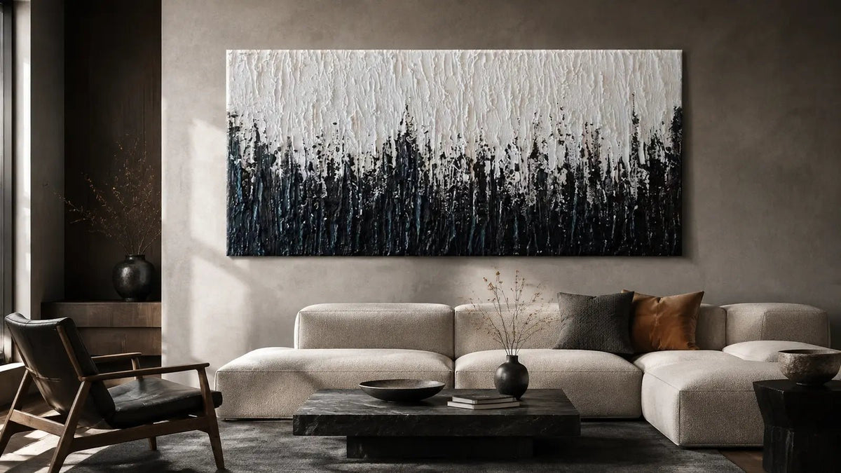
In black and white wall art, the relationship between light and dark is usually the main event. White or cream is not merely a small interruption; it shares enough of the composition to create graphic separation, visible negative space or a clear figure-ground exchange.
Choose black-dominant work when you want tonal immersion, concentrated weight or a surface that unfolds gradually. Choose black and white when you want the composition to remain clearly divided at a glance or when light and dark shapes need equal visual importance.

Know When Another Dark Color Is More Precise
Sometimes a room needs depth without the neutrality of black. Deep blue can retain a cool, nocturnal quality while creating a gentler transition beside blue-grey upholstery, steel or cool stone. Forest and olive greens can provide similar depth while relating more directly to wood, plants and earthy textiles.
Choose black when the work needs to clarify an edge, establish a neutral anchor or make tonal structure the focus. Consider deep blue when you want darkness with a cooler atmospheric cast, and deep green when an organic undertone would connect more naturally with the room.
If black still feels right but an almost solid field seems too absolute, look for warmer undertones, interrupted marks, visible canvas or multiple charcoal values. These features change how the darkness behaves without shifting the work into another color category.
A Focused Checklist Before You Choose
Use five observations to compare works without falling back on generic color matching:
- Function: Is black acting mainly as mass, linear structure or atmosphere?
- Weight: Is the darkest tone concentrated, dispersed or extended to the canvas edges?
- Tonal range: Can you distinguish ink black, charcoal and near-black at more than one viewing distance?
- Surface legibility: Do the darkest areas still reveal relief under the room’s likely light?
- Boundary: Does internal negative space—or open wall around the canvas—give the dark form enough definition?
These questions identify how the artwork will behave, not merely how it has been labeled. They also make it easier to compare pieces that look similarly dark in thumbnails but create very different effects at room scale.
Choose Black Wall Art With a Clear Direction
The most effective black wall decor begins with a specific role. Decide whether the room needs a contained visual anchor, a network of structural marks or an atmospheric dark field. Then compare undertone, continuity, negative space and the visibility of the darkest texture.
Once that direction is clear, explore the Black Wall Art collection. If you are uncertain about scale, format or artwork direction, the Tactile Atelier team can help assess the choice from your wall dimensions or a room photo.
Frequently Asked Questions
Does black wall art make a room look smaller?
Not automatically. A continuous edge-to-edge black field carries more visual weight than separated dark marks or a contained form with pale space around it. If the work feels too dense, look for internal negative space or allow a clearer area of wall around the canvas.
What wall color works with black artwork?
Black artwork can sit on pale, colored or dark walls. On a pale wall, pay attention to the silhouette and total dark area because the boundary will be prominent. On a dark wall, prioritize tonal separation and a readable edge so the work does not merge into its background.
How can black wall decor feel less severe?
Choose charcoal transitions, warm near-black undertones, interrupted edges or visible canvas rather than one uniform dark plane. These features soften the boundary while preserving the depth and neutrality that make black useful.
What is the difference between black-dominant art and black-and-white art?
Black-dominant art uses darkness as its main field, weight or atmosphere; lighter passages support that dark structure. Black-and-white art gives light and dark enough presence for their contrast and figure-ground relationship to become the central feature.
Why can black artwork look flatter online than it does in a room?
Photography and screens can compress small differences between black, charcoal and graphite. They can also freeze textured relief under one lighting angle. Close-up images help, but the real surface may reveal more variation as daylight, viewing distance and angle change.


Leave a comment
This site is protected by hCaptcha and the hCaptcha Privacy Policy and Terms of Service apply.