


















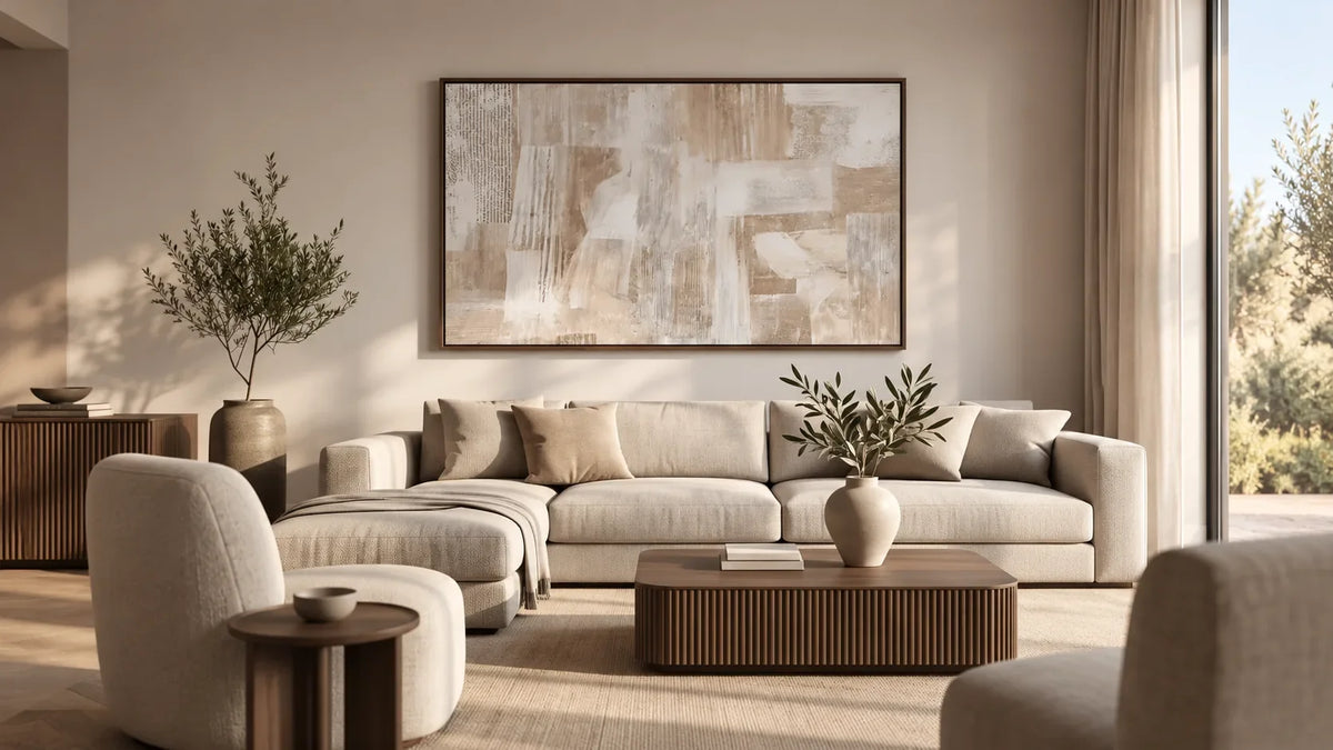
Warm earth tones sound easy to combine until you start shopping for artwork. A beige painting might look too yellow beside your sofa. A rich brown canvas could overwhelm your furniture. And a beautiful terracotta composition may introduce more orange than your room can comfortably accommodate.
The solution isn't to match every color perfectly. It's to choose an earth-tone palette that complements your existing materials and provides the visual impact you want.
Three combinations are especially useful: light sand and taupe, muted clay and terracotta, and deeper caramel and brown. Each creates a different result.
Which Warm Earth Tones Should You Look For in Wall Art?
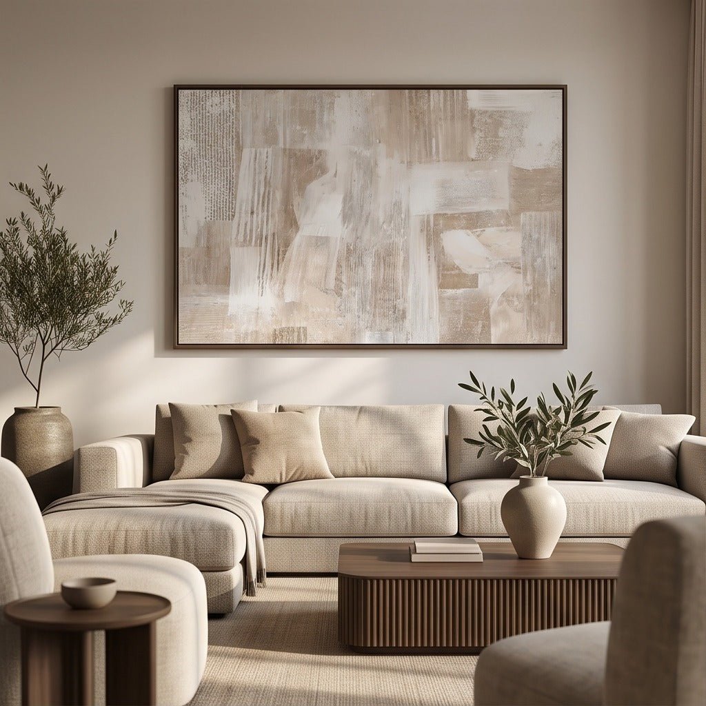
When comparing paintings, distinguish the dominant color from its supporting shades instead of relying on the word earthy.
Sand and warm ivory are relatively light and understated. They often complement pale furniture and natural textiles.
Taupe and mushroom sit between brown and gray. Some are noticeably warm; others have cooler undertones.
Clay and terracotta introduce muted red or orange influences. They can become a recognizable accent in an otherwise neutral room.
Caramel and deeper brown carry more visual weight. They can connect with leather or darker wood and establish a stronger focal point.
A painting with a cream background and a few terracotta marks behaves differently from a predominantly rust-colored canvas. Similarly, beige artwork with strong brown geometry has more presence than one composed entirely of pale tonal transitions.
Start by examining the whole composition: which color occupies the most space, and which smaller accents influence its character?
Palette 1: Sand, Ivory, and Soft Taupe for Light Neutral Interiors
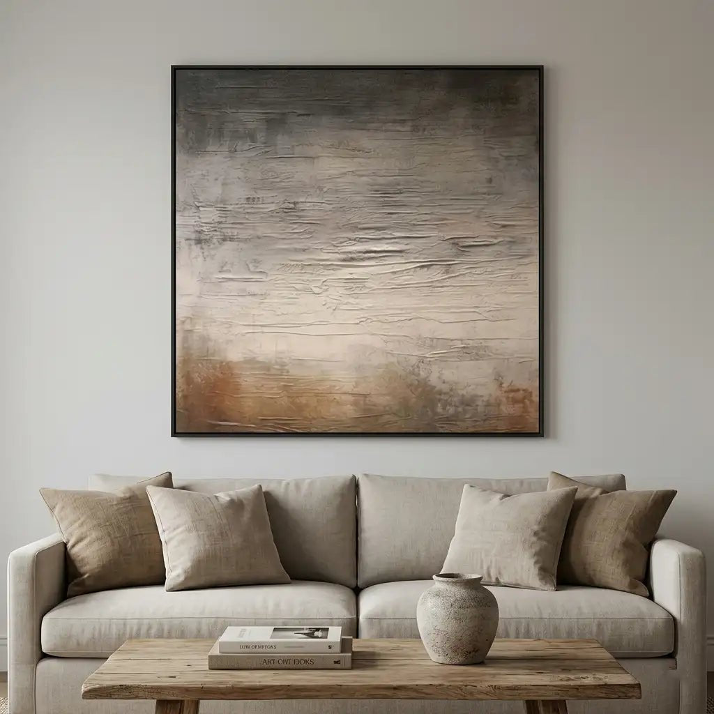
Best suited to: Warm white walls, pale wood, linen upholstery, and rooms where you want subtle variation without introducing a new color family.
Imagine a living room with light oak flooring, an ivory sofa, cream curtains, and a pale stone coffee table.
The furniture already establishes a cohesive palette. The purpose of adding artwork isn't to change the decorating direction. It's to give the wall a distinct feature that still feels connected to the furnishings.
Look for a painting with an ivory or sandy background and recognizable taupe or muted brown forms.
The painting offers tonal variation within a restrained color scheme, making it relevant for homeowners who want an earthy composition without strong orange or red accents.
What Can Go Wrong?
The painting may look less distinct than expected if every major color is nearly identical to the surrounding wall and upholstery.
Before switching to a completely different palette, compare alternative compositions within the same color family. A clearly defined shape or a modestly deeper accent might provide enough differentiation.
If your main concern is the relationship between beige artwork and beige walls, the existing guide to beige wall art on neutral walls covers that narrower question in detail.
Choose this palette when: You want your painting to support a light, natural interior without becoming its strongest color feature.
Palette 2: Clay, Cream, and Muted Terracotta for a More Expressive Earthy Room
Best suited to: Natural wood, cream walls, woven materials, ceramic accessories, and interiors that could benefit from a distinct warm accent.
Consider a dining room with a wooden table, cream upholstered chairs, and simple ceramic accessories.
Another sand-colored painting could fit comfortably, but it might offer little visual change.
Muted terracotta introduces a clearer identity.
For a restrained result, compare paintings in which cream or another light neutral occupies a substantial part of the canvas, while clay or terracotta provides the main accent.
This relationship allows the warmer color to become noticeable without filling the entire artwork.
Pay attention to how the color relates to nearby wood.
Pale oak with a yellow undertone, reddish wood, and dark brown furniture will each affect the perceived warmth of the painting differently.
If the room already contains golden wood and several orange accessories, a highly saturated terracotta canvas might repeat that warmth more strongly than intended.
A muted rust or terracotta-brown accent could be easier to accommodate.
What Can Go Wrong?
Terracotta artwork can appear more saturated in a room than it does in an isolated product photograph.
For instance, a canvas with large areas of orange-red may become the strongest visual feature in a dining room that otherwise contains cream and natural wood.
If you prefer a quieter palette, look for an artwork where clay or muted terracotta is balanced by a substantial cream background.
Also compare the painting with any nearby ceramics, upholstered chairs, or reddish wood surfaces. Too many similar accents at the same intensity can make the combination feel repetitive.
Choose this palette when: Your home already has a natural foundation and you want a more noticeable warm accent than sand or taupe can provide.
Palette 3: Caramel, Chocolate Brown, and Beige for a Stronger Focal Point
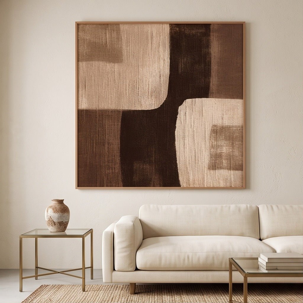
Best suited to: Warm off-white walls, leather furniture, medium-to-dark wood, and interiors where pale artwork lacks sufficient presence.
Picture a room with a tan leather chair, a dark wooden sideboard, a cream rug, and warm white walls.
A very pale painting could work, but an artwork containing caramel, taupe, and deep brown may create a clearer connection with the substantial furniture.
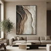
Brown Geometric Abstract Wall Art #TO186 is an example worth comparing. Its dark brown, taupe, beige, and cream tones form a structured geometric composition.
Rather than treating all brown paintings as interchangeable, notice where the darker colors appear and how much lighter space surrounds them.
The distribution of those colors influences whether the painting reads as a substantial focal point or a quieter companion to the furniture.
What Can Go Wrong?
A predominantly dark brown artwork positioned above a dark sideboard and against a medium-brown wall can concentrate much of the room's visual weight in one place.
You might prefer an alternative with more light beige or cream areas.
You could also compare the painting on another wall where its dominant colors have more separation from the furniture.
Choose this palette when: You want deeper earthy colors to play an intentional role rather than simply matching an existing brown accessory.
How Should You Adapt Earth-Tone Artwork to Your Furniture?
After choosing a palette, compare it against the most prominent materials in the room.
| Existing furniture or finish | What to examine | Artwork direction to compare |
|---|---|---|
| Light oak and linen | Whether the room already contains a strong yellow-beige influence | Muted taupe with restrained brown details |
| Dark wood and leather | How much dark color is concentrated in the same area | Artwork with more cream or sand-colored space |
| Cool beige stone | Whether a strongly orange painting feels intentionally contrasting | Mushroom, clay-gray, or muted earthy compositions |
| Cream upholstery and white walls | Whether the painting has enough recognizable structure | Artwork with a distinct form or secondary accent |
These combinations are starting points, not universal rules.
A terracotta painting can look appealing beside cooler stone when the contrast is intentional. Likewise, dark brown artwork can work above dark furniture when the composition and wall arrangement provide enough separation.
A useful way to compare options is to place photographs of two paintings beside an image of your actual furniture.
Choose alternatives that produce visibly different results instead of repeatedly comparing nearly identical shades.
Which Earth-Tone Color Mistakes Matter Most?
When an artwork doesn't seem right, try to identify the specific issue before dismissing the entire palette.
A strongly yellow appearance. Warm lighting, golden flooring, and yellow-beige upholstery may emphasize similar undertones. Compare a quieter taupe or mushroom alternative.
Unexpectedly bright terracotta. A painting may include more saturated orange-red than its product title suggests. Check the whole canvas and the proportions of the brighter areas.
Too much concentrated brown. If both furniture and artwork contain substantial dark regions, consider a painting with a lighter dominant background.
An overly uniform palette. If the walls, furniture, and painting all have a very similar appearance, test a piece with more distinct forms before abandoning the chosen color family.
Avoid correcting all four problems at once.
The aim is to understand which relationship isn't working, then compare one practical alternative.
How Do You Choose Earth-Tone Wall Art Online?
Begin with the artwork's dominant color.
A product described as earth-tone wall art may be mostly ivory, deep brown, or terracotta. Each will affect the room differently.
Next, examine secondary colors. Small blue, gray, green, or black accents may matter when deciding whether a piece fits your existing palette.
Look at detailed photographs, particularly when raised paint or layered texture is part of the design.
Then compare the painting with your actual furniture and wall. A room photograph is more useful than an isolated color swatch because it includes the materials and surroundings that affect your decision.
Remember that screens, camera settings, and lighting can influence the appearance of colors. Online photographs cannot guarantee an exact match.
Finally, review the product's listed dimensions and available presentation options.
A large, dark composition may feel much more substantial in a room than it does in a small product thumbnail.
Choose the Earth-Tone Palette That Fits Your Room
Sand, ivory, and taupe support a restrained natural palette. Clay and terracotta introduce a more noticeable warm accent, while caramel and deep brown create greater visual weight.
Compare these directions with your existing furniture and the effect you want the painting to achieve.
Explore hand-painted compositions at Tactile Atelier, and choose a palette because it works in your room—not simply because the artwork is described as earthy.



Leave a comment
This site is protected by hCaptcha and the hCaptcha Privacy Policy and Terms of Service apply.