



















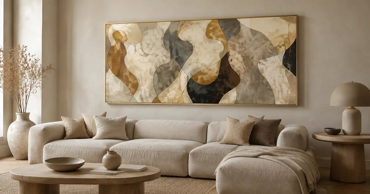
Beige wall art creates a particular design challenge: you want the artwork to belong to a quiet neutral room, but you do not want it to disappear into the wall. The solution is not simply to choose a darker piece or add more texture. A successful neutral-on-neutral pairing usually depends on four controlled forms of contrast: value, temperature, edge definition, and surface shadow. Once you understand which of those levers the room needs, beige artwork can remain calm while still reading as a deliberate part of the interior.

Why Beige Wall Art Can Disappear on a Neutral Wall
An artwork becomes difficult to read when too many of its visual characteristics repeat the wall behind it. If a pale beige composition and a cream wall have nearly the same lightness, similar warm undertones, soft outer edges, and even illumination, the eye receives very little information about where one surface ends and the other begins.
That effect is not always a failure. Tonal continuity can be intentional when the composition remains visible through a clear silhouette, a shift in temperature, or changing surface shadow. The problem begins when the artwork loses both its outer boundary and its internal structure. From nearby, you may still notice brushwork or relief; from the doorway, the piece may register only as a slightly different patch of wall.
The useful question is therefore not, “Does this beige match?” It is, “What keeps this composition legible?” Sometimes the answer is a deeper central form. Sometimes it is a cooler ivory against a warm cream wall. In another room, a defined canvas edge or a small change in shadow is enough. Calm does not require every surface to be identical. It requires the differences to feel controlled.
Diagnose the Wall: White, Cream, Greige, or Beige

Neutral paint names are broad categories, not precise colors. Look at the actual wall in daylight and evening light, then compare it with flooring, stone, wood, and upholstery. Those relationships reveal whether it reads warm, cool, green-gray, pink, yellow, or balanced.
White Walls: Identify Whether the White Is Warm or Cool
A warm white wall often contains cream, yellow, or soft red undertones. A very pale, equally warm composition may lose its boundary. Keep the shared warmth, then add definition through a deeper passage, cooler ivory area, or visible edge.
A cool white wall creates a different problem: sand or biscuit tones may look more yellow than expected. For a quieter transition, look for stone, mushroom, flax, or gray-beige notes. On warm white, value may need to do more work; on cool white, temperature contrast may already be sufficient.
Cream Walls: Use Temperature Before Adding a Dark Outline
Cream walls already carry warmth and softness. Beige abstract wall art with the same yellow-cream cast can easily become overly blended, especially under warm lamps. You do not have to solve this with a dark border. In an ivory-and-beige composition, a cooler taupe or mineral passage can create definition while preserving the light overall palette.
Greige Walls: Watch for Mid-Tone Compression
Greige walls combine gray and beige in different proportions. Pale art may appear clear, but a mid-value artwork can compress with the wall into one muted field.
Here, value and edge usually matter more than adding another color. A lighter ground, a concentrated darker form, or a readable canvas boundary can establish structure. If the wall leans green-gray, check whether the artwork’s warm passages become unexpectedly pink or yellow beside it.
Beige Walls: Separate One Characteristic, Not Every Characteristic
Beige wall art on beige walls works when the relationship is layered rather than matched. Repeat the wall’s warmth, then change the lightness, temperature, edge, or surface response. A pale sand wall may support deeper putty; a mid-beige wall may suit an ivory ground with restrained brown marks.
Avoid maximizing every kind of contrast at once. A dark frame, sharp outline, cool shift, and pronounced relief may create more separation than the room needs. One or two clear differences are often enough.
Build Contrast With Four Levers

The four levers below are not a formula. Think of them as diagnostic tools. Identify which form of separation is currently missing, then strengthen that relationship while leaving the rest of the palette quiet.
1. Value: Change the Light-Dark Relationship
Value is how light or dark a color appears. It remains one of the most dependable ways to clarify beige artwork because it can be perceived from across a room. A pale composition on a darker greige wall may already have enough value separation. On a warm white wall, the same piece may need one deeper form to hold its shape.
Value contrast does not require black or a dramatic dark-brown block. A small step from cream to sand, or from beige to muted umber, can be sufficient when the boundary and lighting support it. Judge the whole composition: if its main shapes merge at normal viewing distance, the value structure may be too compressed.
2. Temperature: Shift Warm Beige Toward Cooler Stone, or Vice Versa
Temperature describes whether a neutral leans warmer or cooler. Two colors can be equally light yet remain distinct because one reads as creamy and the other as stony or gray. This is particularly useful on cream walls, where a cooler beige can create definition without adding a dark contour.
Temperature contrast is relational. A taupe that appears cool beside oak may look warm beside a blue-white wall. Evaluate the artwork against the wall and nearby materials together; notice whether the combination feels connected, uneasy, or indistinguishable.
3. Edge: Decide Where the Composition Needs a Boundary
Edge definition can come from the outer perimeter of the canvas or from forms within the painting. A pale artwork with one clear internal edge may remain more legible than a darker work composed entirely of diffuse transitions. Conversely, a soft composition can still read well when its outside boundary is distinct from the wall.
Not every edge needs to be sharp. Selective definition is calmer than outlining everything. Give the eye one area where it can locate the composition, then allow other passages to dissolve gently.
4. Surface Shadow: Use Changing Light as Supporting Contrast
Relief, layered paint, and visible surface variation can create small shadows that change as the light moves. These shadows may give hand-painted canvas art greater visual depth than a completely uniform surface. They are especially effective when the artwork and wall share a close value range.
Surface shadow is lighting-dependent. Subtle relief may recede under flat illumination and become more articulated in directional daylight. Use it to support value, temperature, or edge definition rather than expecting texture to carry the composition.
When Texture Helps—and When It Does Not

Texture helps when the artwork is already structurally readable and needs more variation within a restrained palette. Raised or layered areas catch light differently, create micro-shadows, and interrupt a flat expanse of beige. Up close, they can make small shifts between ivory, sand, and taupe feel more dimensional.
Texture does not automatically solve low contrast. If the total artwork, its outer edge, and the wall all sit at nearly the same value, the surface detail may disappear as soon as you step back. A close photograph can make relief look prominent while the room view remains almost blank. Test both distances before deciding.
For a deeper discussion of relief and surface behavior, use the textured wall art guide. In this decision, however, texture should remain one supporting lever rather than the main reason the artwork is visible.
Check Daylight, Evening Light, and Viewing Distance
Use a simple three-condition test before committing to a neutral-on-neutral pairing.
First, check daylight. Place the artwork or an accurate visual reference near the intended wall and observe it when the room receives its normal natural light. Notice whether the wall turns warmer or cooler, whether shadows strengthen, and whether the principal shapes remain distinct.
Second, check evening light. Warm lamps can pull cream, tan, and yellow undertones closer together. They may also deepen surface shadows. Ask whether the painting gains welcome warmth or loses internal separation. Do not judge the pairing under a single bulb or temporary light source that you will not normally use.
Third, check normal viewing distance. Stand where you first see the wall—from the doorway, circulation path, or main seating area. The test is not whether you can identify every brush mark. It is whether the artwork still has a readable outer boundary and at least one clear internal relationship. If it vanishes, strengthen value, temperature, or edge before relying on more surface detail.
Use Frames, Canvas Edges, and Negative Space as Boundary Tools

A boundary can clarify a pale composition without changing its central palette. Depending on the specific artwork and currently available options, that boundary may come from a frame, a visible canvas edge, or simply enough open wall around the piece. Always verify the finish and framing details of the work you are considering rather than assuming every product is configured the same way.
Negative space inside the artwork can be equally useful. A quiet ivory field around a beige form allows the eye to recognize its contour. Negative space outside the artwork prevents nearby shelving, curtains, or furniture from competing with an already subtle edge. Neither kind of space is empty; both help the composition stay legible.
If you prefer a more reduced visual language, the minimalist wall art guide offers a related style direction. The visibility decision remains the same: restraint works when the few differences that remain are clear enough to carry the composition.
Shopping Checklist for Neutral-on-Neutral Art
Before comparing individual works, use this checklist:
- Identify the wall family and its actual undertone in daylight and evening light.
- Decide how visible you want the artwork to be: softly integrated, clearly defined, or somewhere between.
- Check for at least one useful value step between the wall and the main composition.
- Look for a temperature shift if the value range is intentionally close.
- Confirm that either the outer boundary or one focal internal edge remains readable.
- Test whether surface shadow still contributes from normal viewing distance.
- Compare the artwork with flooring, wood, stone, and upholstery, not with the wall in isolation.
- Verify the product’s current framing, edge, finish, and size details before using them as part of the contrast plan.
After completing the checklist, compare works in the Beige Wall Art collection by undertone, value structure, edge definition, and visible surface character. If the room needs more tonal weight, brown wall art may provide a warmer, deeper neutral direction.
FAQs
Can Beige Artwork Go on Beige Walls?
Yes. Beige artwork can work on beige walls when at least one relationship creates separation. Keep the shared warmth if you want cohesion, then change the value, temperature, edge definition, or surface shadow. Exact wall-to-art matching is more likely to make the composition disappear.
What Wall Colors Work With Beige Artwork?
Warm white, cool white, cream, greige, and beige can all support beige artwork. The best pairing depends on undertone and value rather than the wall’s category alone. Assess the actual paint in the room’s normal light, then choose the contrast lever the combination is missing.
How Do I Make Neutral Wall Art Stand Out?
Start with value and edge because they remain visible from a distance. If you want a softer result, use a smaller temperature shift or controlled surface shadow instead of a dark outline. The artwork should have one readable point of definition without becoming disconnected from the neutral room.
Is Textured Beige Art Better Than Flat Beige Art?
Not automatically. Texture can add micro-shadows, tonal variation, and depth, but its effect depends on lighting and viewing distance. A flatter artwork with stronger value or edge definition may be more legible. Choose texture for the surface character it contributes, not as a substitute for contrast.


Leave a comment
This site is protected by hCaptcha and the hCaptcha Privacy Policy and Terms of Service apply.