
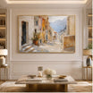


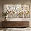


















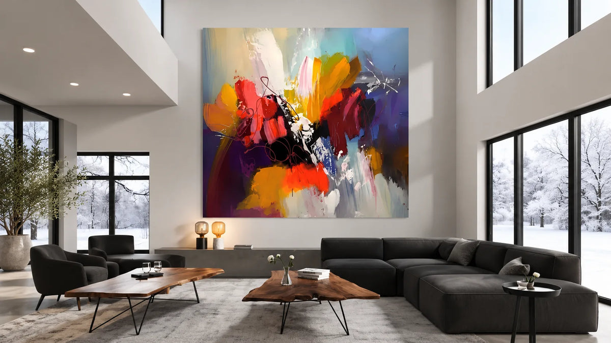
Should your new painting match the sofa, stand out against the wall, or introduce a completely different color? It's a common question when shopping for artwork, especially when several paintings look equally attractive online.
The easiest way to choose wall art colors is to decide what your room needs before choosing a shade.
A neutral painting may suit a colorful room better than another bold artwork. A deep green canvas might be exactly what a plain living room needs. And a black-and-white painting can create more contrast than a multicolored piece.
Use the following process to narrow your choices based on your actual space.
What Wall Art Colors Work With Your Existing Room?
Start by identifying the three most noticeable colors or materials.
Focus on the walls, largest furniture pieces, flooring, and dominant textiles rather than every small decorative item.
Suppose your room contains warm white walls, a beige sofa, oak flooring, and black metal lighting.
You have three possible artwork directions:
- Neutral: Continue the existing palette with ivory, taupe, or muted brown.
- Color accent: Introduce a different color family, such as green or blue.
- Contrast: Strengthen existing dark details with a more graphic composition.
None is automatically correct.
If your furniture already provides plenty of visual interest, a neutral painting might be appropriate. If the room looks plain, a stronger color direction may be more useful.
Choose the purpose of the artwork first. Then compare paintings that serve that purpose.
Should Your Wall Art Blend In or Stand Out?
Use the room's existing visual activity to guide the decision.
| Current room condition | First artwork direction to consider | Reason |
|---|---|---|
| Plain furniture, neutral walls, few decorative details | Artwork with a noticeable accent color | Creates a clearer visual feature |
| Patterned rug, colorful furnishings, prominent lighting | Restrained or coordinated artwork | Avoids competing with several existing features |
| Dark furniture and light walls | Artwork containing both light and dark areas | Connects with the furniture without making the wall uniformly dark |
| Pale room with black metal accents | Monochrome or carefully chosen colorful art | Offers contrast or introduces a new color direction |
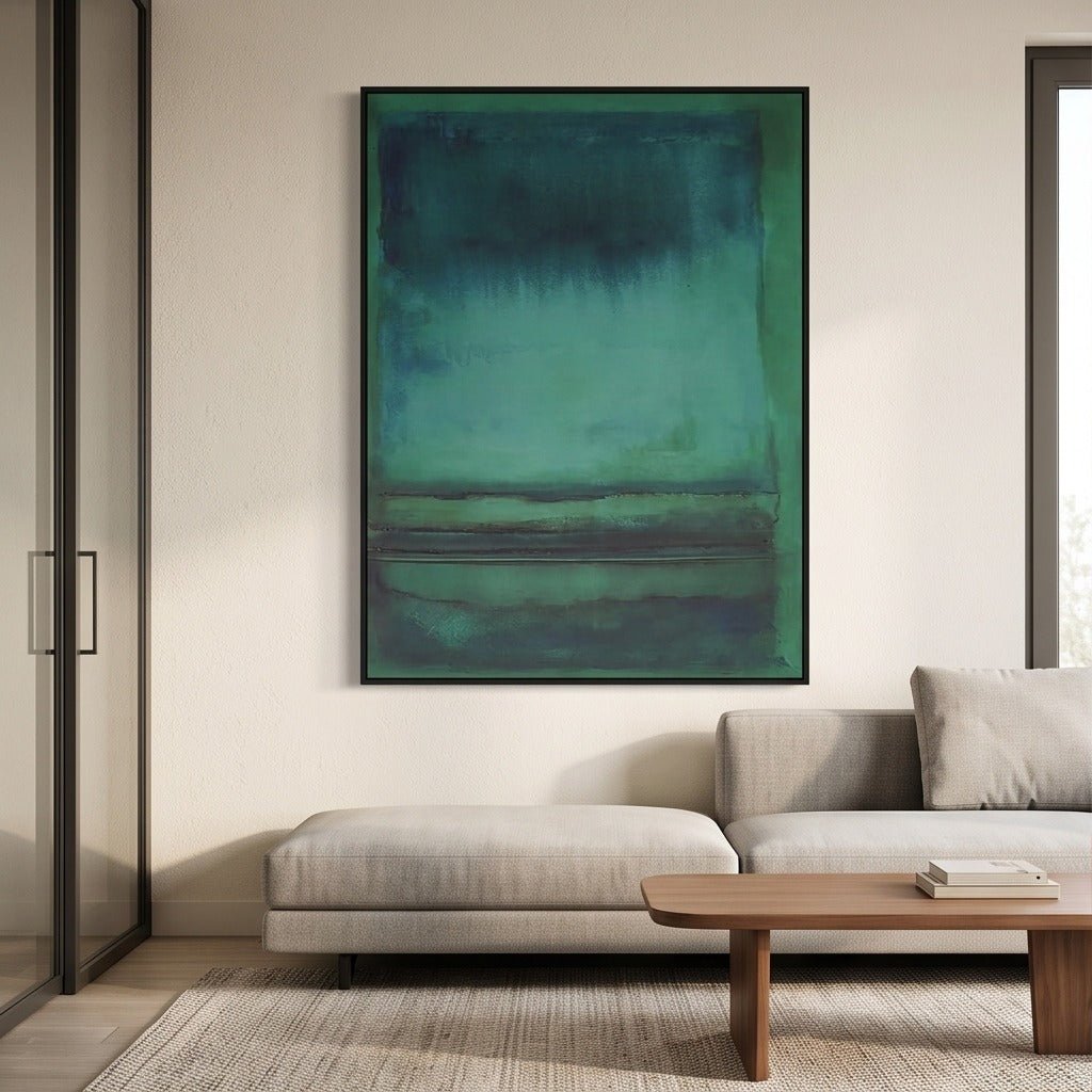
For example, Green Abstract Wall Art #TO841 includes emerald, teal, and deeper blue-green shades.
In a plain neutral room, its dominant color may create a distinct feature without requiring matching green upholstery.
Place the same painting beside a vivid blue rug, green chairs, and patterned curtains, however, and it may contribute more visual activity than you want.
The painting hasn't changed. Its surroundings have.
This is why choosing artwork solely by color name rarely provides enough information.
Which Wall Art Colors Work With White Walls and a Beige Sofa?
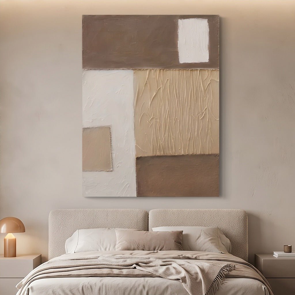
White walls and beige seating give you considerable flexibility. The best direction depends on what else is in the room.
Let's compare three situations.
Situation A: The Furniture Already Makes a Statement
Imagine a beige sofa with a patterned rug, a distinctive floor lamp, and sculptural wooden furniture.
Several features already attract attention.
Instead of introducing another strong color, consider a neutral geometric painting.
Neutral Geometric Abstract Wall Art #TO187 is one option to compare.
A restrained composition can support the existing arrangement without becoming another competing focal point.
Recommendation: Begin with coordinated neutral artwork rather than a brightly colored canvas.
Situation B: The Room Feels Too Plain
Now imagine the same beige sofa against white walls, but with a simple oak table, an undecorated rug, and very little visual detail.
A painting in another pale beige shade may contribute little.
Consider green or blue-green artwork instead.
TO841, with its deeper green and teal areas, represents a noticeably different option from a neutral canvas.
The painting can introduce a new color direction without requiring you to replace furniture.
If blue is a serious option, the blue wall art guide explores that color family in more detail.
Recommendation: Compare an artwork with a recognizable green or blue accent before choosing another pale neutral.
Situation C: The Room Has Strong Black Details
Suppose the windows have black frames, the coffee table has black metal legs, and the lamps have dark finishes.
A black-and-white composition can strengthen those existing relationships.
This approach introduces clear contrast without adding another color family.
However, remember that black-and-white artwork can be visually strong even when it contains only two colors.
Recommendation: Test monochrome artwork when you want definition and the room already contains dark architectural or furniture details.
The important point is that a beige sofa doesn't lead to one universal answer.
The surrounding objects—and the effect you want—determine the starting direction.
What Wall Art Colors Should You Choose for a Gray Bedroom?
Gray bedroom walls can have different undertones, so inspect their actual appearance before choosing artwork.
Consider two bedrooms with similar gray paint.
Bedroom A: Gray walls with warm wood furniture
This bedroom contains blue-gray walls, a natural wood bed, and cream bedding.
The wood already introduces warmth.
Artwork in slate blue, soft gray, or muted charcoal could continue the cooler background without making the room overly uniform.
The warmer furnishings provide separation.
Recommended direction: Restrained cool-toned artwork.
Bedroom B: Gray walls with gray furniture
This bedroom contains gray walls, a gray upholstered bed, white bedding, and black metal lamps.
Most of the visible elements belong to a cool, low-saturation palette.
A painting with a cream background and restrained clay or warm neutral accents could introduce a useful difference.
That doesn't mean choosing the most orange painting available.
A small amount of warm color may be sufficient, particularly when the artwork hangs near the bed.
Recommended direction: Artwork with controlled warm accents rather than another predominantly gray composition.
Before deciding, view the walls in daylight and under the bedroom's normal evening lighting.
A gray that appears neutral during the day may look noticeably warmer or cooler at night.
What Wall Art Colors Work With Dark Dining Room Furniture?
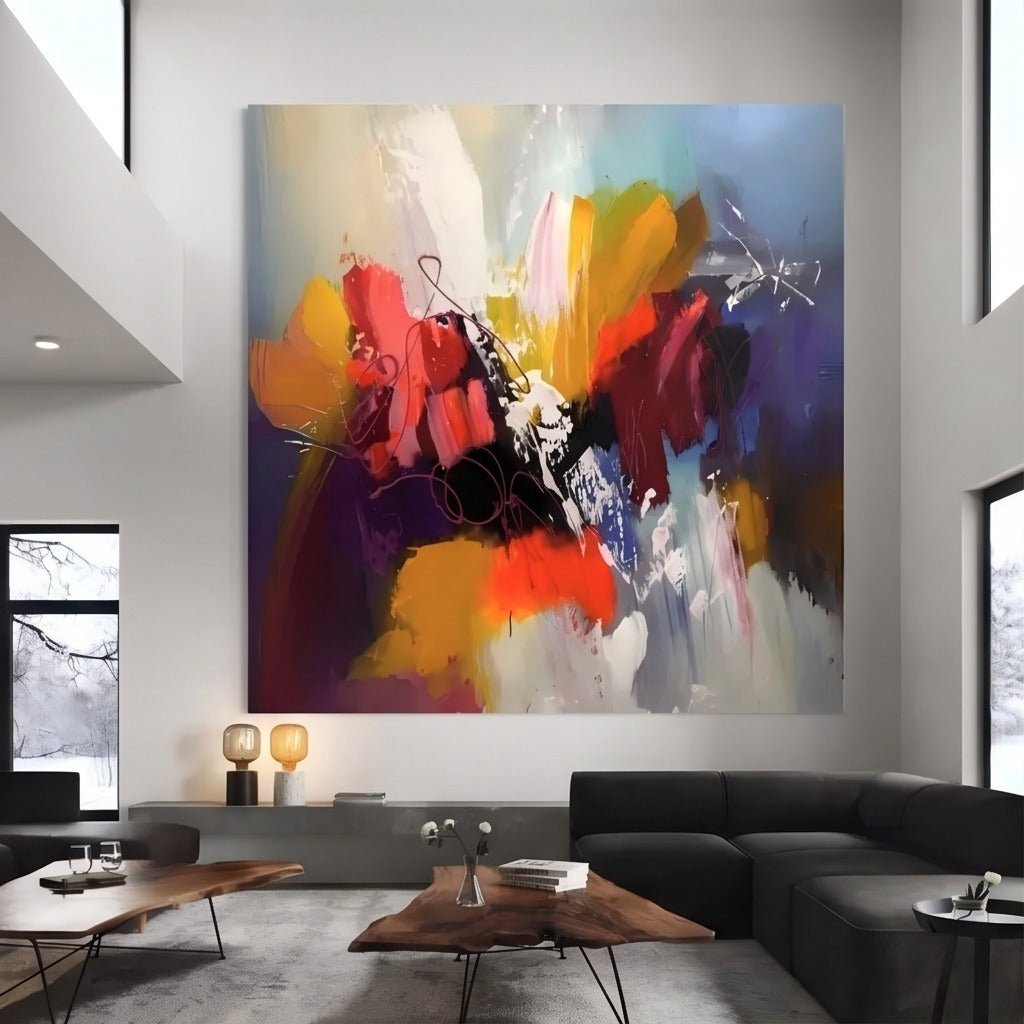
Dark dining furniture already introduces substantial visual weight.
The artwork can either balance that weight or become a stronger decorative feature.
Consider these two arrangements.
Dark Table, Dark Chairs, and Dark Rug
This dining room contains several large dark areas.
Choosing a nearly black painting above a dark sideboard could concentrate even more visual weight on one wall.
Instead, compare artwork with a light dominant background and a few darker forms.
The dark details can relate to the furniture while lighter areas prevent the composition from looking excessively dense.
Recommendation: Prioritize paintings with substantial light areas and controlled dark accents.
Dark Table, Light Chairs, and Neutral Walls
Here, the room has more visual separation.
You may have room for a more expressive painting.
Colorful Abstract Wall Art #TO024 includes several vivid hues within a single composition, offering an alternative to restrained neutral artwork.
Such a painting could become a focal point when the surrounding furnishings are relatively simple.
If the dining room already includes an elaborate chandelier, patterned rug, and colorful accessories, compare a quieter painting as well.
Recommendation: Consider colorful artwork when the furniture arrangement is controlled and the wall would benefit from a distinct feature.
The same dark dining table can support very different artwork choices depending on the surrounding details.
How Can You Compare Two Wall Art Colors Before Buying?
Once you've identified a suitable direction, stop comparing dozens of similar paintings.
Choose two options that would produce different results.
For example, compare a restrained neutral geometric work with a deeper green abstract.
Then evaluate them in the following order.
1. Look at the whole room, not the empty wall.
Take a photograph that includes the furniture surrounding the intended display area.
A painting should be considered alongside the objects that influence its appearance.
2. Identify the dominant color of each painting.
A painting described as colorful may still be dominated by one shade. A neutral painting may contain a large area of dark contrast.
Look beyond the product title.
3. Compare the paintings against the same room photograph.
Place both options beside the image or use a simple visual mock-up.
This helps reveal whether one introduces too much color or the other disappears into the surroundings.
Such comparisons are approximate; they don't reproduce exact colors or scale.
4. Consider the room under different lighting conditions.
Compare the room in natural daylight and evening light.
Photographs, screen displays, and artificial lighting can change how colors appear, so avoid assuming an exact digital match.
5. Check the size and available presentation options.
A dark or highly saturated painting may create a much stronger visual effect when displayed at a large size.
Review the product's detailed photographs, listed dimensions, and available options.
If both choices still seem appropriate, return to your original goal.
Do you want the artwork to support an already interesting interior, introduce a color accent, or create more contrast?
Choose the painting that best serves that purpose.
Choose the Artwork That Gives Your Room What It Needs
A neutral painting can support a richly furnished room. A green or blue abstract can give a plain interior more identity, while a lighter composition can balance dark furniture.
Identify what your room needs, compare two suitable color directions, and evaluate the artwork alongside the furniture you already own.
Explore the hand-painted artwork at Tactile Atelier and choose a painting for the role it will play in your home—not simply its color name.


Leave a comment
This site is protected by hCaptcha and the hCaptcha Privacy Policy and Terms of Service apply.