



















Brown wall art can sit beautifully beside oak, walnut, leather, stone, and linen—but the strongest pairings rarely come from finding the closest possible color match. When every surface repeats the same brown at the same depth, the artwork loses definition and the room can feel flat. A more considered approach starts with the undertone of the materials already in place, then decides whether the artwork should blend, bridge, or contrast. That gives a warm interior continuity without turning it into one undifferentiated field of brown.

Start With the Wood’s Undertone, Not ‘Brown’
Oak and walnut are useful labels, but they are not precise colors. Species, stain, finish, age, and lighting can push the same wood toward honey, amber, red, smoke, or gray. Begin by looking at the actual furniture in the room rather than choosing from a mental picture of what oak or walnut is supposed to look like.
Observe the wood in daylight and again under the lamps you use at night. Does it read yellow-gold, reddish, gray-brown, or relatively neutral? Then compare that cast with the dominant brown in the artwork. A yellow-gold oak and a red-brown painting may both be warm, yet the difference can still feel uneasy if neither color appears elsewhere. A cooler taupe-brown, by contrast, may give the oak a clean outline while remaining quiet enough for a neutral interior.
Treat upholstery and architectural finishes the same way. Beige fabric may lean pink, cream, green-gray, or sand; stone may contain warm veining on a cool ground. Assessing all of these materials in the room’s real light gives you a more reliable palette than matching product photographs on separate screens.
Choose the Relationship: Blend, Bridge, or Contrast
Once you understand the undertones, decide what job the artwork should do. There are three useful relationships, and each creates a different kind of balance.

Blend
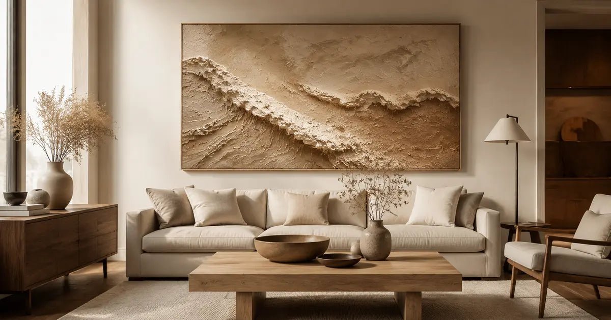
A blended pairing keeps the artwork in the same general color family as the wood, while separating it through value, scale of mark, or negative space. In a room with warm oak, for example, a deeper umber composition on a pale ground can feel connected without copying the grain. The warmth repeats; the light-dark structure keeps the art legible.
Bridge
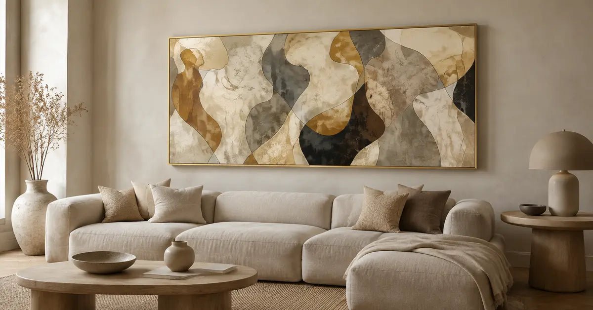
A bridging artwork connects two materials that do not naturally meet. Imagine a walnut console, ivory linen seating, and pale limestone. A composition that moves from creamy mineral tones into muted brown can carry the eye from the light upholstery to the darker wood. It does not need an exact sample of every finish; it only needs enough tonal overlap to make the materials feel related.
Contrast
Contrast is useful when the room is already very cohesive. A cooler mushroom-brown against golden oak, a pale clay field above dark walnut, or a nearly charcoal-brown mark in a soft beige room can give the palette definition. This is not the sharp graphic anchoring associated with black wall art. Brown contrast remains warmer and more gradual, so it can create structure without interrupting the room’s material calm.
Choose one relationship as the lead. Trying to blend with the wood, bridge every textile, and introduce strong contrast at the same time often produces a painting with too many competing roles.
Separate Similar Browns Through Value and Temperature
When two browns feel wrong together, the problem is often not hue but insufficient separation. Value describes how light or dark a color appears; temperature describes whether it leans toward red and yellow or toward gray, violet, and cooler umber. If the artwork and furniture share a similar warmth, change the value. If they sit at a similar value, introduce a small temperature shift.
This is why a brown abstract wall art piece with a pale ground can work above walnut even when its darker marks echo the furniture. The open ground gives those marks a boundary. Against oak, a mid-brown composition can remain distinct when it contains cooler taupe passages or restrained dark accents. Negative space, soft tonal transitions, and visible variation prevent the eye from reading the artwork as another flat brown surface.
The difference between ‘too matched’ and ‘intentionally layered’ is easiest to see from across the room. In the too-matched version, the dominant artwork color repeats the wood at nearly the same value and temperature, so the edges dissolve. In the layered version, one characteristic repeats—perhaps warmth—while another changes, such as depth or temperature. The connection remains visible, but so does the artwork.
Brown Wall Art With Oak, Walnut, Leather, Stone, and Linen

With oak: control the golden echo
Oak often brings a light, yellow-gold energy to a room. The common risk is choosing artwork whose tan or caramel tones repeat that energy so closely that everything becomes uniformly warm. One correction is depth: use quieter cocoa, umber, or soil-brown passages that sit clearly below the wood in value. The other is temperature: introduce mushroom, stone, or gray-brown notes that temper the gold without making the room cold.
For a warm oak room, picture a composition with a soft cream field, one deeper brown form, and only a limited honey note. It acknowledges the oak without reproducing the wood color across the entire canvas. If the walls and upholstery are already pale, the darker form also gives the room a necessary visual stop.
With walnut: introduce lightness before adding more depth
Walnut can read rich, red-brown, neutral-dark, or slightly cool depending on the finish. Its main risk is accumulation: a dark console, deep floor, and dark-centered artwork can merge into a heavy block. Look first for a pale ground, open area, or lighter mineral tone that gives the walnut room to breathe. A cooler brown can also clarify reddish walnut; a muted clay accent can warm walnut that reads gray.
The artwork does not have to avoid dark brown. It simply should not place its darkest value everywhere. A composition with light surrounding space and concentrated umber marks can feel grounded above walnut while maintaining a readable silhouette. This is often more effective than adding another pale accessory to compensate for an overly dark wall arrangement.
With leather, stone, and linen: let the artwork act as a bridge
Brown leather has a strong identity, especially in saddle, cognac, or chocolate tones. Matching it exactly can make the artwork feel selected by swatch. Instead, repeat one aspect of the leather—a warm undertone or dark edge—then connect it to a second material. Cream, chalk, or flax passages can link a leather chair to linen upholstery; taupe and mineral gray can connect it to stone.
Stone and linen are useful relief materials because they interrupt the visual density of wood and leather. In a room with walnut, limestone, and natural linen, artwork that moves between creamy light areas, muted earth tones, and a restrained dark accent can bridge all three. Texture may deepen that relationship by catching light differently from smooth cabinetry or upholstery, but it should support the color structure rather than replace it.
Keep an Earth-Tone Room From Feeling Too Brown

When an earth-tone room feels dull, the answer is not automatically more décor. First check whether the palette has a hierarchy. One brown can dominate, another can support, and a light or cooler neutral can provide relief. If every object receives equal emphasis, even a beautifully coordinated room can feel visually congested.
Create breaks in the repetition: preserve a lighter wall area around the art; choose a composition with quiet negative space; add a cooler taupe, stone, or gray-brown note; or use one darker anchor rather than many medium-brown accents. Mixed surface character also helps. Matte linen, veined stone, softly textured paint, and polished or open-grained wood respond to light differently, giving a restrained palette depth without multiplying colors.
If the room still feels overly saturated, consider a lighter neutral direction rather than forcing another brown element. A restrained piece of beige wall art can preserve warmth while increasing visual breathing room.
Evaluate the Artwork in Real Light and at Viewing Distance
A brown palette can shift considerably between cool daylight and warm evening light. Review the artwork near its intended wall at both times. Pay attention not only to the dominant color, but to whether the light ground stays open, whether reddish notes become stronger under lamps, and whether darker passages remain distinct from nearby wood or leather.
Then step back to the distance from which you normally enter or cross the room. Can you still identify the principal forms, or does the artwork collapse into the furniture below it? If it disappears, look for more value separation, a cooler or warmer shift, or clearer negative space. The goal is not high contrast for its own sake; it is enough distinction for the artwork to hold its place in the composition of the room.
A Five-Step Selection Sequence
Identify the undertone of the actual wood, leather, stone, and upholstery in the room’s normal light.
Choose the artwork’s main relationship: blend with one material, bridge two materials, or create quiet contrast.
Check value and temperature separately. Repeat one if you want continuity; change the other to maintain definition.
Review the pairing in daylight and evening light, then step back to your normal viewing distance.
Confirm that the room has hierarchy: a dominant tone, a supporting tone, and enough light or cool relief.
Use that sequence while exploring the Brown Wall Art collection. It keeps the search focused on the room’s material relationships rather than on finding a perfect brown swatch.
FAQs
Does brown wall art work with brown furniture?
Yes. The pairing works best when the artwork and furniture share one quality—such as warmth—while differing in value, temperature, or amount of negative space. A deeper brown above light oak or a pale-ground composition above walnut creates connection without allowing the two surfaces to merge.
What color wall works with brown artwork?
Warm white, cream, beige, greige, and muted stone tones can all support brown artwork. The right choice depends on the artwork’s undertone and contrast. A pale wall usually gives dark brown forms clarity, while a mid-tone wall requires stronger light-dark separation within the artwork.
Should brown artwork match wood furniture exactly?
Usually not. Exact matching can reduce legibility and make the choice feel overly coordinated. Repeat the wood’s warmth or one secondary tone, then vary the value or temperature. This creates an intentional layered effect and allows both the furniture and the artwork to retain their own character.
How can I keep an earth-tone room from feeling flat?
Build hierarchy rather than adding more accents. Combine a dominant earth tone with a lighter break, a cooler neutral, or a concentrated dark anchor. Negative space and varied surface character can add depth as well. The room should repeat selected tones, not the same brown at every surface.


Leave a comment
This site is protected by hCaptcha and the hCaptcha Privacy Policy and Terms of Service apply.