




















Can you recognize the painting's outline from the doorway in daylight and after dark? Then move closer: can you still see its surface? These two checks are more useful than choosing a color from a list. White or ivory relief often gives a clear silhouette on black walls; warm neutrals offer a softer contrast, and dark artwork needs a deliberate edge or visible detail. The best choice is the one you can read under the light you actually use, whether you want an obvious focal point or an intentionally quiet composition.
Test the Boundary Before Picking a Color
First, look at the background itself. Matte black, charcoal and warm near-black do not behave as interchangeable backdrops. A charcoal wall may reveal a distinct gray cast in daylight. A warm near-black can look brown beside cooler artwork. Even paint that reads as solid black can change when a window or lamp lights only part of the wall.
Compare whole artwork views at TactileAtelier.com, not just close-ups of the most striking detail. Note what reaches the outside edges: pale ground, dark paint or a frame. A bright central patch may attract attention while leaving the painting's full outline difficult to follow against the wall.
Use three viewing positions. From across the room, check whether the artwork has a recognizable shape. Close up, look for the differences within the surface. Finally, turn on the lights you normally use at night and return to the first position. The painting may pass one test and fail another; that tells you what needs to change.
If the outline remains clear but the surface flattens, consider a less subtle composition or a better-lit location. If the details are visible close up but the whole work disappears from the doorway, focus on the border and overall light-dark balance. These are different problems, and a more elaborate frame is not always the answer to either.
Three Ways to Keep the Artwork Readable
Start with a light silhouette
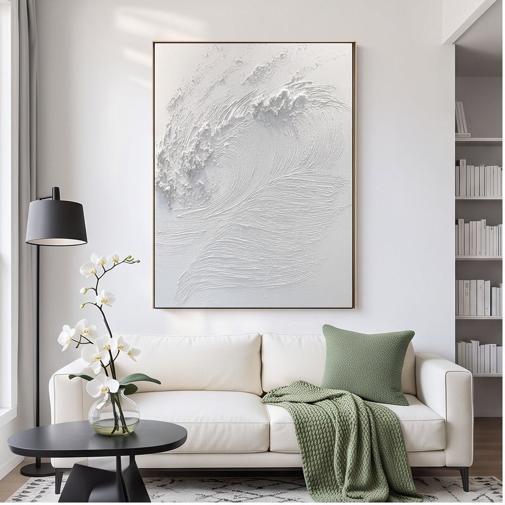
TO869's white textured wave wall art has a pale field with sculptural ivory ridges. Against black, that broad light area offers a clear starting point. Its internal relief provides a second layer of interest once you look more closely, rather than asking a small colored accent to define the entire painting.
Gentle angled light may reveal shadows along the raised forms. Under diffuse light, those shadows can soften even while the outline stays clear. Choose the work because both effects suit your room, not because all white textured paintings are assumed to look equally distinct. The reference photographs show the products, not verified black-wall installations.
Let pale passages organize a graphic work
A black-and-white painting does not disappear simply because part of it is black. What matters is where the pale areas sit. They can separate the dark forms from the background and make the composition readable without a light frame surrounding every edge.
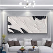
TO898's black and white abstract diptych wall art contains two coordinated panels, with bold dark forms set against pale grounds. Assess the entire pair against the black wall, including the gap. The wall visible between the panels becomes part of the overall view, so both outer edges and the separation between them matter.

This approach suits a room where the artwork should have a strong internal structure. It may be less suitable when nearby shelving or patterned upholstery already creates many competing lines. High contrast can make a painting easy to see without making it the right amount of visual activity for the room.
Use warm neutrals for a less abrupt transition
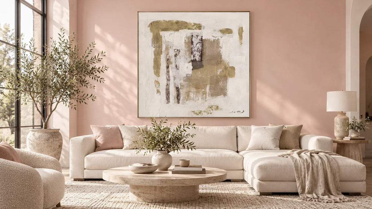
TO022 offers a horizontal composition of cream, beige and taupe layers. On charcoal, its pale areas can define the outline while the warmer passages provide a gentler step away from the dark paint. It is an alternative when a stark light rectangle would feel disconnected from the rest of the room.
Compare it under the actual evening light before deciding. If the neutral areas lose their differences and become one uniform patch, you may not see the layered composition that attracted you online. Conversely, a clearly visible cream boundary may provide enough definition even when the finer relief is subdued. Decide which part of the work matters most to you.

The Dark-on-Dark Exception
Dark artwork on black paint can be an intentional low-contrast choice. It works best when you want a close-viewing experience or a quiet surface, rather than expecting a high-visibility focal point. There still needs to be something discernible: a difference in tone, readable relief, a distinct frame edge or light that reveals the surface.
Do not assume that texture will rescue an invisible painting. If the work reads as a blank dark patch under normal conditions, it may not be suitable for that position. Leaving open wall around it can reduce competing detail, but it does not add light or create tonal differences that are absent.
The guide to black wall art looks more closely at tone and visual weight within dark paintings. For this wall-first decision, the threshold is simpler: can you see enough of the artwork to enjoy it without changing the room's lighting every time?
Compare Light and Frame as Separate Variables
Begin in daylight, then look under diffuse room lighting. Finally, if you have a movable lamp, compare a gentle light from one side. A change in shadow may make relief easier to read, while a bright reflection may obscure part of the composition. Check from your seated position as well as standing directly in front. Avoid treating a brief bright highlight as proof that the work will remain visible all evening.
Use the lamps already in the room for this comparison, keeping them away from the painted surface and following the maker's care guidance. If the proposed position requires special lighting you do not want to maintain, choose a composition that reads under the room's existing light.
Now compare the perimeter. A slim pale frame can distinguish a dark painting from black paint. A black frame can recede, allowing a light composition to establish its own boundary. A frameless stretched canvas leaves the work's actual edge exposed as the transition. Compare available options for the selected product rather than assuming the frame in a photograph comes with every order.
Change one variable at a time. If a pale frame solves the outline but the surface remains unreadable, you have learned that the remaining issue is not the border. If angled light reveals the surface but introduces a distracting reflection from your usual seat, the lighting position needs reconsideration.
Two Rooms That Need Different Answers
A small bedroom with a charcoal wall. Imagine a detailed headboard and bedside lamps already occupying the main view. A restrained neutral composition may be easier to live with than a high-contrast pair with several bold dark shapes. Compare the artwork from the bed: the goal is a visible, coherent painting, not the greatest possible contrast.
If the wall receives little evening light, favor a composition with enough pale area to stay legible. A smaller bedroom does not need the highest-contrast painting simply because its wall is dark. Look for enough separation to recognize the art without adding more visual demands around the sleeping area.
A large black feature wall with warm wood and brass accents. The room may support a more varied composition, such as TO848's blue and gold coastal abstract wall art. Blue areas are interrupted by white surf-like passages and warm gold-toned detail. Those breaks offer contrast without requiring an entirely pale painting.

Compare the blue with the black in evening light: the darker passages may become less distinct while the white remains visible. The gold tones may connect visually with warm furnishings, but they are not a promise of metallic reflection or brightness. If the color feels like an unrelated accent, the warmer neutral option may provide a more coherent result.
Before choosing, answer four questions:
- Can I identify the painting's full outline from the doorway?
- Can I see the surface detail that made me choose it?
- Does it still read under my normal evening lighting?
- Does its visual weight suit the room without depending on a different frame or lighting scheme I have not planned?
If one answer is no, revisit that specific issue rather than starting another unrestricted color search. A clear silhouette, an enjoyable surface and a workable evening view are enough to make a confident shortlist.


Leave a comment
This site is protected by hCaptcha and the hCaptcha Privacy Policy and Terms of Service apply.