
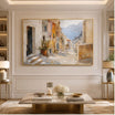


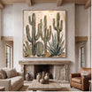
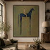














Ivory and cream offer gentle contrast on pink walls, warm neutrals create a layered look, and charcoal or black-and-white artwork gives deeper rose more definition. Cool blue can work with mauve, but it needs a closer undertone check. Start with the pink paint you already have, rather than searching only for pink paintings. The useful choice depends on how clearly the artwork's edges read, what its pale and dark areas contribute, and how your room is lit. Compare those features before deciding whether you want the painting to blend in or stand apart.
Read the Pink Wall Before Choosing Art
A peach-pink wall and a dusty mauve wall can ask for quite different artwork, even if both paint samples are labeled "soft pink." The first may look warm and orange-leaning; the second may carry a cooler, violet or gray cast. Nearby wood, flooring and upholstery affect that impression, so assess the wall where the art will hang, not in an isolated paint photograph.
Try a two-minute comparison in morning light, then repeat it in the evening. Hold a plain white sample and a taupe sample beside the paint. Does the white make the wall look peachy, rosy or slightly purple? Does the taupe sit comfortably beside it, or seem unexpectedly yellow? Neither sample is a scientific test; they simply give your eye a reference when the whole room has begun to look like one familiar color.
Keep the actual wall in view when comparing product photographs at TactileAtelier.com. A screen can help narrow the choices, but it cannot establish an exact paint-to-art match. Notice whether you are responding to the painting itself or to the attractive room around it. Those are not necessarily the same decision.
Choose by Pink Shade, Not One Universal Palette
Use the table to choose a direction for your shortlist. Its cautions matter as much as its suggested colors: a suitable hue can still disappear if the whole painting is too close to the wall in lightness.
| Pink wall | Artwork direction | Why compare it | What to watch |
|---|---|---|---|
| Pale blush | Cream, textured ivory, taupe | Gentle definition without a strong second color | A pale canvas edge may merge with the paint |
| Dusty rose | Warm gray, muted brown, olive | An earthy balance to the rose | Very gray art may feel dull in flat light |
| Peach pink | Cream, sage or soft green | A lighter or cooler break from the warm wall | Yellow-leaning neutrals can repeat more warmth than intended |
| Saturated rose | Charcoal or black-and-white | Clear shapes against a strong rose wall | Dense dark areas may compete with dark furniture |
| Mauve | Ivory, gray, controlled blue accents | A restrained connection with the cooler undertone | Strong blue can become a separate focal color |
Do not try to include every suggested color in one painting. Pick the effect first: a quiet surface, a more defined composition, or a graphic focal point. That choice gives you a reason to reject an otherwise appealing artwork that would do the wrong job on this wall.
Decide How Much Contrast You Want
The useful distinction is not simply light art versus dark art. Look at the boundary around the canvas, the range of tones inside it, and whether the surface gives you something to notice beyond color. The product photographs below are artwork references, not documented installations on pink walls.
Quiet contrast: let relief do some of the work
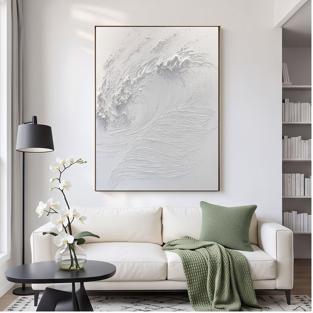
On pale blush, TO869's white textured wave wall art provides a light field with raised ivory ridges. The interest lies partly in the shadows across those forms. Where daylight reaches the work from an angle, the ridges may be easier to distinguish than under even, front-facing light.
This is a useful direction if you want the wall to remain the main color and the painting to add surface detail. Check the perimeter, though. If the pale edge disappears, compare a visible frame finish rather than assuming the relief alone will establish the outline. A fine boundary can be enough; it does not need to become the strongest line in the room.
Moderate contrast: keep the internal shapes visible
TO843's neutral abstract wall art is a square composition with ivory, taupe, warm-gray and muted-gold marks. Against dusty rose, the deeper marks offer more definition than an almost uniform pale field. They give the eye a composition to follow without relying on a sharp black outline.
Look at the balance between open areas and concentrated marks. A neutral painting is not automatically unobtrusive: a dense central shape can still draw considerable attention. Choose this middle level when you want a readable artwork but do not want a strong graphic contrast to lead the room. Furniture does not have to repeat every tone in the painting.

Graphic contrast: assess the pair as one composition
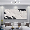
The TO898 black and white abstract diptych wall art uses bold dark forms across two coordinated panels with pale grounds. On a deep rose wall, those light areas can establish a clear separation while the black shapes give the pair weight.
Judge both panels together, including the wall visible between them. A single cropped panel does not show the full visual balance. This is a genuine two-panel product, not two unrelated paintings selected to match. If the room already contains dark furniture and strong patterns, the pair may be more assertive than you want, even though its colors technically suit the wall.

When Pink-on-Pink or Cool Blue Can Work
A painting containing pink can connect with the background without matching it. A few rose marks within a cream composition behave differently from a broad pink field whose lightness nearly equals the paint. In the first case, the surrounding pale area separates the marks from the wall; in the second, the canvas may become difficult to distinguish from a distance.
For advice about choosing the pink-colored artwork itself, the existing pink wall art guide covers that related question. Here, the pink belongs to the wall. A tonal painting earns its place only if its shape, internal contrasts or edge remain useful against that background.
Cool blue needs a similarly selective approach. TO106 combines navy, white, beige and muted blue passages. It is worth comparing with a cool mauve wall because the blue can introduce a cooler counterpoint while the pale and beige areas interrupt it. It is not a blanket recommendation for peach or warm rose.

If the blue becomes the first thing you notice every time you enter, decide whether that is welcome. A small cool accent in the artwork may support a quiet room; a substantial blue passage can shift its emphasis. Reject the combination if it only works after you imagine replacing the curtains, rug and bedding. The painting should not require a different room to justify the pairing.
Two Rooms, Two Different Decisions
A pale blush bedroom with light wood and ivory bedding: start by checking whether another light rectangle would add anything. If the headboard is simple and window light reveals the surface, ivory relief may supply detail without adding a competing color. Compare the proposed frame against the wall, not just the wood bed. A narrow, discernible edge may define the painting more effectively than an exact furniture match.
View that choice from the bed as well as the doorway. If the relief becomes nearly invisible from your resting position, decide whether its quiet presence is enough. You may prefer the more visible internal marks of a neutral abstract rather than a heavier frame around a composition that remains faint.
A deeper rose accent wall with dark furnishings and evening lighting: the main risk is accumulated visual weight. Light passages in a black-and-white pair can keep the art distinct, but its black forms join the dark furniture in the overall view. Test whether the painting supplies a needed focal point or makes that side of the room feel overly concentrated.
A pale frame can mark the edge; a dark one may recede into the surrounding composition. Neither fixes insufficient light on the painting. Look under the lamps you normally use, then compare the full pair with a quieter single work. Do not choose the stronger contrast simply because it looks dramatic in a bright product photograph.
Before ordering, settle three decisions: identify the wall's undertone, choose the level of contrast, and check the complete artwork with the intended frame under ordinary room lighting. Keep the option that answers all three without requiring a chain of other decorating changes.


Leave a comment
This site is protected by hCaptcha and the hCaptcha Privacy Policy and Terms of Service apply.