
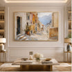
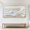
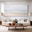
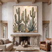
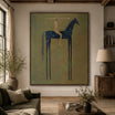

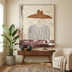
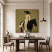
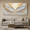
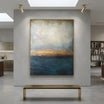
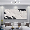
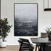
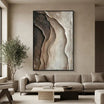


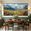

A kitchen gallery wall can work on a dry breakfast-nook or eat-in wall with room to see and enjoy the paintings. Start with a genuine two-panel work or a carefully chosen pair, rather than filling the wall with many small canvases. Areas exposed to stove heat, cooking grease, sink splashes or persistent steam are unsuitable for conventional hand-painted canvas unless specific product guidance says otherwise. Some kitchens offer no appropriate art wall; others need only one painting. Choose the location first, then decide whether a grouping earns the extra space.
First Find a Dry, Suitable Wall
Watch what reaches the proposed wall during ordinary cooking and cleanup. A position that looks sheltered in an empty kitchen may catch kettle steam or splashes when someone uses the counter. Check the wall's daily conditions before judging the arrangement. Do not rely on a single distance-from-appliance rule: room layout and exposure vary.
| Wall zone | Opportunity for art | Reason to rule it out |
|---|---|---|
| Dry breakfast nook or banquette | A compact pair can relate to the eating area | Condensation, close seating contact or an obstructing light fixture |
| Dining-side wall away from appliances | Separate canvases can create a small grouping | Steam from a nearby kettle or coffee machine still reaches the wall |
| Open-plan dining transition | A pair can identify the dining area | A busy traffic route or insufficient clear wall between fixtures |
| Active cooking or sink zone | Choose another location for conventional painted canvas | Heat, grease, splashes or persistent moisture |
A wall does not become suitable because a product photograph looks attractive beside a dining table. When comparing artworks at TactileAtelier.com, separate the painting's visual qualities from the conditions in your own kitchen. The reference images here show the products, not verified kitchen installations.
Case One: A Genuine Diptych Above a Breakfast Nook
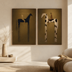
TO229's neutral abstract diptych wall art is sold as two coordinated panels. Its brown, taupe and cream layers offer a ready relationship between the compositions, so you are not trying to turn unrelated pictures into a set. A pair can provide the multiple-artwork effect without building a larger gallery around the nook.
The listed smallest size option is 2P | Each 16 x 22 inches, stated as width by height. Each nominal canvas is therefore 16 inches wide and 22 inches high. With an illustrative 3-inch gap, the canvas-only group width is:
16 + 3 + 16 = 35 inches.
On a hypothetical usable dry wall measuring 48 inches across, 48 - 35 = 13 inches remains horizontally, or 6.5 inches on each side if centered. Those numbers help you picture the grouping; they do not establish a required gap, minimum clearance or approved mounting position.

Framing can change the result. Rolled canvas measurements do not tell you the finished outside width of a stretched and framed panel. Confirm the selected finish and both outside dimensions, then revise the footprint before ordering. The wall also needs enough usable height; a width calculation alone does not prove that the pair fits above a banquette back or below a pendant.
Sit at the breakfast table and consider the combined view. A substantial banquette can give the pair a clear visual base, while a small freestanding table may make the same group seem more prominent. If you have to push either panel toward a corner to make room, one work may suit the nook better.
If you prefer an intentionally paired composition, compare other set of 2 wall art options against that same measured wall. Check whether their finished footprints leave enough room around the table, trim and lighting.
Case Two: Separate Works on the Dry Dining Side
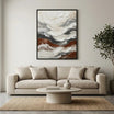
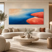
Consider a side wall in the eating area, away from the working counter and any coffee-machine steam. TO810's neutral textured abstract wall art could provide the quieter starting point, with its ivory and taupe relief. TO098's blue-gray seascape could add a controlled color accent beside it. These are independently sold artworks, not a marketed set or a photographed two-work kitchen installation.
Both product size menus currently include a 20 x 24-inch width-by-height option. At those nominal canvas sizes, an illustrative 3-inch gap produces 20 + 3 + 20 = 43 inches of canvas-only group width. Use that figure to reject an obviously narrow wall before pursuing the pairing; confirm the selected frame's outside dimensions for the actual layout.
The more important decision is whether the compositions help each other. TO810 has pale raised forms, while TO098 introduces a horizon and darker water. Place their whole product views together, then ask which attracts attention first. If the seascape dominates in a way you enjoy, let the neutral work support it. If both feel busy beside patterned chairs or a visible counter display, choose one rather than searching for a third painting to balance them.

Independent selections do not have to match every dimension or frame finish. They do need a readable relationship. Compare the scale of the main forms and the amount of dark color, not just the rectangular outlines. Matching their outside heights might simplify the arrangement, but do not force a size choice that makes one painting wrong for the wall.
Give the Group One Connection to the Kitchen
With warm oak and light stone, a restrained neutral pair may already provide enough variation. Look for a connection in the broader light-dark balance rather than trying to reproduce the cabinet color exactly. If the cabinetry has strong grain and the counter has pronounced veining, quieter compositions leave those surfaces room to remain visible.
An alternative is one controlled accent near the dining area. TO098's blue-gray water, pale sky and ochre passages could relate to a muted seat cushion or table textile without requiring every kitchen accessory to repeat blue. Judge the seascape as a complete painting: a small warm passage should not be treated as its dominant color.

TF112 offers a different, more colorful direction, with small multicolored flowers across a deep green ground. It may suit a dining wall that needs one clear accent. Beside several other detailed canvases, those scattered flowers could add more activity than the grouping needs. Compare it as an alternative to the neutral approach, not an automatic extra panel.

In a connected space, check whether the dining group competes with an existing living-room focal point. The guide to wall art for an open-plan living and dining room addresses that wider relationship. For this wall, make the narrower decision: does the small group remain useful when seen behind the dining table, or would a single supporting work do the job?
Test the Arrangement During a Normal Day
Make paper outlines of the finished outside frames and use tape appropriate for your wall finish. Place them where the artwork would actually hang, then return the chairs, tabletop objects and portable appliances to their normal positions. A layout tested against an empty wall can overlook the very things that make a kitchen difficult.
Check from a seated breakfast position and while standing at the entrance. Open adjacent doors and cabinets fully. Walk the usual route with a chair pulled out, and leave switches, outlets and fixtures usable. Do not shift the group toward cooking exposure just to improve its relationship with the furniture.
Choose a position you can access for the maker's recommended care without reaching over active cooking or a sink. Do not plan on wiping grease or splashes from painted relief, or assume a protective washable coating is present. If the wall needs frequent wet cleaning, select another location rather than treating special cleaning as part of the purchase.
Once the layout works, confirm installation guidance suitable for the artworks and the wall. Paper templates establish a footprint, not the correct anchors or hardware. Get appropriate installer advice where the wall construction or mounting method is uncertain.
Know When to Stop at One Work
A narrow wall between cabinets may have room for a single vertical painting but not two finished frames and a comfortable gap. A busy nook may also benefit from one quieter composition. If exposure is the problem, reducing the artwork count does not fix it; leave that wall unoccupied by conventional painted canvas.
Before ordering, confirm that:
- The selected wall stays dry and outside cooking, splash and steam exposure.
- The finished frames fit without crowding trim, lighting or everyday access.
- The pair looks coherent from the table and the normal approach.
- Each additional work contributes more than an empty space would.
Order the genuine pair if its coordinated compositions and finished footprint suit the nook. Choose separate works only when you want their particular relationship. If the second painting adds a compromise rather than something you enjoy, keep the single work and the breathing room around it.


Leave a comment
This site is protected by hCaptcha and the hCaptcha Privacy Policy and Terms of Service apply.