









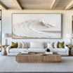





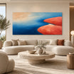
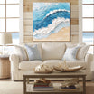
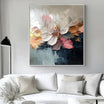
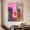


wabi sabi art is about more than filling an empty wall. It is about creating a room that feels quiet, natural, and lived in. Wabi sabi interiors often favor soft imperfection, organic texture, muted colors, and a sense of stillness. The right artwork can support that mood without making the space feel overly styled.
For homeowners who prefer natural materials, calm palettes, and tactile surfaces, wabi sabi wall art can become the quiet focal point of a room. It may be simple in composition, but it should still have presence. Texture, tonal layering, scale, and placement all matter.
This guide will help you choose wabi sabi artwork for living rooms, bedrooms, dining spaces, entryways, and other refined modern interiors.

What Makes Wabi Sabi Art Feel Different
Wabi sabi art is rooted in the beauty of simplicity, natural aging, irregularity, and restraint. In interiors, this often translates into artwork that feels organic rather than polished, quiet rather than decorative, and textured rather than flat.
Instead of sharp symmetry or highly finished surfaces, wabi sabi artwork often works through softness, uneven movement, muted tones, and tactile depth. A canvas may have layered neutrals, raised texture, subtle marks, or a composition that feels open and balanced. The appeal comes from what is understated.
This makes wabi sabi decor especially suitable for homes that use natural wood, linen, stone, clay, plaster-like walls, warm lighting, or minimal furniture. The artwork should feel connected to those materials, not separate from them.
A good wabi sabi piece does not need to be visually loud. It should help the room breathe. It can add quiet structure to a blank wall, soften modern architecture, and bring a more grounded feeling to the space.
Choosing the Right Size for Wabi Sabi Wall Art
Size is one of the most important decisions when choosing wabi sabi wall art. Because this style is usually calm and restrained, scale often does more work than color. A piece that is too small may disappear on the wall. A piece that is too large may overwhelm the softness of the room.
Start by looking at the wall and the furniture around it. Artwork should feel connected to nearby pieces, such as a sofa, bed, sideboard, console, or dining table. It does not need to fill the entire wall, but it should feel intentional.
Above a sofa, a wide horizontal canvas can create a sense of balance. The artwork should relate to the width of the seating area and leave enough breathing room around the edges. In a calm living room, this can help the wall feel complete without adding extra decor.
Above a bed, wabi sabi artwork should support rest. A large neutral piece with gentle texture can frame the bed beautifully, especially when paired with linen bedding, soft lighting, and natural wood. Avoid pieces that feel too busy or sharply contrasted if the goal is a restful bedroom.
In a dining room, a large artwork above a sideboard or main wall can bring warmth to the space. Since dining areas often include harder materials such as wood, ceramic, glass, or stone, textured artwork can make the room feel softer.
For entryways and hallways, consider how the artwork will be viewed. A smaller textured piece can work well if people pass close to it. For a longer sightline, a larger artwork with clear tonal contrast may hold the wall better.

When to Choose One Large Piece
One large piece works well when you want the room to feel calm and uncluttered. This is often the better choice for wabi sabi decor because it avoids visual fragmentation. A single artwork can create a clear focal point while keeping the wall simple.
This approach works especially well above sofas, beds, console tables, and sideboards.
When to Use a Pair or Set
A pair can work when the wall is wide or when the room already uses strong symmetry. Two related pieces may feel balanced above a long console, dining bench, or bed. Keep the palette and texture consistent so the arrangement still feels quiet.
Color, Texture, and Mood in Wabi Sabi Decor
Color is central to the mood of wabi sabi decor. The palette usually feels soft, earthy, and grounded. Common tones include ivory, warm white, beige, sand, taupe, clay, stone, muted brown, soft gray, and charcoal. These colors work well because they echo natural surfaces.
The goal is not to match every color in the room exactly. Instead, look for shared undertones. If your room has warm wood, cream upholstery, and soft beige walls, artwork with sand, ivory, taupe, or muted brown can feel naturally connected. If your room uses stone, concrete, black accents, or cooler neutrals, artwork with gray, off-white, charcoal, or soft black may feel more balanced.
Texture is equally important. Wabi sabi interiors often feel incomplete if every surface is smooth. A hand-painted canvas with real texture can bring a tactile layer to the wall. Raised details, soft marks, and tonal layering can create visual depth while keeping the composition restrained.
This is where wabi sabi artwork can be especially effective. It does not need a dramatic subject. The surface itself can carry the mood. A quiet textured canvas can give the room depth, warmth, and a more natural sense of movement.

Soft Neutrals for Restful Rooms
Bedrooms, reading corners, and meditation-like spaces often work best with soft neutral artwork. Look for gentle tonal shifts, low contrast, and a surface that feels warm rather than sharp.
Deeper Tones for Structure
If the room feels too pale or empty, deeper browns, charcoal marks, or muted black accents can add structure. Use these tones carefully. The goal is to anchor the wall, not overpower the room.
Where Wabi Sabi Artwork Works Best
Wabi sabi artwork can work throughout the home, but it is especially effective in spaces where you want calm, warmth, and natural depth.
In a living room, it can make a large wall feel more grounded. A textured neutral canvas above a sofa works well with linen seating, wood tables, ceramic lamps, and soft rugs. The artwork becomes part of the atmosphere rather than a separate decorative statement.
In a bedroom, wabi sabi wall art can support a softer mood. Above the bed, choose artwork with quiet movement and a limited palette. This helps the room feel restful and complete without adding visual noise.
In a dining room, wabi sabi art can balance hard surfaces. If the room has a wood table, stoneware, woven chairs, or plaster-like walls, textured artwork can make the space feel more layered and inviting.
In an entryway, one tactile piece can set the tone for the home. Since entry spaces are often simple, the texture and scale of the artwork can create immediate warmth.
In a home office, wabi sabi decor can soften the working environment. A calm artwork behind a desk or above a credenza can make the space feel more thoughtful while still allowing focus.

Wabi Sabi, Minimalist, and Neutral Art: How to Compare
Wabi sabi, minimalist, and neutral art can overlap, but they are not exactly the same. Understanding the difference can help you choose the right direction.
Wabi sabi art usually has an organic, imperfect, tactile feeling. It may include uneven texture, soft marks, earthy tones, or a surface that feels naturally weathered. It is well suited to rooms where you want warmth, quiet depth, and a sense of natural imperfection.
Minimalist Art is often more reduced. It may focus on clean composition, open space, and simple form. If your room is very modern or architectural, minimalist artwork can keep the overall mood crisp and uncluttered.
Neutral Art is defined more by palette than by style. It can be textured, abstract, minimalist, organic, or more structured. If your main concern is color harmony, browsing neutral artwork can help you compare pieces that work with beige, ivory, taupe, gray, brown, or soft black interiors.
All Paintings can be useful if you are still deciding which direction fits your room. You may begin with wabi sabi artwork, then compare minimalist or neutral pieces to see whether your space needs more texture, more simplicity, or more tonal contrast.
Tactile Atelier Wabi Sabi Wall Art
If you are choosing artwork for a natural, calm interior, start with Wabi Sabi Wall Art. This selection is a helpful starting point for comparing texture, scale, color mood, and composition in rooms that favor quiet depth over decorative excess.
Tactile Atelier creates hand-painted canvas art with real texture, tonal layering, and visual depth. The artworks are designed for calm, refined modern interiors where surface, material, and atmosphere matter.
Custom sizes and selected finish options may be available depending on the artwork. If you are unsure which size or format will work best, the team can help choose an artwork direction from your wall dimensions or room photo. This can be useful for wabi sabi interiors, where proportion and negative space are just as important as the artwork itself.
Free global shipping, free and fast delivery, secure payments, and a 30-day risk-free return policy help make the selection process easier.
As you compare options, think through the room first. Is the wall large or narrow? Is the furniture low or tall? Is the palette warm or cool? Does the room need more texture, more softness, or more structure? Once those answers are clear, choosing from Wabi Sabi Wall Art, Minimalist Art, Neutral Art, and All Paintings becomes much easier.

Final Thoughts on Wabi Sabi Art
The right wabi sabi art should make a room feel calmer, warmer, and more grounded. It does not need to dominate the space. Instead, it should work with natural materials, quiet colors, and simple forms to create a wall that feels thoughtful and lived in.
Choose artwork by looking at scale, texture, color, and mood together. A soft neutral canvas can calm a bedroom. A larger textured piece can anchor a living room. A more organic composition can bring warmth to an entryway, dining room, or office.
When the artwork feels connected to the room, wabi sabi becomes more than a style. It becomes a quieter way of shaping the home.
FAQs
What is wabi sabi art?
Wabi sabi art focuses on simplicity, natural texture, imperfection, and quiet beauty. In interiors, it often uses muted colors, tactile surfaces, and organic compositions to create a calm, grounded feeling.
What colors work best for wabi sabi wall art?
Soft natural colors usually work well, including ivory, beige, sand, taupe, clay, muted brown, stone gray, charcoal, and warm white. Choose tones that connect with the materials and lighting already in the room.
Where should I place wabi sabi artwork?
Wabi sabi artwork works well above sofas, beds, sideboards, console tables, dining walls, office walls, and entryways. Place it where the texture and scale can support the room’s calm, natural mood.


Leave a comment
This site is protected by hCaptcha and the hCaptcha Privacy Policy and Terms of Service apply.