















Tree art can bring the structure and atmosphere of nature into a room without making the interior feel rustic or heavily themed. A single tree creates a clear focal point, while a layered forest scene can make a wall feel deeper and more expansive.
At Tactile Atelier, tree-inspired compositions range from quiet neutral designs to darker, more expressive forest scenes. Before choosing one, compare the shape of the canopy, the density of the trees, the amount of open background, and the direction of the composition. These details have a greater effect on the room than the subject alone.

How to Choose Tree Art by Composition
The first decision is whether you want the eye to settle on one tree or move through a wider landscape. Single-tree compositions, dense forests, and abstract tree artwork each create a different visual rhythm.
Single-Tree Compositions
A single tree gives the wall one recognizable subject. The trunk creates a strong vertical or diagonal line, while the canopy controls the apparent width and weight of the image.
A broad, spreading canopy can work above a sofa, bed, or sideboard because it follows the direction of the furniture. A tall tree with a narrow crown is better suited to a slim wall, hallway, or space beside a console.
Look at the balance between branches and background. An open tree with visible gaps between the leaves feels lighter and allows more of the background to show through. A dense canopy has more visual weight and is easier to read from across a large room.
The position of the trunk also matters. A centered trunk creates symmetry and stability. An off-center tree can feel more natural and may leave useful negative space on one side of the composition.
Forest Scenes
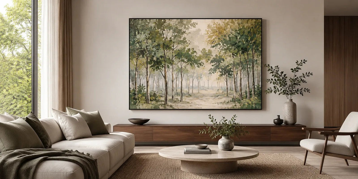
Forest art uses repeated trunks, foliage, mist, and tonal layers to create atmosphere rather than one central object. The eye moves between the trees and into the background.
A forest scene can feel open when the trunks are widely spaced and distant trees fade softly. It feels more enclosed when the canopy is dense, the foreground is dark, or very little sky is visible.
When comparing forest art, consider how much visual depth the room needs. A softly layered woodland can make a compact room feel less flat. A darker, closely packed forest creates a stronger sense of immersion but may feel heavy in a narrow room with limited natural light.
Fine branches and small leaves are easier to appreciate from nearby. For a wall viewed from across an open living area, broader tree shapes and clearer tonal divisions tend to remain more legible.
Abstract Tree Artwork
Abstract tree artwork reduces trunks, branches, and leaves to simplified marks, textured forms, or layered color. It still carries a botanical structure, but it does not describe every detail.
This approach suits rooms where realistic scenery might feel too literal. Raised marks may suggest foliage, while vertical lines create the impression of trunks. From a distance, the work may read as an arrangement of color and texture; at closer range, the tree forms become clearer.
Abstract tree paintings can also connect naturally with the straight lines of furniture and architecture. A vertical trunk may echo window frames, while a rounded canopy can soften angular seating or cabinetry.
Decide How Much Depth and Density the Room Needs
The number of trees and the amount of open space affect whether tree artwork feels airy, grounded, dramatic, or enclosed.
An open composition usually contains:
- Visible sky or a pale background
- Space between trunks and branches
- Soft changes between the foreground and distance
- A limited number of dominant shapes
- Lower contrast around the edges
This type of artwork can suit bedrooms, reading areas, and interiors that already contain patterned textiles or detailed furniture.
A denser composition may include overlapping trunks, dark foliage, or a canopy that fills most of the canvas. It creates more energy and can hold attention on a large wall. Dense forest scenes are often most effective when the furniture and accessories around them remain simple.
The background tone also changes the weight of the image. Pale gray, cream, misty green, or soft blue can make the forest feel more distant. Charcoal, black, deep brown, or dark green brings the trees forward and strengthens their silhouette.

A darker design does not automatically require a large room. It can work in a smaller space when the tree has an open canopy or the surrounding wall is left uncluttered. The problem is usually not dark color alone, but the combination of dark color, dense detail, and insufficient breathing room.
Coordinate Color and Texture with the Interior
Tree artwork does not need to match every wood tone, plant, or textile in the room. A more natural result usually comes from one shared undertone and one controlled contrast.
Green and Forest Tones
Green tree paintings can range from pale sage and olive to deep pine and blue-green. The choice affects the atmosphere of the room.
Sage and gray-green feel softer and work naturally with cream upholstery, pale wood, and warm neutral walls. Olive introduces more warmth, while deep forest green creates stronger contrast and may suit rooms with black accents, darker furniture, or rich wood.
Look for tonal separation within the foliage. When every leaf and tree uses the same shade, the composition may appear flat. Darker foreground trees and lighter distant layers create a clearer sense of space.
Neutral Tree Paintings
Neutral tree artwork relies on silhouette, shadow, and texture rather than strong color. Cream, beige, white, taupe, and gray can still produce a defined image when the leaves and branches have enough variation.
Raised leaf shapes are particularly useful in a limited palette. Light falls differently across each textured area, allowing the canopy to remain visible even when the colors are closely related.

Neutral tree paintings work well with linen, stone, oak, plaster, and low-saturation interiors. They can also be a useful alternative when you like natural subjects but do not want green to become the dominant color in the room.
Black, Gold, and Strong Contrast
Black and gold tree artwork has a more graphic presence. A dark trunk gives the composition a firm structure, while gold, ochre, or cream foliage introduces warmth and catches the light.
This direction works best when the wall has enough open space around the canvas. Avoid placing several small decorative objects close to a highly detailed canopy, as the branches and nearby accessories may compete.
Texture can make gold-toned leaves appear different throughout the day. Side lighting emphasizes raised paint and small shadows, while frontal lighting creates a flatter, more even appearance. Check the wall during both daytime and evening before deciding where to hang a heavily textured piece.
Match Tree Artwork to the Wall Shape
The direction of the tree structure should relate to the proportions of the wall.
| Tree Composition | Suitable Format | Typical Placement |
|---|---|---|
| Tall trunk with a narrow canopy | Vertical | Hallway, narrow wall, or beside a console |
| Single tree with broad branches | Square or horizontal | Above a sofa, bed, or sideboard |
| Repeated trees with visible depth | Wide horizontal or panoramic | Main living or dining wall |
| Dense abstract canopy | Large square or horizontal | Open feature wall |
| Small group of trees | Compact horizontal | Office, reading corner, or smaller bedroom |
A panoramic forest scene works because the repeated trunks and layers lead the eye across the canvas. A single tree does not always need the same width; its canopy may sit more naturally within a square or moderately horizontal format.
Above furniture, the artwork should feel connected to the piece below it without extending beyond it. Instead of relying on a fixed formula, compare the artwork with the visible furniture width and the empty wall around it.
Viewing distance is equally important. A wide forest painting with subtle mist and fine trunks may work well where people can step closer. Across a large open room, a stronger foreground or clearer canopy shape will usually be easier to read.

Before ordering, mark the proposed dimensions on the wall with removable tape. Check the outline from the doorway, seating position, and any adjoining area. This helps you judge both scale and the amount of open wall that will remain around the artwork.
When you are still comparing trees with other natural or abstract subjects, All Paintings offers a broader view before you commit to one direction.
Choose a Tree Painting for the Way the Room Is Used
Rather than following a different rule for every room, consider how the artwork will be viewed and how much visual activity already exists in the space.
In a living room, the painting is often seen from across the room. Broad canopies, distinct trunks, and panoramic forests remain easier to read than very fine branches. A denser design can become the main focal point when the furniture is simple.
In a bedroom, the artwork is usually viewed for longer periods and at a quieter pace. Open branches, misty layers, muted greens, and neutral tree paintings are often easier to live with than highly contrasted forests. Darker art can still work when the canopy has enough open space.
Dining areas can support stronger contrast and more detailed tree paintings because the viewer is often seated closer to the wall. Repeated trunks, visible brushwork, and textured foliage can reward closer viewing.
In an entryway or hallway, prioritize a clear shape. A vertical tree or compact group of trunks can be understood quickly while moving through the space. Very intricate forest scenes may lose their effect when there is no suitable viewing distance.
The existing materials in the room also affect the result. A highly textured tree may be enough detail for a space with plain walls and solid upholstery. If the room already contains wood grain, patterned fabric, shelving, or architectural molding, a simpler canopy may create better balance.
Compare Tree Art at Tactile Atelier
Once you know whether the room needs a single focal tree, an open woodland, or a denser forest scene, compare the available artwork by canopy shape, color, texture, and format.
The Trees & Forests selection includes hand-painted canvas art with real texture, tonal layering, and visual depth. The work ranges from misty forest landscapes to neutral and gold-toned tree compositions designed for considered modern interiors.
Custom sizes and selected finish options may be available depending on the individual artwork. The team can help you compare size, orientation, or artwork direction using wall dimensions or a room photo. Include the furniture width, available wall height, and a clear view of the surrounding colors when requesting guidance.
Best Sellers can provide another reference when you want to compare familiar formats and palettes before narrowing the choice by subject.
Free global shipping and free and fast delivery are available according to the applicable destination and order terms. Secure payments and a 30-day return window are also available for eligible orders under the current return policy.
The right tree art should relate to the shape and atmosphere of the room, not simply fill an empty wall. Start with the tree structure, then compare forest density, background depth, color, texture, and viewing distance. When those elements work together, the artwork can introduce a natural focal point without making the interior feel overly themed.
FAQs
What is the difference between tree art and forest art?
Tree art may focus on one tree, a small group of trees, or an abstract branch structure. Forest art usually repeats trunks and foliage across a wider composition to create a stronger sense of atmosphere and depth.
Should tree artwork match the wood tones in the room?
It does not need to match exactly. Look for a related warm or cool undertone, then use some contrast so the trunk and foliage remain visible against the furniture and wall.
Can forest art make a small room feel more open?
A forest scene with softened background trees, visible distance, and enough pale or open space can make a wall feel less flat. Very dark, densely packed forests may feel more enclosed when the room already has limited light.
```


Leave a comment
This site is protected by hCaptcha and the hCaptcha Privacy Policy and Terms of Service apply.