

















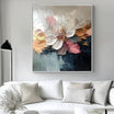



Flower paintings can introduce softness, color, and natural movement without making a room feel overly decorative. The main challenge is choosing a composition that works with the wall, furniture, and atmosphere you already have.
Instead of starting with a favorite flower alone, compare the scale of the blooms, the amount of open background, the strength of the colors, and the direction of the composition. These details determine whether a piece feels quiet, expressive, spacious, or visually dense. Browsing the Flowers & Botanicals selection can help you compare these differences side by side.

How to Choose Flower Paintings by Composition
The subject may be floral, but the composition determines how the artwork behaves in the room. Two paintings with similar colors can feel completely different when one shows a single large bloom and the other uses dozens of small flowers.
Recognizable Flowers
Clearly defined petals, stems, and leaves give the eye an immediate subject. This type of flower artwork can add warmth to rooms with simple furniture, plain fabrics, or clean architectural lines.
A recognizable composition does not have to feel traditional. Cropped blooms, simplified outlines, and unexpected color combinations can keep it current. A few flowers with open space around them usually feel lighter than a full arrangement that reaches every edge.
Abstract Floral Forms
Abstract florals suggest petals and botanical movement through curved marks, layered color, and textured shapes. They are useful when you want the softness of flowers without a literal bouquet.
From across the room, an abstract piece may read first as color and movement. The floral details become clearer at a closer distance, making this style suitable for open living areas where the artwork is seen from several positions.
Oversized Blooms and Small Flower Clusters
An oversized flower creates a strong silhouette and remains easy to read even on a moderately sized canvas. Small blossoms or clustered wildflowers create more rhythm and detail, but can feel busier. They work best when the wall has breathing room and the surrounding furniture is restrained.

Consider Floral Density and Negative Space
One useful way to compare floral art is to look at how much of the canvas is active and how much is left open.
A dense arrangement creates energy. Overlapping petals, leaves, and stems can suit a main living room wall or dining area where the painting has room to hold attention. A composition with more negative space feels quieter. A few blooms against a pale or softly textured background can work well in bedrooms, reading corners, and rooms that already contain several patterns or materials.
The background also changes the apparent weight of the flowers. Pale backgrounds make dark or colorful petals appear crisp. Deep backgrounds make light flowers more dramatic, while mid-tone backgrounds create a softer transition.
Consider viewing distance as well. Fine stems and small petals can be rewarding up close but may merge into a single field of color from across a large room. Broad petals and stronger silhouettes remain clearer at a distance.
Choose a Color Direction That Works with the Room
The painting does not need to repeat every color already present. Instead, identify one connection and one contrast. The connection might be a warm neutral related to the sofa or rug. The contrast might be a burgundy flower, green stem, or small gold detail that gives the wall more definition.
Blush, Rose, and Burgundy
Soft pink florals work well with cream, warm white, beige, light wood, and muted gray. Blush keeps the composition light, while dusty rose and burgundy add more structure.
On a large wall or above dark furniture, a stronger rose or wine-colored accent can prevent the artwork from appearing faint. In a smaller bedroom, a paler composition with more open background may feel more natural.
The Pink Wall Art selection is useful for comparing how blush, rose, and deeper pink tones change a composition.

White, Cream, and Neutral Florals
Neutral floral art depends on value, shadow, and surface variation rather than strong color. White flowers against cream, taupe, gray, or beige remain visible when the petals have distinct edges or the background is slightly darker.
This direction pairs naturally with linen, pale timber, and stone. Neutral Art can also provide a useful comparison when you are deciding whether the room needs a clearly botanical subject or a less literal composition.
Multicolor Florals
A multicolor painting works best when one color family leads the composition. Warm reds and pinks, for example, may be supported by smaller areas of blue, green, or yellow. This keeps the artwork organized rather than equally divided between competing tones.
In a room with solid upholstery and simple finishes, a colorful floral piece can provide the main pattern. If the space already contains patterned textiles, choose fewer colors or larger, simpler flower forms.
Match the Format to the Floral Structure
Size matters, but format is often the better starting point. The direction of the stems, petals, and flower clusters should make sense within the shape of the wall.
| Floral Composition | Suitable Format | Typical Placement |
|---|---|---|
| Tall stems or climbing forms | Vertical | Narrow wall or beside a console |
| Wide meadow or layered flower field | Horizontal or panoramic | Above a sofa, bed, or sideboard |
| One oversized bloom | Square or vertical | Entry area or compact feature wall |
| Dense abstract petals | Large horizontal | Main living room or dining room wall |
| Two balanced flower groups | Wide horizontal | Centered above long furniture |
Above furniture, the painting should look connected to the piece below it without extending beyond it. A wide sofa generally needs a horizontal composition with enough visual weight. A narrow console may work better with a vertical painting or compact square.
Mark the proposed dimensions on the wall with removable tape or paper, then step back to the usual viewing position. This reveals whether the composition has enough presence and whether the surrounding wall still feels open.
In smaller rooms, a restrained background can make a larger canvas feel less heavy. On broad walls, a small, intricate painting may appear lost unless it is placed within a more compact furniture arrangement.
How Texture Changes Floral Artwork
Texture should support the structure of the flowers rather than appear as a separate effect.
Raised paint along petal edges can make individual blooms easier to distinguish. Thicker marks near the flower center create weight, while softer outer edges keep the form from feeling rigid. Leaves and stems often benefit from a different texture so they remain distinct from the flowers.
A smoother background allows heavily textured petals to stand forward. When both the background and flowers use strong texture, the result feels more immersive but may need more open wall space around it.

Side lighting reveals raised edges and small shadows most clearly, while frontal light creates a flatter, more even view. Texture also changes with distance: from across the room it supports the overall shape, while up close the brushwork and layered edges become more visible.
Compare Flower Artwork with the Room in Mind
In a living room, broad flowers or a horizontal floral field can anchor a sofa, while a more open composition can keep a smaller space from feeling crowded.
In a bedroom, softer transitions and fewer competing shapes are often easier to live with. The artwork does not have to be pale; burgundy, deep green, or muted gold can still work when the composition has enough open background.
Dining rooms can support denser arrangements and stronger contrast. In an entry area, a single clear bloom or vertical botanical composition can establish the mood without requiring several smaller pieces.
Tactile Atelier creates hand-painted canvas art with real texture, tonal layering, and visible depth. Custom sizes and selected finish options may be available depending on the individual artwork. The team can also help compare size, format, or artwork direction using wall dimensions or a room photo.
When you are still deciding between floral and non-floral subjects, Neutral Art and All Paintings can provide a wider point of comparison. Start with the wall shape and the amount of visual energy the room needs, then narrow the choice by composition, color, and texture.
Tactile Atelier offers free and fast global delivery, secure payments, and a 30-day risk-free return. Rather than choosing flower paintings by color alone, compare how the blooms occupy the canvas, how the background controls the mood, and how the format relates to the wall. Those decisions will have the greatest effect on how naturally the artwork fits the room.
FAQs
What is the difference between botanical art and abstract flower paintings?
Botanical art usually gives more attention to recognizable stems, leaves, and plant structure. Abstract flower paintings use color, shape, texture, and movement to suggest floral forms without describing every detail.
Can flower paintings work in a minimalist room?
Yes. Choose a limited palette, a clear silhouette, and enough negative space around the flowers. One well-scaled piece usually feels more consistent with a minimalist room than several small, detailed artworks.
Should floral artwork match the room’s existing colors?
It does not need to match exactly. Look for one or two colors that connect with the room, then allow the artwork to introduce a controlled contrast. This keeps the result coordinated without making it look overly planned.


Leave a comment
This site is protected by hCaptcha and the hCaptcha Privacy Policy and Terms of Service apply.