









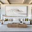





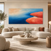
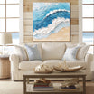

Abstract landscape art refers to the natural world without always describing a specific place. A painting may suggest a horizon, shoreline, mountain or changing sky through simplified shapes, layered color and textured marks.
Some works remain clearly recognizable as landscapes. Others retain only a feeling of distance, weather or terrain. Understanding that range helps explain why two paintings carrying the same subject label can look entirely different.
At Tactile Atelier , abstract landscapes can be compared by how they organize space, which natural clues they preserve and how color and texture contribute to the atmosphere. These qualities are more useful than trying to identify the exact location shown.
What Makes a Painting an Abstract Landscape?
An abstract landscape begins with visual ideas associated with land, sky, water, vegetation or weather. The artist may simplify, blur, fragment or rearrange those elements rather than depict them realistically.
A mountain might become an uneven dark mass. A shoreline may appear as a break between two horizontal color fields. Clouds can be suggested through pale layers and softened edges instead of clearly outlined forms.
This differs from a traditional landscape, where the main natural features and sense of place remain easy to identify. It also differs from fully nonrepresentational abstract art, which may not refer to a physical environment at all.
The boundary is flexible. A painting does not stop being a landscape simply because its forms are ambiguous. If the composition creates a convincing relationship between foreground and distance, land and sky, or surface and atmosphere, the landscape reference may still be present.
For a broader comparison of landscape subjects, formats and room placement, see the Landscape Painting Guide . This article focuses specifically on how abstraction changes the way a landscape is read.
Choose the Level of Abstraction
Abstract landscape art can be grouped into three practical categories. These are viewing tools rather than formal classifications, but they make different works easier to compare.
Recognizable Abstract Landscapes

A recognizable abstract landscape retains identifiable features such as mountains, trees, fields, water or a visible horizon. Shapes and colors may be simplified, but the viewer can still understand the setting quickly.
This type of painting suits someone who wants an obvious connection to nature without the detail of a traditional scenic work.
Look at which elements carry the subject. It may be the silhouette of a mountain, the reflection of water or the division between land and sky. The remaining areas can be highly abstract without losing the overall landscape.
Suggestive Landscapes

A suggestive landscape contains enough visual structure to imply a natural setting, but the scene remains open to interpretation.
One viewer may see a coastline, while another sees a field beneath a misty sky. Softened boundaries, incomplete forms and layered transitions allow several readings without making the composition feel random.
This middle range combines familiarity with ambiguity. It is often suitable for buyers who want a natural atmosphere but do not want the artwork tied to one literal location.
Atmospheric Abstraction
An atmospheric abstraction may contain no clearly defined trees, mountains or water. The landscape is communicated mainly through color, light, movement and a sense of depth.
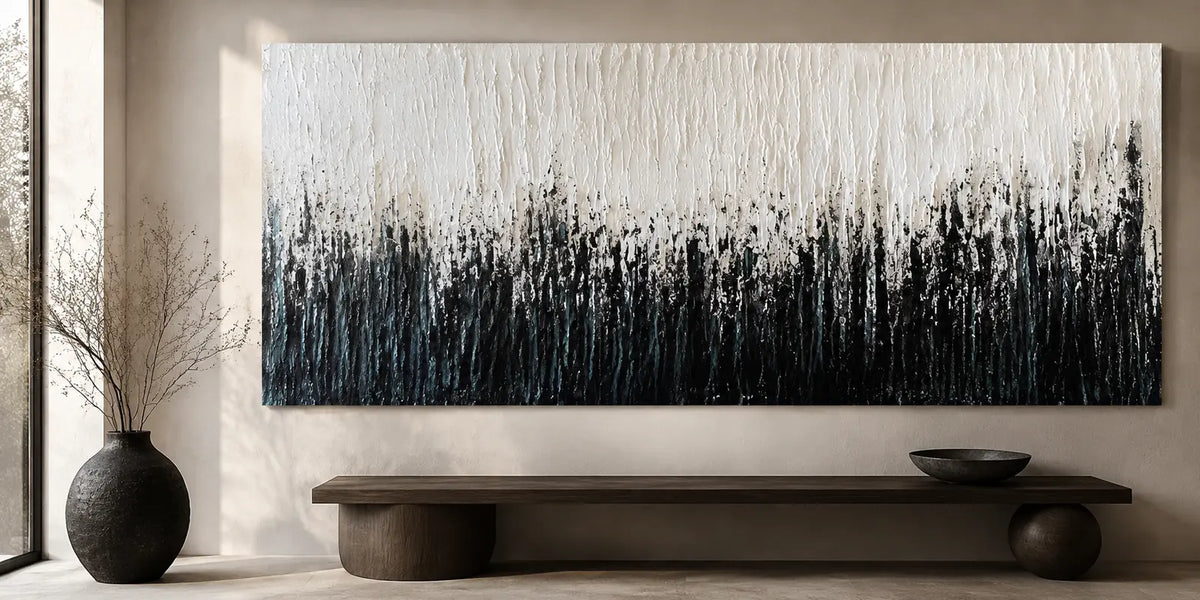
A long horizontal division may function as a horizon. Pale layers can suggest fog or open sky. Darker textured areas may imply land, rock or distant weather.
This direction suits viewers who respond more strongly to atmosphere than subject. The image remains connected to landscape, but it does not settle into one fixed scene.
Find the Horizon—or What Replaces It

The horizon is one of the strongest visual clues in landscape art. Even when no line is clearly drawn, a change in color, texture or paint density may divide the composition into areas that feel like land and sky.
A low horizon gives more space to the upper area. This can suggest open sky, distance or changing weather.
A high horizon places more emphasis on the surface below. The painting may feel grounded, enclosed or focused on terrain.
A horizon near the center creates a more balanced division, though the effect depends on whether the two areas are similar or strongly contrasted.
Some abstract landscapes remove the horizon completely. In these works, depth may be created through overlapping forms, changes in tonal value or marks that become softer and less distinct toward the background.
Do not look only for a literal line. Ask what separates near from far and what allows the eye to move into the image.
Read Edges, Movement and Gesture
The treatment of edges affects how clearly the landscape is perceived.
Hard edges define a form and give it more visual authority. A sharply bounded dark area may read as a mountain, cliff or foreground even when it contains little detail.
Soft edges allow forms to merge. They can suggest fog, reflections, distant hills or changing light. When most boundaries are softened, the painting tends to feel more atmospheric.
Movement provides another clue. Horizontal marks often imply distance, still water or layered terrain. Upward strokes may suggest trees, cliffs or rising land. Diagonal movement can evoke slopes, wind or unstable weather.
Circular or repeated gestures may represent vegetation, water or cloud movement without describing those elements literally.
Follow the direction of the marks before deciding what the painting depicts. Their rhythm often communicates more than the individual shapes.
Look at Layering and Spatial Depth
Abstract landscapes do not need traditional perspective to create distance. They can establish space through overlapping layers, tonal changes and differences in detail.
Darker or more textured passages often appear closer. Paler, smoother or less distinct areas tend to recede. A transition from heavy foreground marks to softened background color can create a convincing sense of depth without a recognizable path or mountain range.
Transparency also matters. Thin layers that allow earlier colors to remain visible may resemble haze, reflected light or changing weather. Opaque areas feel more solid and can suggest land or rock.
Open areas are not necessarily unfinished. A large quiet field may function as sky, mist or distance while giving denser marks room to stand out.
When comparing paintings, consider whether the layers draw the eye inward or keep attention on the painted surface. Both approaches can work, but they produce different experiences.
Understand What Color Is Suggesting
Color in an abstract landscape may describe an environment, but it can also suggest temperature, season, time or weather.
Ochre, clay, brown and muted green often imply earth, vegetation or dry terrain. Blue-gray, sand and softened white can suggest water, coast or open sky. Pale gray and cream may create the impression of mist or distant light.
The relationship between colors matters more than the individual names. A gradual transition from dark to light can create distance. Closely related tones may soften boundaries, while strong contrast can make separate areas feel more solid.
Unexpected colors can still read as landscape. Violet, pink, gold or orange may suggest sunset, heat, changing weather or an imagined environment when the composition retains spatial movement.
Ask what the palette makes you sense before deciding what it represents. Does it feel warm or cool, dry or humid, still or unsettled? Those impressions often reveal the intended atmosphere more clearly than a literal subject description.
How Texture Supports the Landscape

Texture can give abstract landscape art a physical connection to the natural world.
Rough, irregular areas may suggest rock, soil or erosion. Long directional ridges can evoke moving water, wind or grass. Thin layered paint may create a sense of clouds, mist or distant weather.
The position of the texture is important. Dense texture across the lower canvas may act as a foreground. Texture distributed evenly across the entire surface keeps attention on the material itself and may make the work feel more abstract.
Raised areas also create real shadow, but texture should not be judged only by how dramatic it looks in close-up photography. Consider whether it supports the movement and spatial structure of the painting.
A convincing abstract landscape does not use texture as decoration added after the composition. The surface marks should help establish terrain, atmosphere or distance.
How to Compare Two Abstract Landscapes

When two paintings initially appear similar, compare them in a consistent order.
First, identify how much of each scene is recognizable. Decide whether you prefer an immediate natural reference or a more ambiguous atmosphere.
Next, find the horizon or the visual division that replaces it. Look at whether the composition feels open, enclosed, grounded or distant.
Follow the edges and gestures. Determine whether the painting is organized through horizontal calm, upward growth, diagonal energy or softened transitions.
Then examine how color creates temperature and distance. Do not compare dominant colors alone; compare the relationship between light and dark areas.
Finally, study the texture. Look at where it is concentrated and what it contributes to the landscape idea.
The Landscape Art collection includes works ranging from recognizable scenery to atmospheric abstraction. Compare full views and close-up details so that subject, structure and surface are considered together.
Final Thoughts
The most suitable abstract landscape is not necessarily the one whose subject is easiest to name. It is the one whose horizon, movement, color and texture create an atmosphere you continue to respond to.
Choose a recognizable abstract landscape when you want a clear connection to nature. Consider a suggestive landscape when you prefer more interpretive space. Choose atmospheric abstraction when mood, light and surface matter more than literal scenery.
Once you understand how the painting builds its landscape, it becomes easier to compare works on their own terms rather than judging them only by color or product title.


Leave a comment
This site is protected by hCaptcha and the hCaptcha Privacy Policy and Terms of Service apply.