


















Equestrian wall art for modern interiors is most successful when the horse is part of a visual composition, not a decorating theme. A close portrait, a poised rider, and moving horses may share a subject while creating different levels of intimacy, rhythm, and visual weight. Before comparing colors or dimensions, read where the eye settles, how movement travels, how much space surrounds the horse, and how strongly the painted surface asserts itself. The useful question is not only “Do I like this horse?” but “What role will this artwork play in the room?”
Start With the Role of the Horse in the Composition
The horse may be the sole focal point, one half of a relationship, or a repeated form within a larger pattern. In a modern interior, the more useful question is how that figure is edited: isolated by negative space, tightly cropped, or placed within a wider composition.
A portrait creates one concentrated focus; a horse-and-rider image adds human scale and narrative; multiple horses introduce rhythm. Contemporary character comes from how those subjects are organized. Open canvas, simplified clothing or scenery, altered proportions, and uneven emphasis between figures can keep the work from reading as genre décor.
Look for a clear hierarchy. One dominant silhouette supported by quieter forms feels controlled, while several equally strong figures create a denser visual field. The arrangement should read first as a deliberate composition, with the equestrian subject supplying its character.
Partially abstracted horses behave differently again. The animal may remain recognizable, but line, color field, silhouette, and negative space do as much work as anatomy. In the Minimalist Horse Wall Art #MT008, the elongated horse and symbolic figure are held within a restrained field rather than a literal landscape. The subject reads clearly, yet the open background allows the piece to function first as a composed modern image.

If you need a broader comparison of pose, figure count, and canvas direction, the existing guide to choosing horse artwork for your home covers those fundamentals. Here, the more specific decision is how the equestrian subject establishes contemporary visual character.
Decide How Literal or Artistic You Want the Image to Feel
Literal equestrian artwork asks the viewer to look at the horse itself. Expression, tack, posture, and surrounding scenery carry much of the meaning. That directness also makes period clothing, landscape, or riding references more prominent, so examine how much descriptive detail surrounds the animal.
Minimal and expressive interpretations reduce those signals. A simplified background prevents scenery from defining the style, while loose edges or altered proportions shift attention toward shape. A curved back may become an arc, a mane may dissolve into directional marks, and the body may merge with surrounding color.
Abstraction can make equestrian imagery easier to place in a contemporary home because edited forms, controlled contrast, and deliberate space relate naturally to modern furnishings. The equestrian wall art collection includes literal, minimalist, figurative, folk, and surreal approaches that can be compared on this basis.
Read Movement Before You Choose Color
Movement changes how a painting directs attention through the room. Start with the horse’s posture, but continue through the entire composition. A stationary, centered horse with level horizontal lines tends to create stability. A lifted leg, turned head, or forward lean introduces a quieter sense of motion. Running bodies, diagonals, repeated limbs, and cropped figures produce stronger directional energy.
In horse-and-rider art, the rider can either reinforce or counter that movement. An upright, balanced rider may calm an active horse. A leaning body or sweeping garment can accelerate the image. Reins are especially influential because they draw visible paths across otherwise open areas.
The Modern Surreal Equestrian Wall Art #MT034 demonstrates this distinction. The horse remains poised, but the looping rein travels widely through the olive field. That single gestural line gives the restrained palette a larger radius of movement. The painting feels animated without depending on vivid color or a crowded scene.

When comparing two works, trace the strongest line with your eye. Does it hold you near the center, move you steadily across the canvas, or send attention toward an edge? Choose calm presence when the room already contains several directional elements. Choose visible movement when a restrained interior needs rhythm.
Judge Visual Weight, Not Just Physical Size
Two paintings with identical dimensions can occupy a wall very differently. Visual weight comes from the concentration of dark values, contrast, dense figures, large painted masses, limited negative space, and heavy surface activity.
A dark horse against a pale field creates a compact, high-contrast focal point. It may feel stronger than a larger pale composition with soft edges. Multiple figures increase weight because the eye must process repeated bodies and relationships. Edge-to-edge imagery also feels fuller than a central figure surrounded by open canvas.
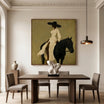
The Neutral Figurative Equestrian Wall Art #MT011 uses a dark horse and pale rider as a concentrated vertical mass. The beige ground remains quiet, but the charcoal form gives the painting authority. It is a useful example of restrained color producing substantial presence through contrast rather than saturation.

Evaluate a prospective piece from a normal viewing distance. Squint slightly or view a thumbnail: the areas that remain most visible carry the greatest weight. This test is more useful than relying on dimensions alone, because it shows whether the artwork will act as a quiet layer, a focused accent, or the dominant visual anchor.
Match the Palette to the Room Without Matching Everything
Color should establish a relationship with the interior, not reproduce it. Exact matching can make a room feel over-coordinated, especially when the painting repeats the sofa, rug, and accessories at the same intensity.
Earthy neutrals—olive, beige, brown, warm gray, and black—share undertones with timber, stone, linen, and plaster. Repeating one undertone is often enough; an olive field can relate to stone veining or a muted textile without requiring green accessories throughout the room.
Monochrome and high-contrast work creates a more architectural presence. A black horse against cream can echo dark window frames or a single metal detail, giving the room structure. Muted atmospheric colors create a softer link: blue-gray, dusty green, or weathered earth tones can establish distance around the figure without making the subject decorative.
Repeat temperature or undertone when you want continuity, and introduce controlled contrast when the room lacks definition. Allow some colors to remain unique so the painting feels collected rather than matched.
Choose Between Quiet Presence and a Statement Piece
Use the visual-weight assessment to assign the artwork a role. Where patterned textiles, sculptural furniture, shelving, or strong architecture already lead, let the equestrian piece remain secondary. In a restrained room, it can become the focal point if surrounding elements support rather than compete with it.

Compare the room and painting as two compositions. If both have many equal focal points, the result feels unsettled; if neither has one, the space feels unresolved. Give one element priority and let the others support it.
Use Texture to Add Interest Without Adding More Color
Texture becomes useful when you want visual richness but prefer a restrained palette. Visible brushwork can articulate a mane or garment; layered paint can separate a horse from a tonal background; raised areas create small highlights and shadows as the viewer moves.
Texture also affects distance. Fine brush marks reward closer viewing but may merge into tone from across the room. Broader palette-knife passages remain legible farther away and increase the apparent weight of the painting. Look at both full-room photography and detail images before buying hand-painted work online, because a frontal product image may not reveal how the surface responds to angled light.
Treat texture as a supporting factor here. It should reinforce the silhouette, movement, or atmosphere already present rather than compensate for a composition that does not suit the room.
A Quick Equestrian Art Decision Framework
| If You Want... | Look For... |
|---|---|
| Quiet sophistication | Negative space, restrained palette, limited figures |
| Strong focal point | Clear silhouette, concentrated horse form, stronger contrast |
| Movement | Riders, diagonals, flowing lines, directional forms |
| Contemporary character | Abstraction, simplified background, unconventional composition |
| Softer atmosphere | Muted tones, dispersed edges, layered brushwork |
| Greater visual impact | Darker values, multiple figures, stronger contrast |
FAQs
Can equestrian wall art work in a modern home?
Yes. Look for edited compositions, clear visual hierarchy, negative space, controlled palettes, and artistic treatments that emphasize line and form. Minimal, abstract, or surreal equestrian artwork can read as contemporary art first while keeping the horse recognizable.
How do I choose horse art without making my room look Western?
Avoid relying on ranch settings, period clothing, rustic motifs, or detailed narrative scenery. Choose simplified backgrounds, restrained colors, abstraction, unusual proportions, or modern figurative treatment. The subject can remain equestrian without defining the entire decorative style.
Choose by Visual Character
The decision sequence is subject, composition, movement, visual weight, palette, then texture. Start with what the horse and accompanying figures do inside the painting. Next decide how forcefully the image should direct attention and how it relates to the room’s existing visual activity. Color and surface can then refine that role. Comparing work this way prevents equestrian imagery from becoming a theme and makes it easier to recognize the piece that belongs in a modern home. Tactile Atelier offers contemporary treatments to compare through that lens.


Leave a comment
This site is protected by hCaptcha and the hCaptcha Privacy Policy and Terms of Service apply.