









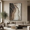





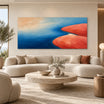
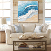
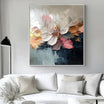

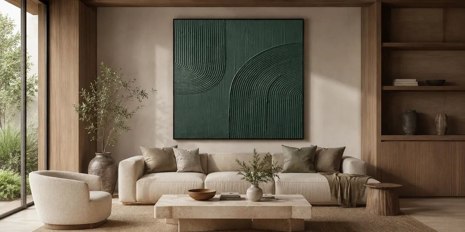
Choosing green wall art is a thoughtful way to bring a natural, grounded feeling into a modern home. Green can feel soft and restful, earthy and organic, or deep and structured depending on the shade, texture, scale, and room around it.
For interiors with wood, linen, stone, plants, ceramic, warm light, or neutral furniture, green artwork can help connect the room visually. It adds color without making the space feel overly bright. At Tactile Atelier, green art is approached as part of the room’s atmosphere, with hand-painted canvas pieces that use real texture, tonal layering, and visual depth.
A muted green canvas can soften a bedroom, a deeper green artwork can anchor a living room, and textured green art can add depth to a wall that feels too plain.
This guide explains how to choose green wall decor by shade, size, placement, texture, and room mood, so the artwork feels natural in the space rather than simply added to the wall.

Why Green Wall Art Works in Modern Interiors
Green wall art works well because green sits between warm and cool color families. It can feel fresh, quiet, earthy, or dramatic depending on how it is used. This flexibility makes it especially useful for modern interiors that need color, but not too much visual noise.
In a room with natural materials, green often feels easy to place. It works with oak, walnut, stone, linen, rattan, clay, matte ceramics, and soft neutral fabrics. If the space already includes plants or organic textures, green artwork can make those elements feel more intentional.
Green also helps shape the atmosphere of the room. Soft sage can make a bedroom feel more relaxed. Olive can add warmth and depth to a living room. Forest green can give a large wall more structure. Blue-green can feel cooler and more atmospheric, especially in interiors with gray, stone, or off-white tones.
The surface of the artwork matters as much as the color. A hand-painted canvas with real texture, tonal layering, and visual depth can make green feel richer and more natural. Instead of reading as a flat color, the artwork becomes part of the room’s material language.
That is why green is a strong choice for people who prefer natural interiors. It adds presence, but it can still feel restrained.
Choose the Right Shade of Green for Your Space
Not every green creates the same mood. Before choosing artwork, look at the room’s existing color palette, materials, and lighting. The right shade should support the space rather than fight it.
Soft sage green is one of the easiest shades to use in modern homes. It pairs well with cream, beige, warm white, light wood, pale gray, and linen. Sage is a good choice when you want the room to feel quiet and natural without making the artwork too dominant.
Olive green feels warmer and more grounded. It works well with walnut, brown leather, clay tones, beige upholstery, stone, and darker wood. Olive green wall decor can make a room feel more layered, especially when the surrounding palette is neutral.
Deep forest green or emerald green creates more contrast. These shades are stronger and more visually present. They can work well on a large living room wall, above a dining sideboard, or behind a desk when the room needs a more defined focal point.
Blue-green tones sit between green and cooler color directions. They can feel calm, atmospheric, and slightly more contemporary. This direction works well with soft gray, off-white, stone, black accents, or rooms with a quieter coastal influence.

Soft Green for Relaxed Rooms
Soft green is often the safest choice for bedrooms, reading corners, and relaxed living spaces. It works well when the goal is to create a natural mood without strong contrast.
Deeper Green for Structure
Deeper green works best when the wall needs more weight. It can help anchor light furniture, balance a large blank wall, or add more definition to a simple room.
Size and Placement: Make Green Artwork Feel Intentional
Size is one of the most important choices when buying green wall art. Even if the color is subtle, the artwork still needs to feel properly scaled to the room.
Before choosing a piece, measure the wall width and look at the furniture below it. A sofa, bed, console, sideboard, or desk should guide the artwork size more than the empty wall alone. The goal is to make the artwork feel connected to the room’s layout, not floating separately on the wall.
Above a sofa, a wide green canvas can create a clear focal point. Horizontal formats usually work well because they follow the shape of the seating area. Leave enough space around the artwork so the wall still feels open, especially if the green tones are deep.
Above a bed, choose green art that supports rest. Sage, olive, muted botanical tones, and soft abstract movement can work well. A large piece can frame the bed, but it should not feel too active for a sleeping space.
Above a sideboard or console, green wall decor can bring warmth and definition to dining rooms, entryways, and hallways. This placement works well when the artwork connects with objects nearby, such as a lamp, vase, ceramic piece, or natural wood furniture.
In a home office, green artwork can make the space feel more composed. A balanced green canvas behind a desk or above a credenza can add character without making the room feel distracting.
Large Blank Walls
A large blank wall usually needs a larger piece or a strong composition. One substantial artwork can create structure without requiring many smaller decor items. In open-plan spaces, a larger green painting can also help define a living or dining area.
Smaller Spaces
In smaller rooms, choose softer greens, lighter backgrounds, or more open compositions. Dark green can still work, but it should be balanced with enough light, negative space, and simple furniture.
Texture and Depth in Green Artwork
Texture is especially important with green artwork because it can make the color feel more organic. A flat green surface may look clean, but a textured hand-painted canvas has more movement and depth.
Raised texture catches light. Tonal layering creates variation. Brushwork and surface detail help the artwork feel connected to natural materials in the room. This is useful in modern interiors where walls, furniture, and finishes can sometimes feel too smooth.
Green abstract art can be especially effective when layered tones and organic forms create movement without overwhelming the room. The composition does not need to be busy. A quiet arrangement of sage, olive, cream, gray, or deep green can still give the wall enough visual interest.
Texture also changes with lighting. In daylight, the artwork may look soft and natural. Under evening lighting, shadows across the surface can make the green tones feel deeper. If the artwork will be placed near a window, lamp, or wall sconce, consider how light will affect the surface throughout the day.
A textured green artwork can work in several styles. It can feel calm in a minimalist room, natural in an organic modern space, or more refined in a contemporary interior. The key is choosing the right balance of color, surface depth, and composition.

Where Green Wall Decor Works Best
Green wall decor can work throughout the home, but each room needs a slightly different approach.
In a living room, green artwork often works well above the sofa. It can connect beige upholstery, wood furniture, plants, and neutral rugs. If the space feels too plain, a textured green canvas can add more depth without requiring a brighter color palette.
In a bedroom, green can support a restful atmosphere. Soft sage, olive, or muted botanical tones work well with linen bedding, warm lighting, and natural wood. Above the bed, choose a piece with enough presence to frame the room, but not so much movement that it feels restless.
In a dining room, green artwork can make the space feel more inviting. It pairs naturally with wood tables, ceramic pieces, woven chairs, and warm light. A larger green artwork above a sideboard can define the dining wall while keeping the table area clean.
In an entryway, a single green piece can create a natural first impression. It works well above a console, especially when paired with simple materials such as wood, stone, clay, or matte metal.
In a home office, green art can help soften the working environment. A balanced composition behind a desk or on a side wall can make the room feel more finished without pulling too much attention.
Compare Green Wall Art With Abstract, Contemporary, and Modern Styles
When choosing artwork, color is only one part of the decision. Style, composition, and surface texture also affect how the room feels. Use the comparison below to clarify what your space needs.
| Artwork Direction | Room Mood | Best For |
| Green Wall Art | Natural, grounded, organic | Rooms with wood, plants, linen, stone, or earthy neutral tones |
| Abstract Art | Expressive, layered, fluid | Spaces that need movement or a stronger focal point |
| Contemporary Art | Current, polished, design-led | Modern homes, offices, entryways, and dining rooms |
| Modern Art | Clean, versatile, structured | Interiors with simple furniture and restrained styling |
Green Wall Art is a strong starting point when you already know the room needs a natural color direction. Abstract Art may be better if the wall needs more motion or visual energy. Contemporary Art can work when the room needs a more defined design statement. Modern Art is useful if you want a clean, flexible piece that can work across different modern interiors.
The easiest way to choose is to start with the room. Does it need more color, more texture, more movement, or more structure? Once that is clear, the right artwork direction becomes easier to identify.
Best Tactile Atelier Green Wall Art
If you are ready to compare options, browse Green Wall Art. It is a helpful place to look at green artwork by shade, size, texture, and composition.
Custom sizes and selected finish options may be available depending on the artwork. If you are unsure which size, format, or shade direction will work best, the team can help from your wall dimensions or room photo. This is especially useful when choosing green artwork, because scale, lighting, and nearby materials can change how the color feels.
Free global shipping, free and fast delivery, secure payments, and a 30-day risk-free return policy help make the selection process easier.
When comparing Green Wall Art, Abstract Art, Contemporary Art, and Modern Art, think through the space in this order: wall size, furniture, lighting, existing materials, color mood, and texture level. Then choose the artwork that supports the room naturally.

Final Thoughts on Green Wall Art
The right green wall art can make a modern interior feel more natural, grounded, and visually layered. It can soften a bedroom, add depth to a living room, bring warmth to a dining space, or make an office feel more considered.
Start with the shade. Sage feels soft and relaxed. Olive feels warm and earthy. Deep green adds more structure. Blue-green feels cooler and more atmospheric. Then consider the artwork’s size, placement, texture, and lighting.
When green artwork is chosen with the room in mind, it becomes more than a color accent. It helps connect materials, furniture, and atmosphere, giving the wall a quieter sense of depth.
FAQs
What colors work well with green wall art?
Green wall art pairs well with beige, cream, ivory, gray, brown, black, wood tones, stone, linen, and ceramic materials. Soft green works well with light neutrals, while deeper green can balance pale furniture or large blank walls.
Is green artwork suitable for modern interiors?
Yes. Green artwork works well in modern interiors because it adds color while still feeling natural and controlled. Textured green pieces can also add depth without making the room feel busy.
Where should I place green wall decor?
Green wall decor works well above sofas, beds, sideboards, console tables, desks, dining walls, and entryways. Choose a location where the artwork can relate to nearby furniture and natural materials.


Leave a comment
This site is protected by hCaptcha and the hCaptcha Privacy Policy and Terms of Service apply.