

















Choosing colorful wall art is one of the most direct ways to create a visual focal point in a room. Color can make a blank wall feel more expressive, help define a living area, or bring energy to a space that feels too plain. The key is choosing artwork that feels intentional rather than overwhelming.
For homeowners who like bright interiors but still want a refined modern look, colorful artwork should be selected with the room’s palette, furniture, lighting, and scale in mind. A bold canvas can anchor a living room. A softer colorful painting can warm up a bedroom. A textured piece with layered tones can add depth without making the wall feel too busy.

At Tactile Atelier, color is treated as part of the room’s atmosphere. This guide will help you choose colorful art by palette, placement, size, texture, and room mood, so the final result feels bright, balanced, and connected to your space.
Why Colorful Wall Art Works as a Focal Point
Colorful wall art works well when a room needs more visual energy. Many modern interiors use neutral furniture, pale walls, wood finishes, and simple decor. These choices can feel calm, but they can also leave a space looking unfinished if the main wall has no focal point.
A colorful artwork can solve that problem without requiring a full room redesign. It can introduce warmth, contrast, movement, or personality in one clear place. Instead of adding many small decor objects, one large canvas can give the room a stronger center.
Color also affects how a room feels. Warm colors can make a space feel more inviting. Cool colors can feel quieter and more atmospheric. Mixed palettes can create movement and visual interest. The best colorful artwork is not just bright; it supports the mood you want the room to have.
For a refined interior, balance matters. If the artwork is very bold, the surrounding furniture can stay simple. If the room already has patterned rugs, colorful cushions, or dark furniture, a softer colorful painting may be easier to live with. The goal is not to use as much color as possible. The goal is to choose color with control.
Texture can make colorful artwork feel more layered. A hand-painted canvas with real texture, tonal layering, and visual depth gives color more dimension. The surface catches light, creates small shadows, and helps the artwork feel more tactile than a flat color field.
Choose the Right Color Palette for the Room Mood
Before choosing colorful wall decor, decide what kind of mood the room needs. Colorful does not always mean bright, loud, or high contrast. It can also mean layered, warm, atmospheric, or softly expressive.

A warm palette may include coral, terracotta, ochre, gold, clay, rose, rust, or muted orange. These colors work well in rooms with beige upholstery, walnut wood, cream walls, brass accents, woven textures, or warm lighting. Warm colorful artwork can make a living room or dining area feel more welcoming.
A cool palette may include blue, teal, green, lavender, gray-blue, or soft aqua. These tones work well in rooms where you want a calmer atmosphere. They can connect with stone, pale wood, white walls, linen fabrics, and black or metal accents.
A mixed palette can be effective when the room needs a stronger focal point. Colorful paintings with several tones can add personality to a large wall, especially if the rest of the room is restrained. In this case, look for a composition that has balance rather than random color.
A muted colorful palette is often the easiest option for refined interiors. Instead of bright primary colors, look for softened tones, layered neutrals, and color transitions. This gives the room energy while keeping the overall atmosphere calm.
Bright Color for a Strong Focal Point
Use brighter colorful artwork when the room is simple and needs a clear visual anchor. This works well above sofas, sideboards, console tables, and large blank walls.
Muted Color for Softer Rooms
Choose muted colorful art when the room already has texture, warm materials, or several decorative elements. Softer color can add interest without making the space feel crowded.
Size and Placement: Make Colorful Artwork Feel Intentional
Size is especially important with colorful artwork because color naturally draws attention. A small piece on a large wall may look disconnected. A very large piece with strong color may feel too dominant if the room is already visually active.
Start by measuring the wall and looking at the furniture below it. A sofa, bed, sideboard, console, or desk should guide the artwork size. The artwork should feel connected to the furniture, not placed randomly on the wall.
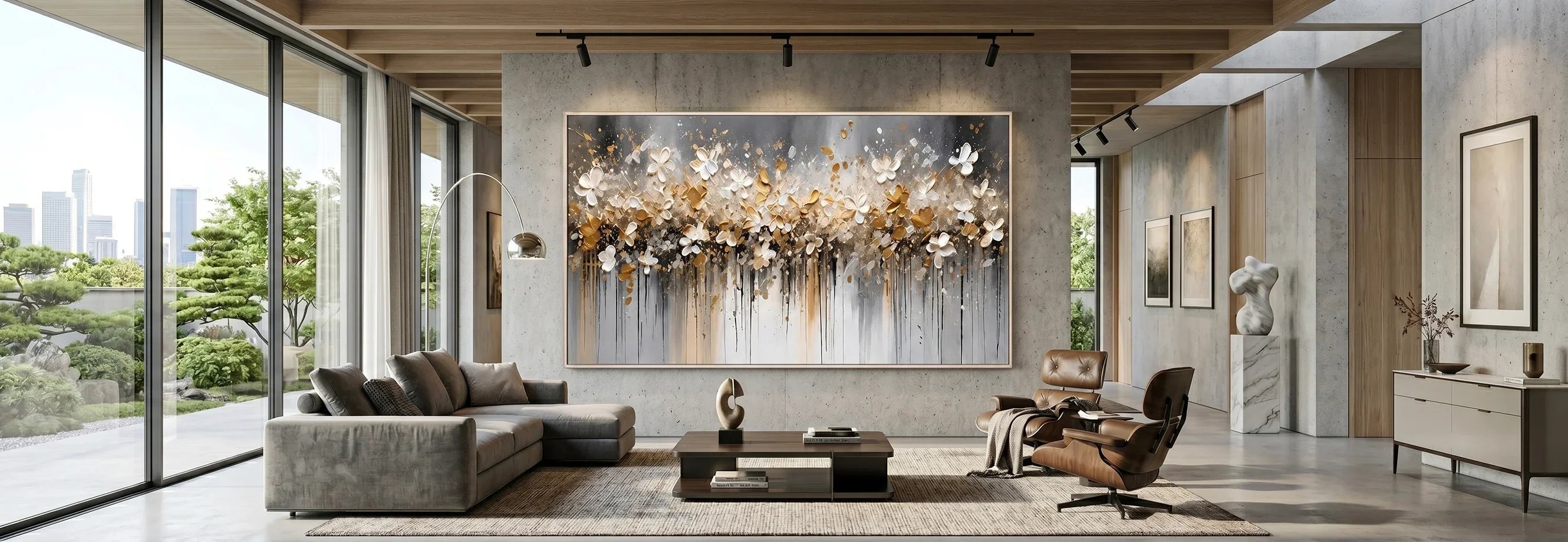
Above a sofa, a large horizontal canvas often works well. It follows the width of the seating area and gives the room a clear focal point. If the artwork has a strong color palette, leave enough breathing room around it so the wall does not feel crowded.
Above a bed, colorful artwork should be chosen more carefully. Bedrooms usually need a softer mood. A colorful painting with muted tones, gentle movement, or tonal layering can add warmth without disturbing the room’s restful feeling.
Above a dining sideboard, colorful wall decor can bring energy to a space used for gathering. A larger artwork can create a sense of occasion while keeping the table surface simple.
In an entryway, colorful artwork can create a strong first impression. Since entry spaces often have limited furniture, one expressive piece can set the tone for the home.
In a home office, choose colorful artwork with a balanced composition. It should add personality, but not become distracting if placed behind a desk or within a video-call background.
Large Blank Walls
Large blank walls can handle more scale and color. A single oversized artwork can create structure without requiring multiple smaller pieces. If the room is neutral, this approach can make the space feel more complete.
Smaller Rooms
In smaller rooms, choose colorful artwork with more open space or softer tones. A compact room can still use color, but the artwork should not compete with every other surface.
Texture and Tonal Layering Add Depth to Color
Color becomes more interesting when it has texture. A flat colorful surface can feel simple, but a hand-painted canvas with raised detail, layered tones, and visible movement gives the artwork more presence.

Texture helps color interact with light. In daylight, the surface may look softer. In evening light, raised areas can create shadow and make the composition feel deeper. This is especially useful in modern interiors where furniture and walls may have smooth finishes.
Tonal layering also makes colorful artwork easier to place. A colorful painting may include bright accents, but it should usually have supporting tones that connect with the room. Cream, beige, gray, white, taupe, brown, blue, green, black, or gold undertones can help the artwork relate to nearby furniture and materials.
This is where colorful artwork can feel more refined. The piece does not rely only on strong color. It uses depth, surface, and composition to make the color feel intentional.
A textured colorful canvas can also soften contrast. For example, strong colors may feel less sharp when they are layered with neutral tones. Softer colorful art may feel richer when the surface has visible brushwork or tactile movement.
Where Colorful Artwork Works Best
Colorful artwork can work in many rooms, but each space needs a different level of intensity.
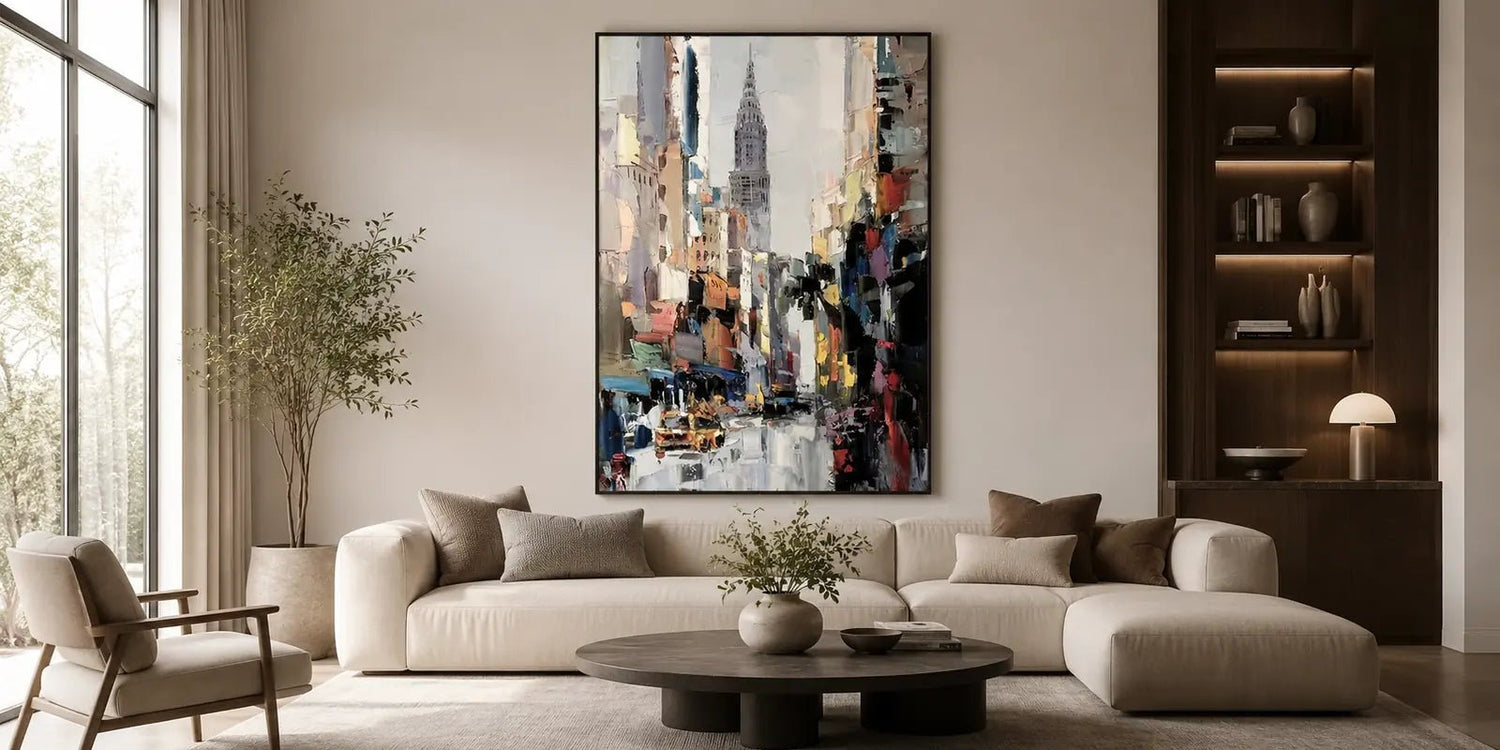
In a living room, colorful wall art often works best above the sofa or on the main seating wall. This placement gives the room a central focus and helps connect the furniture arrangement. If the room is mostly neutral, a colorful canvas can bring energy without requiring new furniture or decor.
In a bedroom, use color more softly. Muted pink, blue, green, lavender, warm beige, or layered earth tones can create a gentle focal point above the bed. Avoid overly intense color if the goal is rest.
In a dining room, colorful artwork can make the space feel more lively. A large canvas above a sideboard or main wall can add atmosphere without cluttering the table. Warm or mixed palettes can work well with wood, ceramic, glass, and soft lighting.
In an entryway, a colorful artwork can set a confident tone. Choose a piece that gives the space character while still working with the flooring, console, lighting, and nearby rooms.
In a home office, colorful art can make the workspace feel more personal. A balanced palette can add energy while still supporting focus.
Compare Colorful Art With Blue, Green, and Black & White
When choosing artwork by color, think about what the room needs most: energy, calm, nature, or structure. Colorful artwork is not the only option, and comparing directions can help you make a better decision.
| Color Direction | Room Mood | Best For |
| Colorful Art | Expressive, bright, energetic | Focal walls, neutral living rooms, dining spaces, entryways |
| Blue Wall Art | Calm, cool, atmospheric | Bedrooms, relaxed living rooms, quiet modern interiors |
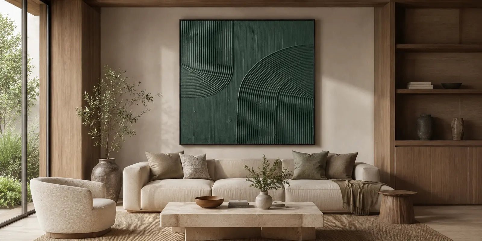
| Green Wall Art | Natural, grounded, organic | Rooms with plants, wood, stone, linen, and earthy materials |
| Black & White Wall Art | Structured, graphic, modern | Minimalist rooms, offices, high-contrast interiors |
Colorful Art is a strong choice when a room feels too plain or needs a more expressive focal point. Blue Wall Art works better when the goal is a cooler and quieter atmosphere. Green Wall Art is useful when the room needs a natural or organic feeling. Black & White Wall Art is a better direction when the space needs contrast and structure without adding color.

The easiest way to choose is to look at the room honestly. If it already has plenty of color, choose artwork with more restraint. If it feels too neutral, colorful artwork can bring the missing energy. If the space needs calm rather than brightness, blue or green may be more suitable.
Colorful Art for Your Space
If you are ready to compare options, browse Colorful Art. It is a helpful place to look at colorful artwork by palette, size, texture, and overall room mood.
The artworks are designed for calm, refined modern interiors and use hand-painted canvas surfaces with real texture, tonal layering, and visual depth. Custom sizes and selected finish options may be available depending on the artwork.
If you are unsure which size, format, or color direction will work best, the team can help from your wall dimensions or room photo. This is especially useful with colorful artwork because scale, lighting, furniture color, and nearby materials can change how bold the final piece feels.
Free global shipping, free and fast delivery, secure payments, and a 30-day risk-free return policy help make the selection process easier.
When comparing Colorful Art, Blue Wall Art, Green Wall Art, and Black & White Wall Art, start with the room’s mood. Then consider wall size, furniture, lighting, color temperature, and how much attention you want the artwork to hold.
Final Thoughts on Colorful Wall Art
The right colorful wall art can turn a blank wall into a clear focal point while still fitting a refined modern interior. It can add warmth to a neutral living room, energy to a dining space, personality to an entryway, or a softer color note to a bedroom.
Start with the room’s atmosphere. Choose brighter color if the space needs energy. Choose muted color if the room should stay soft. Then consider size, placement, texture, lighting, and the surrounding materials.
When colorful artwork is chosen with the room in mind, it does not feel random or excessive. It becomes part of the space, adding visual interest, depth, and a stronger sense of intention.
FAQs
How do I choose colorful wall art for a neutral room?
Start with the mood you want. Choose bright colorful wall art if the room needs energy, or muted colorful artwork if the room should stay soft. Then match the artwork scale to the sofa, bed, sideboard, or main wall.
What colors work well in colorful artwork?
Colorful artwork can include warm tones, cool tones, or mixed palettes. For refined interiors, look for colors that connect with the room through shared undertones, such as beige, cream, gray, wood, black, blue, green, or gold.
Where should I place colorful paintings?
Colorful paintings work well above sofas, sideboards, console tables, beds, desks, dining walls, and entryways. Choose a location where the artwork can act as a clear focal point without competing with too many other elements.


Leave a comment
This site is protected by hCaptcha and the hCaptcha Privacy Policy and Terms of Service apply.