

















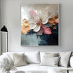
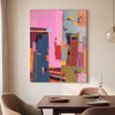

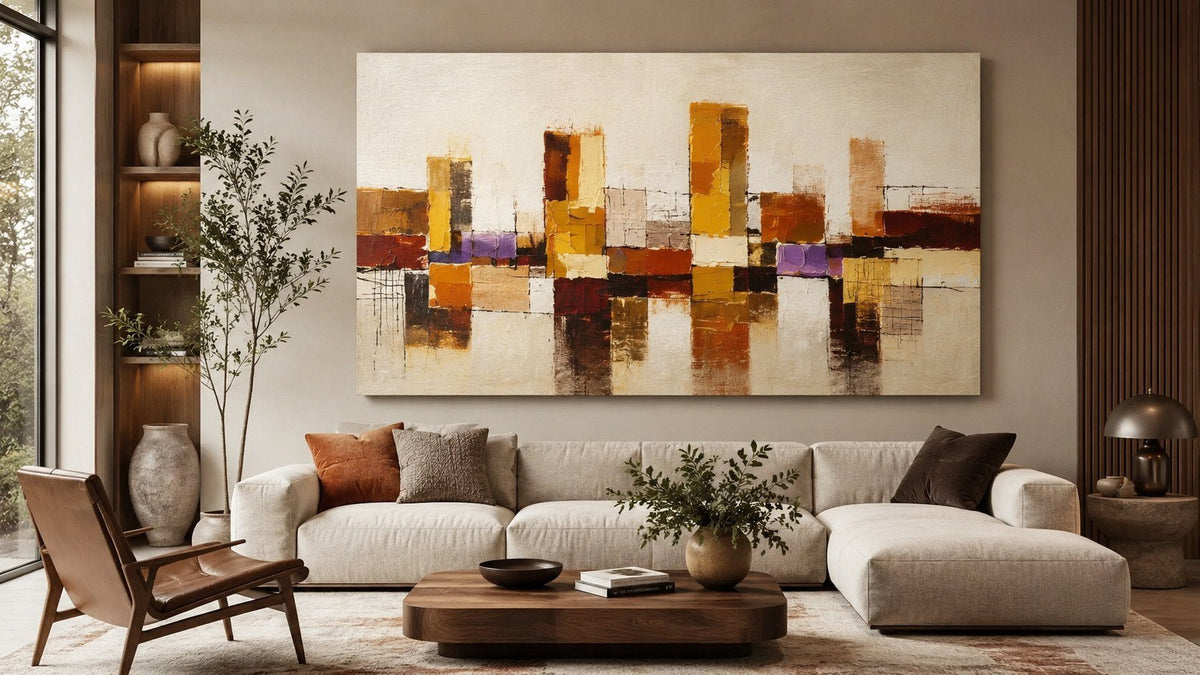
Abstract art can give a living room a clear focal point without tying the space to one subject or decorating style. The challenge is choosing a painting that works with the room rather than simply matching its colors.
The strongest abstract painting ideas for living rooms begin with four practical questions: How much wall space is available? How strong should the artwork feel? Which colors should connect it to the room? How will its surface respond to natural and artificial light?
Answering these questions makes it easier to compare abstract wall art by its effect on the room, not only by how it looks in a product image.

Start With the Role of the Painting
Before choosing colors or dimensions, decide what the painting needs to do.
A focal-point painting should be easy to notice from the main entrance or seating area. It may use stronger contrast, a larger format or a more active composition. This approach works well above a sofa, fireplace or long console.
A supporting painting has a quieter role. It may repeat colors already present in the upholstery, rug or wood finishes while leaving visual attention on the architecture or furniture.
Neither approach is inherently better. Problems arise when the artwork’s visual strength conflicts with its intended role. A small but highly contrasted canvas can compete with an otherwise calm room, while an oversized low-contrast work may blend into the wall more than expected.
Choose Color Relationships, Not Exact Matches
An abstract painting does not need to reproduce every color in the room. Exact matching can make the result feel overly coordinated and may reduce the artwork to another decorative accessory.
Instead, look for one of three relationships.
Repeat One Existing Color
Choose a painting that picks up one secondary color already present in the room, such as the rust in a rug, olive in a cushion or warm grey in a stone surface. The repeated color creates a connection without making every element identical.
Use a Related Neutral Palette
Beige, cream, taupe, brown, soft black and muted grey can support warm contemporary interiors. Their success depends on undertone. A cool blue-grey painting may feel disconnected from yellow oak and cream upholstery, even though all the colors are technically neutral.
Compare the painting with the room under actual daylight and evening lighting. Digital images and showroom photographs may not represent the way subtle neutrals appear in your home.
Add Controlled Contrast
A contrasting color can give a neutral living room more definition. Deep blue, burnt orange, forest green or black may be enough to establish a focal point when used in a limited area of the composition.
The rest of the painting should still share something with the room—an undertone, a quiet background or a similar level of warmth. This keeps contrast intentional rather than isolated.
Match the Composition to the Room
Color receives the most attention, but composition often determines whether a painting feels calm, energetic or visually heavy.

Broad horizontal movement tends to work naturally above a long sofa or console because it follows the furniture line. Vertical movement can draw attention upward and suit narrow wall sections or rooms with high ceilings. If the available space is tall and restricted, these vertical wall art ideas provide a more specific way to measure and evaluate the wall.
Open compositions with large quiet areas usually feel lighter. Dense brushwork, sharp diagonals and multiple points of contrast create more activity. In a room that already contains patterned textiles, open shelving or strong architectural details, a simpler composition may provide better balance.
In a minimal room, a more active abstract painting can supply the movement that the furnishings do not.
Choose Scale From the Usable Wall Area
Do not base size on the total wall dimensions alone. Measure the usable area after accounting for furniture, windows, sconces, trim and circulation.
For artwork above a sofa or console:
- Measure the furniture width.
- Mark the proposed artwork outline with removable tape.
- Check the relationship from the main entrance and seating position.
- Confirm that the work has breathing room around it.
- Review the exact dimensions before ordering.
A painting that is too narrow may appear disconnected from the furniture below it. One that nearly matches the full furniture width can feel crowded, particularly when side tables, lamps or tall plants already occupy the wall visually.
Ratios can provide an initial estimate, but they are not universal rules. Furniture shape, ceiling height, contrast and composition all affect apparent scale. A dark high-contrast work usually carries more visual weight than a pale tonal painting of the same dimensions.
Decide Between One Large Painting and a Set
One large canvas creates a continuous focal point and is usually easier to align with a sofa or console. It works particularly well when the room already contains several smaller decorative objects.

A two- or three-piece set introduces rhythm and can cover a wide wall without the physical weight of one oversized canvas. However, the gaps become part of the overall dimensions. Measure the complete arrangement rather than each panel separately.
Use a set only when the panels belong together visually. Several unrelated paintings placed side by side may look fragmented even when their colors are similar.
Consider Texture and Viewing Distance
Texture changes with light and distance. Raised brushwork may appear pronounced in side lighting and much quieter under flat frontal light. A highly textured surface can add interest to a neutral composition, but texture should not be treated as a substitute for suitable scale or color.
Check the room at different times of day. Side light from a nearby window can emphasize ridges and shadows, while evening lighting may flatten them. Avoid positioning delicate artwork where intense direct sunlight, moisture or repeated physical contact may affect the surface.
Viewing distance matters as well. Fine details are easier to appreciate near a chair or reading corner. Above a sofa viewed from across the room, larger forms and clear tonal relationships tend to remain more legible.
Five Reliable Abstract Painting Approaches

1. Warm Neutrals With Visible Texture
Cream, sand, taupe and brown work well with oak, walnut, linen and warm white walls. Texture keeps a restrained palette from appearing flat.
2. Black and White With Soft Furnishings
A graphic black-and-white painting can structure a room furnished with boucle, linen, wool or light wood. The surrounding materials soften the contrast.
3. Muted Color on Neutral Walls
Dusty blue, olive, terracotta or muted ochre can add color without dominating the room. Repeat one of these tones in a small object rather than throughout the entire space.
4. One Large Horizontal Canvas
A wide composition can connect a long sofa to the wall and reduce the need for several smaller decorative pieces. Confirm both width and height so the painting does not feel compressed between the furniture and ceiling.
5. A Vertical Painting in a Secondary Zone
Not every abstract painting must sit above the sofa. A portrait-oriented work can give purpose to a narrow wall beside a doorway, bookcase or window while keeping the main wall less crowded.
Common Mistakes to Avoid
- Choosing artwork only because its dominant color matches the sofa.
- Measuring the entire wall instead of the usable area.
- Ignoring how strongly dark tones and dense texture affect visual weight.
- Hanging several small works where one larger composition would be clearer.
- Selecting a painting from a close-up image without checking full dimensions.
- Treating every neutral as interchangeable despite differences in undertone.
- Using texture to compensate for an artwork that is too small.
Final Checklist
Before making a decision, confirm:
- The painting has a defined role as a focal point or supporting element.
- Its undertones relate to the walls, furniture and major materials.
- Its composition suits the shape of the available wall.
- The complete dimensions have been tested with a taped outline.
- Contrast and texture are appropriate for the viewing distance.
- The work still feels balanced in both daylight and evening light.
When these points are resolved, compare suitable living room wall art by actual dimensions, orientation and visual weight rather than relying on color alone.
FAQs
What Type of Abstract Painting Works Best in a Living Room?
The best choice depends on the wall shape, room palette and desired level of visual emphasis. Horizontal compositions often suit spaces above sofas, while vertical works fit narrower wall zones. Color and texture should relate to the room without copying every furnishing.
Should Abstract Art Match the Sofa?
It does not need to match exactly. Repeating one secondary color or using a compatible undertone usually creates a more natural relationship. Controlled contrast can also work when another element in the room helps connect the painting to the space.
How Large Should Abstract Art Be Above a Sofa?
Measure the usable wall area and compare the proposed artwork with the full width and height of the sofa. Use removable tape to test the outer dimensions. The painting should relate clearly to the furniture while retaining visible wall space around it.
Is Textured Abstract Art Suitable for a Small Living Room?
Yes. Texture does not automatically make a room feel smaller. The effect depends on contrast, scale and lighting. A tonal textured painting can remain quiet, while a smaller work with strong dark-light contrast may appear more dominant.


Leave a comment
This site is protected by hCaptcha and the hCaptcha Privacy Policy and Terms of Service apply.