














Ivory, warm beige, muted gold, charcoal and black-and-white artwork can all suit blue walls. The useful question is how each painting separates from your particular shade of paint. Deep navy often benefits from a lighter composition; pale blue can support darker marks; dusty blue may need warmth. When comparing wall art on blue walls, look at the wall's undertone, the painting's light and dark areas, and the frame together. Then test that combination in the room's daylight and evening light before ordering.
What Colors of Wall Art Look Best on Blue Walls?
Start with the blue you already have. Is it deep and almost black, pale and airy, grayish, or visibly green? A paint name alone will not answer that question: the same wall can appear cooler beside warm wood and greener beside a blue rug. Compare a broad section of wall with the room's fixed finishes, rather than judging a tiny patch on your phone.
| Existing wall color | Artwork colors to compare first |
|---|---|
| Navy or deep blue | Luminous ivory, warm white or a light neutral composition |
| Dusty or slate blue | Cream, taupe and restrained soft-gold accents |
| Pale or sky blue | Charcoal details, black-and-white forms or warm neutrals with definition |
| Teal or blue-green | Off-white, earthy neutrals and small warm accents |
These are starting points, not universal matches. Against navy, an ivory painting can stay clearly visible because its overall value is lighter than the wall. A dark painting with one small pale mark may offer much less separation than its close-up photograph suggests. Judge the whole composition from across the room.
There are two different decisions here. If you are selecting a blue-colored painting for a room, the blue wall art guide covers that broader choice. Here, the blue belongs to the wall already; the artwork may be white, neutral, graphic or partly blue.
Contrast gives the painting a clear boundary. Tonal harmony lets it sit more quietly within the wall. Either can work, but decide which effect you want before collecting possible purchases. Otherwise, a quiet tonal choice can look disappointingly faint simply because you expected a strong focal point.
How Should You Pair Art With Navy, Light Blue, Dusty Blue or Teal Walls?
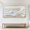
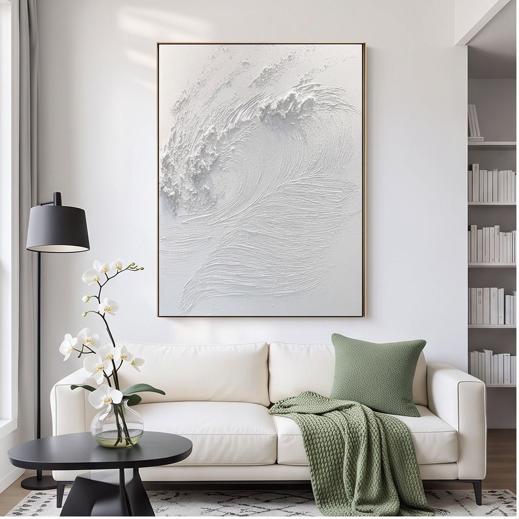
Navy: begin with a lighter field. Ivory or warm-white art is a useful first choice when a dark wall needs a readable focal point. TO869's white textured wave wall art uses raised white contours that provide a light composition to compare with navy. Check whether the surrounding light reveals those ridges; relief that is obvious in a product photograph may appear quieter under flat room lighting.
A warm beige composition is an alternative if white would repeat too many existing pale surfaces. It can connect the wall with wood furniture or oatmeal upholstery while retaining separation. Avoid assuming that every black frame will stand out: on near-black blue, a dark perimeter may recede into the paint.
Dusty or slate blue: test warmth before stronger color. Cream, beige and taupe can balance a cool-looking wall without introducing a second dominant hue. TO022's layered neutral composition offers a horizontal example. Compare its warm passages with the actual blue, especially if the room also contains gray stone or cool upholstery. An alternative is a small soft-gold accent within an otherwise restrained painting.

Light or sky blue: give pale artwork a definite edge. Charcoal marks or a graphic black-and-white composition can remain legible against a light wall. If you prefer warm neutrals, look for visible changes between the painting's cream and taupe areas, or test a frame that separates it from the paint. A mostly pale image with a pale frame may look gentle close up but lose definition from the doorway.
Teal: decide how much warmth the wall needs. Off-white and earthy neutrals can make sense beside blue-green paint, particularly where timber is already present. Small ochre or warm-gold details offer another route. If the wall itself is saturated, a large orange or gold field could become a competing focal point. Compare the amount of accent color, not just its name.
When Does White, Neutral or Black-and-White Art Create Better Contrast?
White relief works especially well as a comparison when you want contrast without another strong color. Side light can reveal raised areas through shadow, giving a pale composition definition against dark blue. Look at the room at more than one time of day: a lamp placed directly in front of the work may show its surface differently from a window to one side.
Warm neutral art is worth testing when the wall feels cool but you do not want a stark white rectangle. The textured neutral abstract wall art TO022 combines cream, beige and taupe in broad layered forms. Compare those passages with your sofa or floor, then look back at the wall. The painting can connect existing tones without matching every surface exactly.
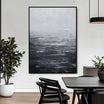
Black-and-white art gives a different result. TO898 is a coordinated two-panel diptych with bold dark forms against warm off-white grounds. On pale blue, both the pale areas and the black shapes may remain distinct. On very dark navy, some dark forms or frame edges may become less visible, leaving the lighter passages to carry the composition. Test the two panels as a pair rather than judging one cropped detail.

The frame belongs in the comparison too. A light or wood-toned perimeter can separate art from dark paint, while a narrow dark edge may define a pale work on light blue. Judge the actual finish and outside dimensions you plan to order. A frame pictured in a room photograph should not be assumed to be included with every available option.
Can Blue Artwork Work on a Blue Wall Without Disappearing?
Yes, when the artwork has enough difference in lightness, color temperature or surrounding edge. A light-blue painting may show clearly on navy; darker blue forms can define a composition on sky-blue paint. Two blues that look distinct on separate screens may merge when brought together, so avoid relying on color names as evidence of contrast.
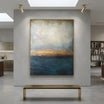
TO848's Blue & Gold Coastal Abstract Wall Art illustrates a more varied blue composition: ocean-blue passages sit alongside white surf-like areas and warm gold-toned shoreline detail. Those lighter and warmer breaks give you something to compare with a blue wall. They do not establish that the painting will work against every navy, slate or teal shade.

If your first choice disappears when viewed small or from a distance, compare its overall light-dark balance with a different composition. The White Wall Art collection provides a focused route for considering lighter alternatives. Keep the wall sample beside those images so you remain focused on the pairing rather than switching to a general search for favorite paintings.
How Can You Test the Pairing Before Ordering?
Use a short first pass to narrow the options, then return to the shortlist under evening light. Five minutes is enough to reject an obvious mismatch; it is not a guarantee of exact color reproduction.
- Put the wall and artwork references together. Use a photograph of your wall taken in ordinary daylight, without a strong filter. Compare whole artwork images at a similar screen brightness. Treat the result as an indication; photographs and displays can shift color.
- Check the view from a distance. Reduce the artwork image on screen, then stand where you normally enter or sit. Can you still distinguish its main pale and dark passages against the wall reference?
- Mark the finished outline. Check the selected artwork and frame dimensions, then use paper and wall-appropriate tape to test the footprint. An attractive color pairing can still feel cramped beside a doorway or sconce.
- Include the frame and nearby finishes. Compare the proposed edge with trim, furniture and hardware. A separating frame may help a tonal work read clearly, but it should not need to compensate for a composition you cannot see.
- Revisit after dark. Look at the wall under the lamps you actually use. Warm evening light can change the apparent relationship between cool paint, cream areas and gold-toned details.
Choose the pairing that remains convincing in both conditions: a distinct light field on navy, warm neutrals against slate, or deliberate dark detail on pale blue. Use the original product views at TactileAtelier.com to check the complete composition and selected options. The final choice should suit the blue wall you have, rather than a blue room imagined from a product photograph.


Leave a comment
This site is protected by hCaptcha and the hCaptcha Privacy Policy and Terms of Service apply.